Tuesday, 20 May 2014

OUGD505 - Studio Brief 2 - Final Images

Here are the final images of my luxury Yurt hotel 'Bostandyk' branding:


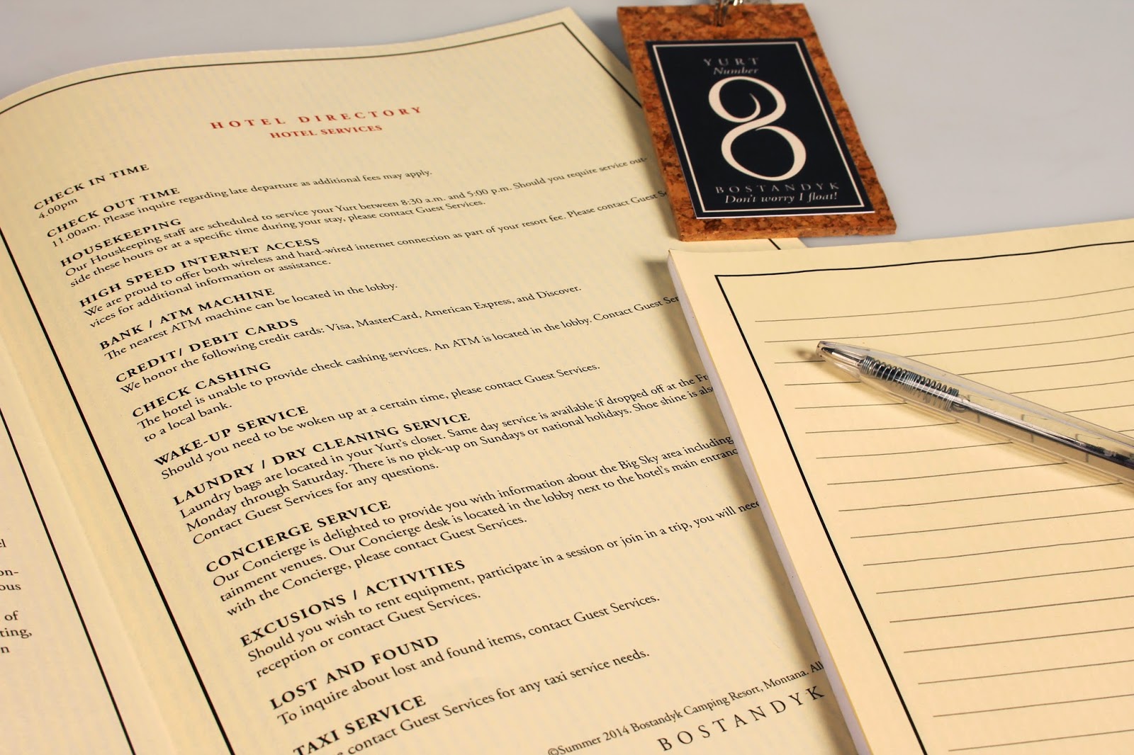
The stationery designed for inside the yurt itself.


This includes a room service food menu, a drinks menu, note paper, a do not disturb door hanger, cork key hangers, a hotel directory and toiletries, beverages and a first aid box. 


A close up of the ribbed stock. I had to ensure that the lines were vertical on every document.


The cork room keys designed to float when dropped in water should the guest go canoeing!


Cork Wayfinding signage


Office Stationery


Compliment slip


US Letterhead since the hotel is based in Montana!


Closeup of stock.
 

The back of the letterhead and inside of envelope adorned with the Kazakh inspired pattern.


The Business cards
 

Four variations colour coded by the different mini brands of the hotel; room related service, the office, outdoors wayfinding and excursions.

OUGD505 - End of Module Evaluation


BA (Hons.) GRAPHIC DESIGN     
LEVEL 
05
 Module Code  
OUGD505


 Module Title
Design Process


END OF MODULE SELF-EVALUATION

1.  What skills have you developed through this module and how effectively do you think you have applied them?
In this module, the main skill I think I have developed is communication skills and photography/ presentation skills. Constantly keeping up each week with critique sessions and workshops have helped me to gauge where my work should be, as would be in 'real world' constant communication with the client. As for presentation - previously I have settled for shoddy iPhone photos for final presentations and produced design boards as a final thought, and until now haven't seen the importance of setting aside time to present my work properly. Since starting this module, I have learnt how to set up and use professional photography equipment all on my own and produced photographs I am happy to use in my portfolio that do my work a bit more justice! 
I have also greatly improved on my layout design skills in this module. Looking at my research book then looking at all of the design boards that I produced towards the end of the module there's a huge difference! I have come to terms with using grids a lot better and understanding leading, kerning etc in typography. The Jackson Rising session helped a lot!


2. What approaches to/methods of design production have you developed and how have they informed your design development process?
I have, for the first time ever, produced a book with Japanese book binding techniques, which gave my research a more of a folk-inspired look. Other than that, I really don't feel like I've challenged myself enough to try any new methods of design production and only use pretty basic techniques otherwise (IE, Digital print). I think this is because of my loss in confidence in screen printing after the struggles I had with it in OUG504, I try to avoid it at all costs. I need to face my fears and definitely not compromise design decisions for the sake of lack of practice.


3. What strengths can you identify in your work and how have/will you capitalise on these?
This time around, especially for Studio Brief 2 I have chosen to work in a probably more mature style, completely different from my usual preferred style of 1950's and 1960's illustrative style. I think it's a strength that I've gone out of my comfort zone, which for me was a big leap again, as I feel like I've only just got comfy/ good at the one I normally work in!
I have also never really done branding before, so for studio brief 2 it was a nice change! Again, I need to broaden my range of areas of expertise as opposed to packaging, illustration and hand lettering all the time!

4. What weaknesses can you identify in your work and how will you address these in the future?
Because I have come out of my comfort zone in studio brief 2, I think that the execution of my work in this style is quite weak and almost plain, which leaves me really quite unsatisfied as I think that I tried hard to work in a different style, which I don't think is that successful. I really want to improve on this style and learn to teach myself different styles to work in to ensure I am a more versatile designer. 
As always, I have struggled with time management but I see it as a problem that is all-relative to the ever increasing workloads I face. This period seems to be the busiest so far and compared to previous projects I have improved greatly but to meet with the final year's workload I really need to keep timekeeping and staying organised.
I have not been very creative with my design decisions in this module because I don't manage my time properly enough to not put pressure on others that I may require to assist me. For example, I leave it too late to book into the laser cutter, or too late to ask a member of woodwork to help me create something a bit more special. I plan to change this and plan a project in it's entirety completely in advance.


5. Identify five things that you will do differently next time and what do you expect to gain from doing these?
Decide on a research topic quicker and stop being so particular about my design outcomes - a professional designer doesn't always get to work in their favourite style either!
Keep up to date with my blogging - because it only mounts up if I don't!
Be more proactive in trying out different techniques and try to avoid just 'mocking up' design products - if I properly made each of my products I would better understand how they properly worked and what would be required of me in industry to design for that purpose.
Make design decisions more quickly so that I can plan around external professionals who could assist/ print/ help me build the final products.
Bump up the quantity of my work, obviously without compromising quality - this will help avoid pre-deadline anxiety.


6.How would you grade yourself on the following areas: 
(please indicate using an ‘x’)  

5= excellent, 4 = very good, 3 = good, 2 = average, 1 = poor

1
2
3
4
5
Attendance


x

Punctuality


x
Motivation


x

Commitment


x

Quantity of work produced


x

Quality of work produced


x


Contribution to the group


x


OUGD505 - Studio Brief 2 - Final Mockups/ Proposed products

Here are the proposed products intended for the Bostandyk Camping Resort, should this project have an unlimited budget!

Branded Vehicles


Branded in the turquoise colour scheme associated with the events, sessions and excursions mini brand within Bostandyk, 4x4 vehicles were needed for guests to enjoy trips hosted by the resort on this mountainous Montana lanscape.

Front doormat - Wayfinding


In addition to the cork signs around the resort, the black welcome doormat greets guests and introduces them to the brand as soon as they enter the front doors.

In- room comforts


As well as all of the other things branded for the Yurt, towelling and robes adorned with the brands black outline and logo are also given to guests.

Instead of resorting to the usual disposable, plastic mini toiletries bottles used in the hospitality industry, I have designed mini biodegradable, reusable pouches that fit snugly into the boxes provided, if the screwcap is folded over. If these were created in the intended materials to intended size and all placed in the same box, it would cut back on packaging around 40%. There is a label on both the side and the top so it can be seen both when standing up and laying down when presented in the box itself.


Monday, 12 May 2014

OUGD505 - Studio Brief 2 - Bostandyk Logo development

I know that I want to have the Shanyrak found in my research as part of my logo:


But as you can see by this first image, it's looking a bit plain! It also doesn't convey the hotel's high class 'michelin' standard I'm after. I think it needs to be more delicate!

I look back at the Kazakh alphabet for a bit of inspiration:


I have now decided to change my hotel name from Koreym to Bostandyk, meaning 'freedom' in an anglicised pronunciation of Kazakh. I chose to change it because I wasn't entirely certain on the meaning on 'Koreym' and I was having problems working around the 'K'! I chose 'Bostandyk' because it means freedom, so is a lot more relevant to the outdoor theme of my hotel. After looking at the Cyrillic Kazakh alphabet I have chosen the symbol that best resembles the latin 'b'. I don't mean to ever use this in context but just as a starting point for visuals:


Trying out with different letters how they may look a bit more kazakh- stylised. 


The logo so far - I used as many different symbols from the cyrillic alphabet as possible. At this point, I feel like the logo looks rather dated, and possibly needs simplifying.


To incorporate the Shanyrak symbol back into the design and to simplify the long logo into a more apply-able version, I have cut to just the 'b' shape with the brackets of the Shanyrak over the bowl of the 'b'. 

In this image, I have deleted one of the brackets as I'm now using the swoop of the bowl as the third vertical bracket.


Here is the finished logo! I refined the shape of the 'b' to a lot more sleek and elegant by practising lots of different line thicknesses until this was the final result.
for the title etc, I tried lots of different fancy typefaces but found that the simplest ones, like 'Adobe Garamond Pro' with stylised kerning settings give a lot more classier look.
I'm really happy with the logo so far, but I am thinking that I want to incorporate different colours into the overall branding so I will see how the logo gets affected in these different sectors.

Saturday, 10 May 2014

OUGD505 - Studio Brief 2 - Pattern development

After looking at my research, it seems the best way to unite a brand all together is obviously through logos and colours, but more notably, patterns. This is why I have decided I want to make my own pattern to not only unite all pieces across my brand, but also get more of the Kazakh theme into my work.


Kazakh patterns are a heavy mixture of both angular and natural wavy parts. Here Iam layering a possible pattern idea.


This was the first time I had used the pattern creator in illustrator and I don't like it at all!  However, I think my pattern is getting somewhere, only I feel like its a bit flimsy looking with a lot of blank spaces in between each section. I am also having problems wondering how colours will/ can be applied to this. I think it needs to be strengthened.


I re-started the pattern into something a bit more modern, but found it was too dense! Feeling a bit like goldilocks!


After looking AGAIN at lots of different Kazakh patterns, I decided to do something a bit more floral based on a medallion layout as it would be easier to apply.


This application of colour is a lot easier to categorise into the 4 sections of the hotel I want to include. Because of it's bold outline and stark black, I don't feel like this pattern is too feminine but does the job nicely! The medallion shape is good for application onto business cards and other products too as a watermark perhaps?

Wednesday, 23 April 2014

OUGD503 - Responsive - Summative Module Evaluation

OUGD503 - Responsive - Summative Module Evaluation

Looking at the module as a whole, it has definitely been my favourite over the two years I have spent on my degree so far. This is because it felt a lot more ‘real’, by being able to pick and choose our own briefs I was able to direct my work in the way I wanted it to go. It felt like it was the first proper chance I was given to have a go at briefs set by ‘real world’ clients, with their own set of requirements and deadlines, and it was exciting to get an insight into what it would be like working out of education. This also gave me a chance to develop my preferred style of work, and choose a lot of illustrative-based projects which I enjoy the most, keeping my momentum up.
Every module I come across teaches me a new, (usually difficult) lesson about time management but this time it was a little different. For example, if I didn’t make the deadline for something in education, it would mean that I wouldn’t be able to continue on my course without penalties, that would affect my overall grade. However, if I were to miss a deadline on a competition, it would simply mean that I wouldn’t be entered and all of my work would go to waste. Somehow, this lack of pressure coming from the competition organisers (since they wouldn’t care if I entered or not) caused me to discipline myself even more and the pressure of the deadline would come from myself. I see this as a greatly positive thing, as the responsibility of the brief rested completely on my shoulders, otherwise I would get entered or I wouldn’t get paid etc.
The feeling of winning the Silver Starpack award 2014 was really great to see real-world rewards and recognitions of my work outside of education. Seeing my work in the Dialogue exhibition occurring more than once was such a proud moment, definitely leaving me wanting to get involved a lot more in these opportunities, having never having the confidence to do so previously. Again, another positive of working with public competitions.
Real-world pressure didn’t come without it’s negative points, though. The fear of being penalised for not properly checking my work for copyright material left me worried for a long time. Lots of extra research into exactly what I could and couldn’t use on my Disney hoodies designs spent up a lot of my time back in January, almost a whole month since I finished the designs, leaving the ‘clients’ rather annoyed and becoming quite abusive over social media. This gap in time also meant that my design practically ‘lost’ over another submitted design, with only very few of my designs actually being downloaded.
On the flip-side also, was the fear of our work being plagiarised, as our work is displayed and sent over the internet, with my classmate’s work being ‘copied’ by another competition entry. This meant that we had to withhold a lot of our blogging being published and our Behance’s being left not updated before the competition deadlines, which was a fruitful lesson to learn.
This is also the first time ever during a module I have time left over at the end to properly photograph my outcomes in a studio, edit the pictures and create presentable design boards that I don’t have to worry about the spelling on! The retouching of the images really improved my Photoshop skills, and I was able to compose and stitch together many different images that couldn’t have been possible for my design boards. By having much more practice to complete design boards during this module, I have also greatly improved my design skills when working with a grid, which I found alarmingly difficult before.
Being able to choose our own partners for the collaborative practice brief went surprisingly well for us. At first, me and Danielle Harrison didn’t particularly want to work together, as we spend a lot of time together anyway, have worked together in the past, and fancied a change but when we found that many others were already paired up, we stuck together. This last minute decision worked highly to our advantage, as we felt that we were already a lot further ahead in our collaborative relationship than perhaps new partners, and knew our skills, capabilities and time management tactics meaning we could distribute the work according to these factors. I wasn’t entirely sure of our choice of brief at first It would be untrue to say we didn’t argue, but we never fell out over the work, and our friendship meant that we could be harsh critics to each other without causing offense as we both wanted the best for the work! We kept in constant contact since we live together and whenever we were apart we would stay in contact over Facebook whilst sharing what we were working on in our shared folder on Dropbox. We found that communication is key and all decisions were made together, yet still there was the freedom to design as we wished. We both have similar design style interests, which helped a lot, too. We worked really well together and managed to create a project we were both more than happy with, which I am very thankful and proud for.
My communication skills, I have found have been improved greatly by the work in this module. Constant presentations, critiques, emailing with clients and working in collaboration have given me a lot more confidence to say what I feel in a respectable, professional manner. This can be seen in other modules, such as PPP where I now feel confident enough to talk to almost anyone, whether it be on email or over the phone, even!
You can see the development and progression of my work into the strong style I want that I am constantly improving upon. My doing briefs which I have enjoyed working on such as Starpack which combined my love for illustration and packaging, I have wanted and been able to put lots of time and effort into, and remain happy with my results! 
I still feel like I need to work on my time management to keep up with the work that I have created in this module, as this is the first time I feel completely in control of my deadlines, quality of work and presentation of work and I’d like to stay this way!
But overall this module has been such a great learning curve that has taught me lots about self-responsibility. Whether it comes to deadlines, being paid, copyrighting, working with others and communication whilst keeping a good standard of work, it all boils down to me as an individual. 
It’s not about if you have a difficult client, it’s about how you handle the situation and how you make them happy whilst remaining in control of your time. It’s not about getting silver in a competition but how you will get gold next time etc. I am so happy with my work that I have produced and look forward to third year when my work is as self directed as it has been in this module.

OUGD503 - Responsive Project Report

OUGD503 - Responsive - Collaborative - BEAR YCN Design Boards

OUGD503 - Responsive - Yoke Dialogue Exhibition Design Boards

OUGD503 - Responsive - Cast Member Hoodies Design Boards

OUGD503 - Responsive - Stockton Heath Peal Appeal Design Boards

OUGD503 - Responsive - Starpack Student Awards Entry Design Boards

OUGD503 - Responsive - Sun and Moon Vintage Clothing Design Boards

Tuesday, 22 April 2014

OUGD503 - Responsive - Verity Taylor Wedding Invitations Design Boards

OUGD503 - Responsive - Starpack Student Awards competition submission design boards

OUGD503 - Responsive - Collaborative Practice - YCN BEAR Alphabites cereal competition submission design boards

OUGD505 - Studio Brief 2 - Critique session 22nd April

OUGD505 - Studio Brief 2 - Critique session 22nd April

I was regrettably very unprepared for today's critique session on our current studio brief, having made little progress in the past few weeks on my work and bringing a few tatty sketches to the session, so I knew I would not be able to get very valuable feedback.

Here are the sketches I brought to the session:


Here are the questions I asked:


  1. Are gold/ silver foils appropriate for the branding of a spa resort if the theme is all natural?
  2. Can you suggest any ways I can have sustainability in my products whilst still keeping them luxurious?
  3. Can you pronounce the chosen name? ( Koryem)


Here are the answers from these questions:

Question 1
"I think that the gold and silver will look swanky"
"If it is upper class, it will be clear. "
"Yes but if the background was black it wouldn't look natural.. How about a green?"
"Yeah the foil would work, could also try using green foil on black or grey- only because green reminds me of natural things"
"Yes but what would your stock colour be? Antique gold foil looks really nice on white stock"
"I love gold, always looks nice in foil. It will add a hint of class to the traditional feel."
"I think that the gold and silver foils are appropriate, depending on the background/ stock colour. If stock is white/ cream then the metallic and light combination will look clean and pure and therefore communicate the all natural element"
"If the foils were applied in limited amounts consistently across your range I think it would be appropriate"

Question 2
"You could use a silverish thread?"
"Could use dissolvable shower gels, refillable containers, recycled materials"
"I don't know a lot about sustianable materials - sorry! Although I do like the idea of a cork lid for the toileteries"
"Re-fillable products, recycled products. Could consider designing the sign that you get on the doors"
"preservative free/ natural ingredients - have a look at the Body Shop"
"Re-fillable, organic etc."
"Eco friendly/ organic products are often more expensive and so could be seen as upmarket anyway, apply some slick branding to ecofriendly products and I believe you'll have the desired effect"

Question 3
Everyone seems to write the word correctly in terms of pronunciation so I think that I feel comfortable going with this name!

Considering how little I brought to the session I was humbled and encouraged by my feedback, I am very grateful for everyone to be so understanding of my lack of preparation! I now need to step up a gear, take on my feedback comments and pull this project properly together!


Wednesday, 16 April 2014

OUGD503 - Responsive - Stockton Heath Peal Appeal Development

OUGD503 - Responsive - Stockton Heath Peal Appeal Development

St Thomas' church in my hometown of Stockton Heath is in need of restoration for it's bell tower, as new bells are arriving. The church has only ever had one bell which doesn't ring, instead a recording is played to call people to service, so there is a lot of work needed to be done to strengthen the bell tower. 

I was approached by the vicar to create a banner and logo to represent a fundraising campaign to help this cause, called Stockton Heath Peal Appeal. (as in Peal of the bell)

I was kindly given this line drawing to work with and somehow incorporate it into the design. They stressed that the belltower must be shown so that people know the money is for the belltower and not just the bells themselves:

I began with an image of a church bell and started to illustrate my own over the top.


I decided to use a rich purple, since it's a colour often associated with christianity and it's also the colour that represents the culture of Stockton Heath.


I didn't like this background I had created, and was struggling to incorporate a belltower onto it, so I decided to draw a landscape instead.


So first it was the sky and clouds.


I created the belltower using the line drawing, reference images from Google, and my own personal knowledge of what the tower looks like. It was paramount that I included the extra tall steeple, as it is unique to this church.


I put the tower onto the landscape and started to play around with words.


The final image:


The final image included the logo design I had created for the campaign, too:


The feedback I got was really positive, the only request was to remove the VirginGiving URL as this was a link to be posted to their website itself, but overall a success!