Showing posts with label critique. Show all posts

Thursday, 27 February 2014

OUGD503 - Responsive - Design Process 2 - Studio Brief 2 - Collaborative Practice - Interim Critique

OUGD503 - Responsive - Design Process 2 - Studio Brief 2 - Collaborative Practice - Interim Critique

Today, we got to present our progress of work to our normal groups and receive feedback in a rather different context. At first, it started as a normal critique but resulted in us giving much more honest feedback because we were asked to 'swap' briefs to see what we would really change. 

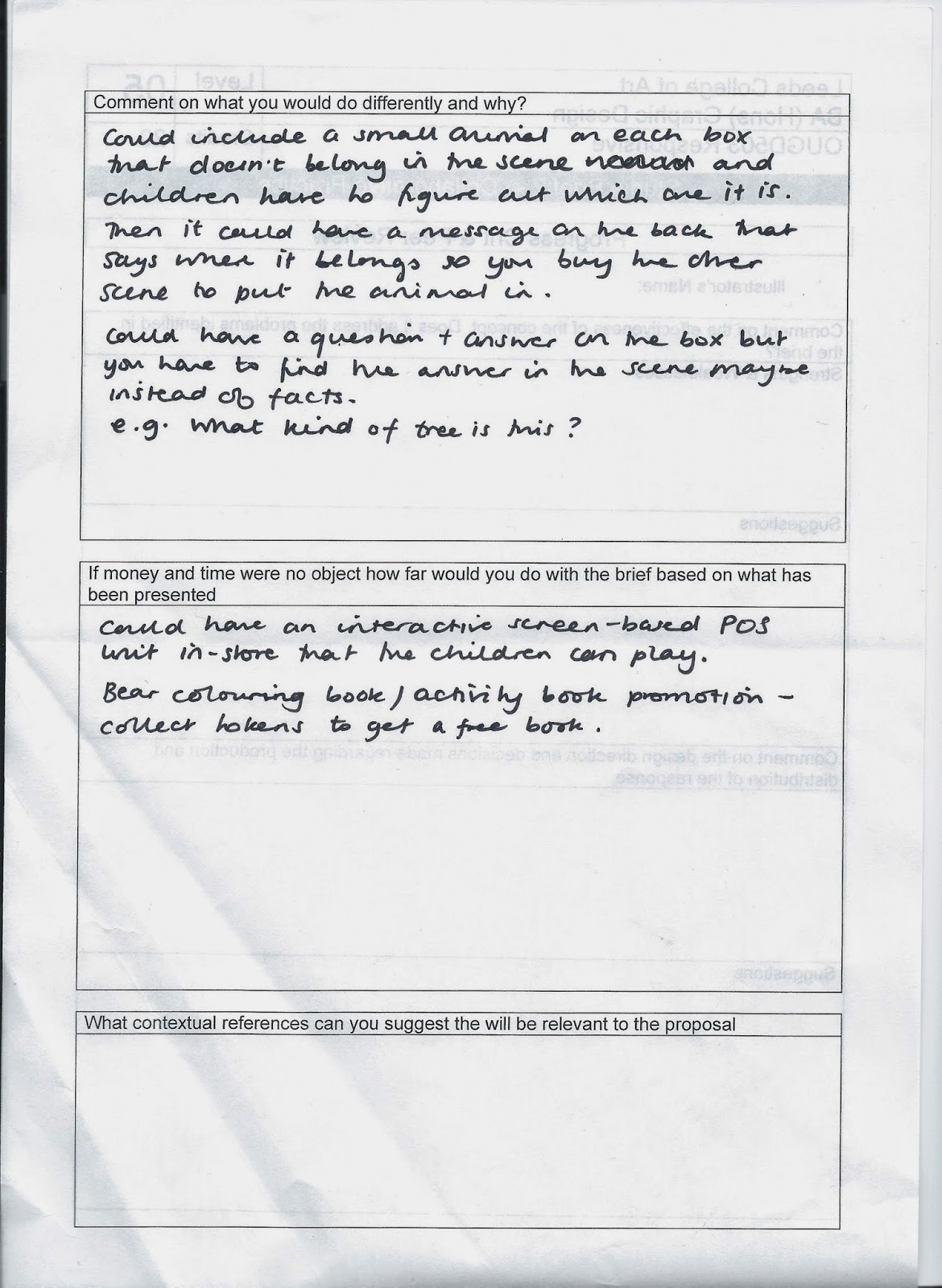
Whilst me and Danielle got Amy and Mel's work to review, our work was passed to Jane and Grace, who came up with some interesting suggestions and good feedback:


We really liked the idea of including an animal from a different box, as we were struggling to come up with an incentive for the user to purchase again. There were also some great suggestions as to different games to include.
They did suggest that we could expand our range of scenes to put on the boxes, such as a beach, but we felt that we should keep the kind of scenes should remain consistent in theme and so didn't pursue this idea.

Wednesday, 26 February 2014

OUGD505 - Studio brief 1 - critique 26th Feb

OUGD505 - Studio brief 1 - critique

Today, I presented my ideas and concepts for studio brief 1. I have been greatly struggling with this brief, as it turns out I don't find my research topic interesting enough and have foolishly pursued it in the hope that my feelings would change. They haven't.

This means that I am massively behind on my development compared to others and really need to get a move on! 

I sheepishly attended the critique with a mere mockup of what my book will look like. Here is what I brought:


The mock up showed how my staggered page ideas, quick sketches and drawn up layouts that I intended to produce in actual size.


Here is the feedback:

Strengths:

'Use of textures/ cut outs and pattern is very suitable'
'Very unique idea and subject'
'Interactive, fun elements such as touch and the interior/ exterior of the yurt'
'Use of materials and binding strongly link book to subject'
'The mock up works really well, the range of layouts keeps visually interesting. The binding technique reflects the subject'

I was happy that people could see the considerations I had made trying to visually translate my findings into my publication.

Areas for improvement:

'Consider the flow of information IE yurt decor & aesthetics before history and facts to tie in with the other characteristics'
'The format could prove too small in relation to the layout'

These are things I had feared and I took all of these on board.

Considerations:

'Consider size of pages and the amount of bodycopy you may have (make sure the content isn't too small)'
'Consider how the stock will fold and read when bound due to different thickness and binding'
'Consider how the front will look when all together, will the 3 separate pages look like one front cover look as if they are 3 separate pages?'

I realise that I need to do a lot more experimentation if I am going to have a well-informed final design.

Additional comments:

'Maybe look at traditional materials that could be utilised in construction'

Another sheet was inserted with feedback all on their own:

I think the style of your publication is suitable as you proposed. I think the structure, different textures amd crafted pages are on instructional and interesting strong concept. I have put stars in your publication on strong layouts you have proposed I think the wide set images and text works well. I don't know much about yurts but I think you should experiment and research into editorial layout design and experiment with some contemporary styles.

I realise that my layout designs are weak and I was so glad could see that and not just the fact I had been procrastinating. I also noticed that no one mentioned how far behind I was - I think this was done on purpose as they could see my difficulties in keeping up.

I know I need to address more experimentations and ideas and most of all - get on with it!!

Thursday, 23 January 2014

OUGD503 - Responsive - Individual Practice - Great British Summer Benson Group brief - critique 23/1

Responsive - Great British Summer Benson Group brief - critique 23/1

Today, we had a 'final' critique for our main Responsive briefs. Here is the work I presented:


I managed to get a colour mockup of the main carrier box, it's bellyband, the sandwich box and it's pull out plate, the dessert box, pasticceria paper and stickers to secure it.


back view of the sandwich and dessert boxes.


front view of the sandwich and dessert boxes.


Pull out plate and pasticceria paper.


closeup of bellyband on carrier box.


Details on the carrier box.

I also brought along to the session 5 design boards, which explained the project so that I could be properly critiqued on how well I had answered the brief.


I also included the Evaluation and 5 questions I wanted answering about the work I had presented:

Evaluation

In response to the brief set by the Benson Group and Starpack to create an on-the-go food pack for two people, I created a design which I feel fulfilled the necessary criteria to accommodate for the associated audience. I found in my research that for a pack like this to work, it has to give lots of choice. Each person gets a main, snack, dessert and drink of their choice all of which will fit inside the box! I also thought about how the user will interact with the product and where, so I ensured that the product will fit on the user’s lap and so can be consumed on public transport, for example. 
I originally intended for the box to be able to go flat-pack once used to ease customer reusability as they could transport it more easily once empty. If I have more time before the official deadline I will improve these elements and reduce the glued elements. This would also improve on environmental impact, which is important for an intended mass-produced product. 
It is proposed that this pack would be able to clip onto the frame of a bike to accompany the user on bike rides etc.
Further development of this product would include co-ordinating in store point of sale design, large instructional posters, and in store shelf signs for prices and to colour co-ordinate the steps 1,2,3 & 4 to assist the users. 

 5 Questions about the work:

Do you think that the packaging inflicting with the inside of some of the windows is a problem? IE the top of the dessert box and the sandwich tray showing inside the sandwich box.
In your opinion, in terms of colour and style, do you think that my design answers to the requested ‘Great British Summer’ theme?
Do you think that this pack suits a wide audience of the general public or does it appeal to a smaller audience?
Are there any glaringly obvious improvements that need to be made on my current design?
In a practical sense, do you think my submission for this competition will stand out from other submissions? why?

Here is the feedback I received:


There has obviously been some confusion that was inadequately explained in my design boards with accordance to the delivery of the final products; as no 2,4, or 6 is required in this scheme. 
I also failed to demonstrate my inner holding system to them through my design boards also, making them question how the products will be held in place.

My fears were confirmed when they said that the design appeals to young children and families. This is a really negative sign, as I have narrowed my audience in half. Since the pack as defined by the brief should accommodate meals for only 2 people, this doesn't work either!


I agree with the numbering of products, I made a big mistake on this! But since it was only a visual mockup, I decided to leave it for this particular critique. The shape of the products is fine though, it's just not generic. This needs to be demonstrated more professionally with the products inside before being presented finally for the competition.

To do list as suggested from the critique:

  1. The products need to be shown in-store and distribution must be explained and demonstrated.
  2. The numbering system needs to be fixed.
  3. The inner holding system needs to be demonstrated - maybe illustrated?
  4. professional photography of the pieces with the products inside will help the viewer to visualise the final outcome.

Thursday, 9 January 2014

OUGD504 - Design for Print and Web - Final crit

OUGD504 - Design for Print and Web - Final crit

After presenting my work today, I found that I didn't really recieve much feedback at all:

Strengths:
-blank-

Areas for improvement:
'having lanyards at the start of the route'

Considerations:
How would you hand out lanyards - could add logo to balloons?

Additional Comments:
-blank-

***

My response to this feedback was that it doesn't matter to me where along the route that the lanyards are distributed, as this is additional to my exsisting plan of users buying them from Waterstone's. If this were a real event, I would deem it more important, but it doesn't at this current time.
Also, how I could hand out Lanyards is an additional thing, and doesn't really give me much insight to my current designs.

I have decided not to act upon anything discussed in the crit, as it wasn't the answer I was looking for, and have no time to do additional work, but to just improve upon the work I have already created.

But in this critique I was questioned about my audience, and it was re-instated that this would most appeal to families and children. This was not my intended audience, but it's the one that would have reacted to my work and gone to the event, and the current style of the work doesn't appeal to them.

***

When I was presenting to the group, I came to the realisation that my collection doesn't really work as a set. I decided that I needed to change the appearance from the photographs in the background to something else - as this format is only working on the Adshel poster designs.

The fonts on my collection are also not really working, there are too many and only one really suits my target audience. I need to adopt a colour scheme and incorporate some different fonts and cut back on the ones I already have.


Tuesday, 3 December 2013

OUGD504 - Design for Print - Final critique

OUGD504 - Design for Print - Final critique

I have not quite finished my work, however, I took part in a final critique today, which was anonymous.

Here are the questions I asked:


  1. What do you think about my choice of stock for the big circular design?
  2. Do you think that this is a feasible product?
  3. Your general comments on the overall design - be as honest as you can!
  4. Do you think that the mismatching colours are a problem? Did you notice before I pointed it out?
1st person:
'I think that the aesthetic of the design is really appropriate to the concept and the construction. The colour combos and fonts work well with the patterns and composition. The navigation and usability is a little confusing, though. I found it hard to access info on particular areas without having to get used to the product first. I think it's an engaging concept that is fun to use but falls down somewhat on the logical organisation of information. Also consider what info is included - is more needed to fully understand print?'

2nd person:
'**Flourescent > Fluorescent**
  1. I think it is durable but would like to see it folded to see if any white would show.
  2. As an information pack it is unique, it still answers the brief, there is a list of processes and how to do them, to an extent.
  3. As a feasible product on the market, I don't think it's obvious what it is at a glance... Maybe if it was in a 'box' and had clear information about print, then you have to fold the structures yourself, it would make the product more 'hands on' and 'fun'.
  4. I think that it is very feminine and for a target audience of 16-20's - slightly arabic?!
  5. I didn't notice, but now it has been drawn to my attention it maybe does lack some consistency.
3rd person:
  1. 'Stock works very well with the type and colour choices
  2. Different approach to the brief than others which makes it engaging but may not be informative enough - the content is enjoyable but not sure it fits the 'info pack' criteria.
  3. Can see from the prototypes that it is feasible and looks like you have thought a lot about the construction.
  4. Design is well constructed but you may not have spent enough time on the content - it looks like a game but if the content was more informative it would work in your favour in this context.
  5. Didn't notice the mismatched colours and think they work well and compliment each other.


Tuesday, 5 November 2013

OUGD504 - Design for print and web - Interim Peer Reviews

Interim Peer Reviews

Today, we had a peer review session where we each got to pitch our ideas and receive feedback and help from one another.

When it was my turn, I pitched my idea:

'Posh Pass the Parcel'

Layers and layers of different printed materials, concluding with an 'infinity card' - with the message that print is endlessly fun. As interactive as possible, including laser cut, scratch card vinyl, thermo-chromatic ink, foil and flocking. A special gift to own that will be cherished by designers and print enthusiasts alike.

Feedback I got:

You need to consider the audience in more detail - they are graphic designers / print enthusiasts but WHO are they? How old are they? Where do they shop? What is their sense of humour like?


There could be a pattern inside some of the layers - this could include print / present illustrations?


Does it need instructions?

Most probably! 


Does it need outside packaging? How will it be stored in shops?

Could I package it in a wooden box? Maybe laser cut it?

**AMENDED : I have booked a laser cut induction to experiment!**


Tuesday, 29 October 2013

OUGD504 - Design for print - self initiated critique and resolutions 29/10

Self Initiated Crit 29th Oct 2013

Because we have no scheduled critiques any time soon, I decided that we should get together and help each other out and plan a crit ourselves.

I messaged everyone from the class on Facebook and arranged to meet today to discuss our ideas and give reviews and suggestions for one another.

People who attended the crit:

  1. Sarah Butler
  2. Sarah Goldthorpe
  3. Sean Connolly
  4. Caitlin Walsh 
  5. Jamie Pudsey

When it was my turn, I pitched my idea:

'Posh Pass the Parcel'

Layers and layers of different printed materials, concluding with an 'infinity card' - with the message that print is endlessly fun. As interactive as possible, including laser cut, scratch card vinyl, thermo-chromatic ink, foil and flocking. A special gift to own that will be cherished by designers and print enthusiasts alike.

Feedback I got:


Sarah Butler

  • Will it act as informative or showing viewer?
  • Might need a conterpoint inclusive book
  • Might be too much information to have on the boxes
  • The interactivity of the product will set it apart from others
Although it will be informative, it is more intended as a keepsake with the idea of having a function. It's not necessarily something you'd refer to in an emergency!
The information will be printed on the 'boxes' and will be readable once they are unravelled and laid flat.

Sarah Goldthorpe

  • Infinity card and endless possibilities of print is genius!
  • Make the letters out of chocolate? - real pass the parcels have sweets/ chocolate in them
  • Keep boxes minimal - 3 to 5 boxes because like 10 boxes will bore the viewer.
I really like the chocolate idea but the end product will be a keepsake and so I wouldn't want anything that is disposable and therefore make the product incomplete once consumed. 

Sean Connolly

  • What stock are you going to use?
  •  Can it be put back together? 
  • Has to be useable.
  • Who is your audience?
The boxes will be re-attachable and able to be re-assembled and so the product will be reusable. The audience are print enthusiasts and designers alike.

Caitlin Walsh

  • How to package?
  • Where will it be sold?
  • You need to do loads of prototypes to ensure it works!!
The packaging is itself - perhaps the outer layer will be sturdy enough to withstand storage? It would either be sold online on print/creative websites like Etsy.com and Ohsobeautifulpaper.org but also be available in shops such as Paperchase and Waterstones.

Jamie Pudsey

  • Sounds ambitious! It's an incredibly unique idea. It would involve a lot of work.
  • Not that practical though - how can people refer to it?
  • Who's your audience?
  • Do lots of prototypes.
Although it will be informative, it is more intended as a keepsake with the idea of having a function. It's not necessarily something you'd refer to in an emergency!

Questions I need to answer/ resolve:

What stock is going to be used?
How can it be packaged?