Showing posts with label design for print. Show all posts
Showing posts with label design for print. Show all posts
Tuesday, 14 January 2014

Friday, 13 December 2013
OUGD504 - Design for print - final pieces
OUGD504 - Design for print - final pieces
Here are all the final piece of my 'Design for print' brief - 'Posh Pass the Parcel'
Never Ending Card design:


Here are all the final piece of my 'Design for print' brief - 'Posh Pass the Parcel'
Never Ending Card design:


Butterfly lid box:


Rose hook lid box:


Octagon based box:


Further Developments:
- Could incorporate instructions on how to use the product.
- belly band wrapping around the product
- Think about where the product would be sold and how it would be incorporated into the shop
Tuesday, 3 December 2013
OUGD504 - Design for Print - Final critique
OUGD504 - Design for Print - Final critique
I have not quite finished my work, however, I took part in a final critique today, which was anonymous.
Here are the questions I asked:
I have not quite finished my work, however, I took part in a final critique today, which was anonymous.
Here are the questions I asked:
- What do you think about my choice of stock for the big circular design?
- Do you think that this is a feasible product?
- Your general comments on the overall design - be as honest as you can!
- Do you think that the mismatching colours are a problem? Did you notice before I pointed it out?
1st person:
'I think that the aesthetic of the design is really appropriate to the concept and the construction. The colour combos and fonts work well with the patterns and composition. The navigation and usability is a little confusing, though. I found it hard to access info on particular areas without having to get used to the product first. I think it's an engaging concept that is fun to use but falls down somewhat on the logical organisation of information. Also consider what info is included - is more needed to fully understand print?'
2nd person:
'**Flourescent > Fluorescent**
- I think it is durable but would like to see it folded to see if any white would show.
- As an information pack it is unique, it still answers the brief, there is a list of processes and how to do them, to an extent.
- As a feasible product on the market, I don't think it's obvious what it is at a glance... Maybe if it was in a 'box' and had clear information about print, then you have to fold the structures yourself, it would make the product more 'hands on' and 'fun'.
- I think that it is very feminine and for a target audience of 16-20's - slightly arabic?!
- I didn't notice, but now it has been drawn to my attention it maybe does lack some consistency.
3rd person:
- 'Stock works very well with the type and colour choices
- Different approach to the brief than others which makes it engaging but may not be informative enough - the content is enjoyable but not sure it fits the 'info pack' criteria.
- Can see from the prototypes that it is feasible and looks like you have thought a lot about the construction.
- Design is well constructed but you may not have spent enough time on the content - it looks like a game but if the content was more informative it would work in your favour in this context.
- Didn't notice the mismatched colours and think they work well and compliment each other.
Monday, 2 December 2013
OUGD504 - Design for Print - Problems and resolutions with choice of stock (again)
Design for Print - Problems and resolutions with choice of stock (again)
So, after the initial problem of getting the stock I needed (off white A1 card stock) I finally picked it up this weekend - it looks great!
I have 10 sheets of A1 Ivory coloured 330 gsm card and 4 sheets of 330gsm in a turquoise-y colour. Unfortunately the turquoise isn't what I originally envisioned, and I realise that turquoise is brighter and bluer than the colour I was thinking of - teal! Nevertheless, this colour looks great and although I'm changing my design, I think that it still looks just as good.
After this weekend, I decided to digitally print most of my project in order to reduce the amount of screens used for practical reasons. This includes the background colour and the words on the interior of the octagon box.
I need the turquoise printed on the ivory card to match the colour of the turquoise stock so the whole pack co-odinates. I got a Pantone reference guide and got a perfect match!
I knew that because the chosen stock wasn't bleach white that the turquoise wouldn't come out exactly the same colour - but so long as it was the closet match possible.


Problems have occurred when advised by James down in the Digital Print Room - he said he thinks that the turquoise would not only not be the same, but appear almost green and completely mis match the colour of the stock. He said that the only way to know is to test it and find out - or mock it up on the computer.
We placed an overlay of the same colour of stock on the design on Illustrator - and found that there was no real way to get the colour to match - he said the only way to get the exact turquoise colour on the stock is to SCREEN PRINT!
I know that this isn't an option I want to go back to, I have asked a few of my peers what they thought and a few tutors and they thought that I should just digital print it and talk about how I could take the project further in my evaluation. But I didn't want to waste my nice stock on something that wasn't as perfect as it could be!
I have decided that I am going to buy more card stock in bleach white and fake the colour of the stock by printing a Pantone match in the background!
I'm really annoyed that the stock problems have set me back a week, and yet I have ended up not using the special stock at all. I'll have to use my posh stock another time....
So, after the initial problem of getting the stock I needed (off white A1 card stock) I finally picked it up this weekend - it looks great!
I have 10 sheets of A1 Ivory coloured 330 gsm card and 4 sheets of 330gsm in a turquoise-y colour. Unfortunately the turquoise isn't what I originally envisioned, and I realise that turquoise is brighter and bluer than the colour I was thinking of - teal! Nevertheless, this colour looks great and although I'm changing my design, I think that it still looks just as good.
After this weekend, I decided to digitally print most of my project in order to reduce the amount of screens used for practical reasons. This includes the background colour and the words on the interior of the octagon box.
I need the turquoise printed on the ivory card to match the colour of the turquoise stock so the whole pack co-odinates. I got a Pantone reference guide and got a perfect match!
I knew that because the chosen stock wasn't bleach white that the turquoise wouldn't come out exactly the same colour - but so long as it was the closet match possible.


Problems have occurred when advised by James down in the Digital Print Room - he said he thinks that the turquoise would not only not be the same, but appear almost green and completely mis match the colour of the stock. He said that the only way to know is to test it and find out - or mock it up on the computer.
We placed an overlay of the same colour of stock on the design on Illustrator - and found that there was no real way to get the colour to match - he said the only way to get the exact turquoise colour on the stock is to SCREEN PRINT!
I know that this isn't an option I want to go back to, I have asked a few of my peers what they thought and a few tutors and they thought that I should just digital print it and talk about how I could take the project further in my evaluation. But I didn't want to waste my nice stock on something that wasn't as perfect as it could be!
I have decided that I am going to buy more card stock in bleach white and fake the colour of the stock by printing a Pantone match in the background!
I'm really annoyed that the stock problems have set me back a week, and yet I have ended up not using the special stock at all. I'll have to use my posh stock another time....
Friday, 29 November 2013
OUGD504 - Design for Print - Screen printing final designs
Design for Print - Screen printing final designs
Friday 29th November 2013
This morning I went to the drop in digital print session to print off my positives for my screens. It came to £12 just for this part and so I'm beginning to doubt whether this is such a good idea.
Screens:


I started to prepare my screens for printing on Monday. I started off with 6x A1 screens as I saw that they were free and so grabbed as many as possible.
As you can see there is a hell of a lot of screens, and so I decided this morning to only prepare 3 to start with, and have a rethink about how many I would need realistically over the weekend, as 6 is a lot of money, time, effort and heightens the difficulty and therefore quality of the outcome and so there's more to go wrong, I was advised by the staff member supervising me.
I prioritised the 'foiling' screen, the 'swirls' screen and the 'boxes' screen design. This is because these are the screens that use the effects that can only be achieved using screen printing.
I didn't realise how long just 3 screen would take me to clean and coat - 3 hours! They have to be left for at least an hour to dry the emulsion and I have to get a train in 20 mins so the exposing will have to wait until Monday!
Sunday 1st December 2013
I've decided to do the majority of the project digitally and add the finishing processes that can only be produced using screen printing in this way, otherwise, we're talking about 7 screens!!
I have finally become united with my chosen stock, and, combined with the disaster of the the inner card misprint, means I can take a good look at the colour of the turquoise card stock and try to match it with my on screen choices to get the colour scheme perfectly calibrated!
Monday 2nd December 2013
Because of the problems with stock this morning, I have gone back to just plain white A1 card stock. Irritating and time wasting, but at least I have a comprehensive solution! FINALLY!
Friday 29th November 2013
This morning I went to the drop in digital print session to print off my positives for my screens. It came to £12 just for this part and so I'm beginning to doubt whether this is such a good idea.
Screens:

A1 both the rose lid box and the smaller butterfly box

A1 Exterior of the Octagon


A1 Swirls and lined border - Metallic ink

A1 illustrations and stars to be foiled in gold

A3 foiling and flocking for the inner card design

A1 interior words and border of the octagon
I started to prepare my screens for printing on Monday. I started off with 6x A1 screens as I saw that they were free and so grabbed as many as possible.
As you can see there is a hell of a lot of screens, and so I decided this morning to only prepare 3 to start with, and have a rethink about how many I would need realistically over the weekend, as 6 is a lot of money, time, effort and heightens the difficulty and therefore quality of the outcome and so there's more to go wrong, I was advised by the staff member supervising me.
I prioritised the 'foiling' screen, the 'swirls' screen and the 'boxes' screen design. This is because these are the screens that use the effects that can only be achieved using screen printing.
I didn't realise how long just 3 screen would take me to clean and coat - 3 hours! They have to be left for at least an hour to dry the emulsion and I have to get a train in 20 mins so the exposing will have to wait until Monday!
Sunday 1st December 2013
I've decided to do the majority of the project digitally and add the finishing processes that can only be produced using screen printing in this way, otherwise, we're talking about 7 screens!!
I have finally become united with my chosen stock, and, combined with the disaster of the the inner card misprint, means I can take a good look at the colour of the turquoise card stock and try to match it with my on screen choices to get the colour scheme perfectly calibrated!
Monday 2nd December 2013
Because of the problems with stock this morning, I have gone back to just plain white A1 card stock. Irritating and time wasting, but at least I have a comprehensive solution! FINALLY!
Thursday, 28 November 2013
OUGD504 - Design for print - laser cutting the boxes
Design for print - laser cutting the boxes
28th November 2013
I decided it would probably be best if I were to laser cut the black boxes BEFORE I print on them with screens/ hand print because it will be easier to register without pencilling onto the stock.
(The black boxes are the 'rose' boxes)
It took me around THREE hours to laser cut these as there were problems with the laser cutter - it kept freezing up and I couldn't figure out why. I resolved the problem by being patient with the machines and not rushing them!
One of the final cut out boxes:

I made about 6 (I want 4 in total) to leave room for errors with screen printing.
I need to decide whether I should laser cut the other designs before or after I screen print - there is no easy way of registering the artwork with the octagon since the design is complicated and the net is symmetrical so I would depend on registration marks around the artwork to align different layers. However the smallest box could probably be laser cut first.
28th November 2013
I decided it would probably be best if I were to laser cut the black boxes BEFORE I print on them with screens/ hand print because it will be easier to register without pencilling onto the stock.
(The black boxes are the 'rose' boxes)
It took me around THREE hours to laser cut these as there were problems with the laser cutter - it kept freezing up and I couldn't figure out why. I resolved the problem by being patient with the machines and not rushing them!
One of the final cut out boxes:

I made about 6 (I want 4 in total) to leave room for errors with screen printing.
I need to decide whether I should laser cut the other designs before or after I screen print - there is no easy way of registering the artwork with the octagon since the design is complicated and the net is symmetrical so I would depend on registration marks around the artwork to align different layers. However the smallest box could probably be laser cut first.
Wednesday, 27 November 2013
OUGD504 - Design for print - Problems and resolutions with the inner card
Design for Print - Inner Card Design - Resolving Design Problems
So, after digitally printing around 30 inner card final designs double sided, I come to realise upon assembly of one of them, that I HAVE DONE IT WRONG!
As opposed to going like this ....


...it goes like this...


...despite me doing it correctly on all of my previous mockups, and writing a little reminder to myself to make sure the panels were correctly arranged!
This is because in all of my mockups etc I have printed off 2 sheets of paper and stuck them together as opposed to printing double sided so I have cut it out and stuck it correctly.
This feels like a major setback as I don't feel like I have time to sort this out!
I know what I have to do - just change the panels around, but this moment of panic also gives me doubts about my design that I didn't even know I had problems with before.
Because it's double sided - this affects the finishing effects that I intended to apply - on the 'unveiling' page I wanted to have flocking on it but because of the calculations the page with the foil on it is the reverse, meaning 2 effects are on the same piece of paper. Because they require different temperatures and lengths of time under the heat press to develop, could this mean that they either burn/ melt or don't develop at all?
I sought the advice of Andy from the Blenheim print room, the main campus for foiling/ flocking. He said that he sees no problem in this but only compromise the temperature/ time to attend to both processes.
Danielle also told me that the thermochromatic ink design that I had created was not suitable for the thermochromatic ink that they provide at the Vernon St campus, as it did not act as a mask, how I had designed it to be. I could purchase thermo ink online, but I didn't know enough about each individual products/ brands to be confident to experiment and would rather use it under the guidance of the staff. I asked the staff at the Vernon Street campus, Neil and Sarah, what they think that my resolutions could be.
They said that to achieve the 'heat to reveal' effect, the thermo ink would have to be the negative space around the lettering and be EXACTLY the same shade and registered perfectly. This sounds super difficult, and now I'm racing against time. I can either do this option, just do a colour change ink effect instead, or not do it at all and put a different effect in the pass the parcel.
I decide I'm just going to do a colour change, as it's still relevant and it's not nearly as difficult!
So, digital print is booked for Monday at 3.00pm to reprint all of the inner card designs, I have changed the panels and bought all of my materials!
Monday 2nd December 2013
Because of the problems with stock this morning, I have changed all of the colours of the inner card design and bought different stock to print it on at 3pm. Hopefully this print will be successful!
So, after digitally printing around 30 inner card final designs double sided, I come to realise upon assembly of one of them, that I HAVE DONE IT WRONG!
As opposed to going like this ....


...it goes like this...


!!!!!!!
...despite me doing it correctly on all of my previous mockups, and writing a little reminder to myself to make sure the panels were correctly arranged!
This is because in all of my mockups etc I have printed off 2 sheets of paper and stuck them together as opposed to printing double sided so I have cut it out and stuck it correctly.
This feels like a major setback as I don't feel like I have time to sort this out!
I know what I have to do - just change the panels around, but this moment of panic also gives me doubts about my design that I didn't even know I had problems with before.
Because it's double sided - this affects the finishing effects that I intended to apply - on the 'unveiling' page I wanted to have flocking on it but because of the calculations the page with the foil on it is the reverse, meaning 2 effects are on the same piece of paper. Because they require different temperatures and lengths of time under the heat press to develop, could this mean that they either burn/ melt or don't develop at all?
I sought the advice of Andy from the Blenheim print room, the main campus for foiling/ flocking. He said that he sees no problem in this but only compromise the temperature/ time to attend to both processes.
Danielle also told me that the thermochromatic ink design that I had created was not suitable for the thermochromatic ink that they provide at the Vernon St campus, as it did not act as a mask, how I had designed it to be. I could purchase thermo ink online, but I didn't know enough about each individual products/ brands to be confident to experiment and would rather use it under the guidance of the staff. I asked the staff at the Vernon Street campus, Neil and Sarah, what they think that my resolutions could be.
They said that to achieve the 'heat to reveal' effect, the thermo ink would have to be the negative space around the lettering and be EXACTLY the same shade and registered perfectly. This sounds super difficult, and now I'm racing against time. I can either do this option, just do a colour change ink effect instead, or not do it at all and put a different effect in the pass the parcel.
I decide I'm just going to do a colour change, as it's still relevant and it's not nearly as difficult!
So, digital print is booked for Monday at 3.00pm to reprint all of the inner card designs, I have changed the panels and bought all of my materials!
Monday 2nd December 2013
Because of the problems with stock this morning, I have changed all of the colours of the inner card design and bought different stock to print it on at 3pm. Hopefully this print will be successful!
Thursday, 21 November 2013
OUGD504 - Design for Print - Preparing and Planning to Print and Sourcing stock
Design for Print - Preparing and Planning to Print
21st November 2013
Because this is such an ambitious project - the preparing of the printing has taken half a day in itself!
Facilities breakdown in chronological order:
1.Digital Print
2.Screen Print
Paper Screens
Fabric Screens
3.Laser Cutter
21st November 2013
Because this is such an ambitious project - the preparing of the printing has taken half a day in itself!
Facilities breakdown in chronological order:
1.Digital Print
- Octagon design - Border, Turquoise Background, centre with words, and registration marks.
- Inner Card design - double sided complete design with registration marks.
2.Screen Print
Paper Screens
- Rose box complete design & butterfly box complete design A1
- Octagon - gold swirls A1
Fabric Screens
- Foil and Flock inner card A3
- Illustrations and stars Octagon A1
3.Laser Cutter
- Octagon - Cut through stars and registration marks, score through folds.
- Rose box - cut through stars and around design and score
- Butterfly - cut around design and score
ADD REGISTRATION MARKS TO EVERYTHING!
***AMENDED : CANNOT PRINT DOUBLE SIDED A1 IN DIGITAL PRINT!***
I totally forgot that you can't print double sided a1 in digital print!
My peers say that I should screen print the whole thing. This sounds like a lot of work, but will the outcome be worth it?
This would mean :
- 4 x a1 Paper screens
- 1 x a1 fabric screen
- 1 x a3 fabric screen
Sourcing stock
Stock needed (doing 4 complete Posh Pass the Parcels in total)
4x A1 Antique white stock - at least 330 - 400 gsm
2x A1 black card stock around 330 gsm
1xA1 (turquoise maybe?) or antique white stock
25th November 2013
***AMENDED : CANNOT BUY A1 ANTIQUE WHITE CARD IN THE LIBRARY!***
Further research reveals that it's not a very common item - but bleach white is. If I can get antique white / off white/ ivory / cream stock then I will go with that because bleach white doesn't really suit the 'posh' theme of the pack.
I phoned my Dad, who works at a large scale printing company to see if he could help me out, as because it's such an uncommon item I would have to order it - at least 25 sheets from the likes of GF Smith that I can't afford and don't need that many!
Success! He managed to get me 10 sheets of a1 cream/ ivory card stock around 330 gsm and 3 sheets of turquoise. This is so useful but I won't be able to get it off him until the weekend which delays my printing plans for nearly a whole week.
Because of my trouble with stock I'm getting on with the things I am able to do. I printed off the inner card design on cream stock as it's only a3, and I've booked a laser cutter session for Thursday to cut out the Rose box design.
Because the Rose Box design is on card stock, I thought it would be easier having it cut out first to be able to register with my screen design.
You can see the laser cutting of the boxes here.
Saturday, 16 November 2013
OUGD504 - Design for Print - Development of Print Pack artwork
OUGD504 - Design for Print - Development of Print Pack artwork
After researching into Victorian and Art Deco art (here) I made a sort of, 'mood board' of ideas. Throughout this post I will keep referring to this mood board as I picked it apart for all different aspects of the artwork:

Design of Artwork for Octagon net




After researching into Victorian and Art Deco art (here) I made a sort of, 'mood board' of ideas. Throughout this post I will keep referring to this mood board as I picked it apart for all different aspects of the artwork:
Design of Artwork for Octagon net
After scribbling all of the ideas possible for the details that could be included on the mood board, I started to jot some down onto an actual net, seeing how it would fit, what might look good etc. I really liked this design revolving around the centre, an ever-symmetrical composition.
Then I had an idea. Going back to one of my original ideas of a Jules Verne style piece about Victorian-era adventure, I sort of thought I could have illustrations of print equipment sort of 'orbiting' the boxes in the middle:
I only did one rough panel and I was hooked on this idea. Again, a mixture of all the different things on the mood board, this idea included all different equipment orbiting and floating around the centre surrounded by swirls and stars, and bordered by the titles of different kinds of print. I wanted it to look like some sort of circular Victorian astrology chart.
I don't normally do this, but I liked this idea so much I didn't pursue initial ideas any further and jumped straight into the development of this one!
I wanted the illustrations to be of realistic resemblance, but with a Victorian etching-style execution.
Here I am refining my drawings so they can be reproduced easily on Adobe Illustrator.
Here is one of the finished illustrations after being taken through Adobe Illustrator. I used the pen tool to go over the sketch and the fill tool. I played around with the stroke tool to create this sketched effect digitally.
I used this font quite often throughout the project, so it was nice to include it on the little ink can
I jumped straight onto the main design with no other sketches for this (!)
I immediately drew several borders to create the outside of the design.
I had to go through quite a few typefaces to see what suited the best! 'Connie' was the best because it was bold and had big bowls on the letters so was easy to read even if small, and was elegant yet striking - very Victorian!
closeup of the design:
Taking different sketches from my original research into Victorian and Art Deco illustrations, I create a bike- spoke resembling design for the second layer of the rose boxes. Here is the final design for this:

Never Ending/ inner card design artwork development
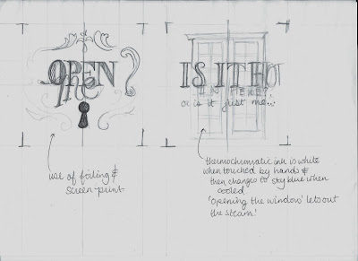
For the never ending card design, I wanted to play to the fact that it had some really interesting opening mechanisms. I thought that maybe it could feature a lock that would open, or some windows/ doors that would 'reveal' the possibilities of designing for print.

With a less rough mock up of the original, I start to draw the intended graphics on a working model:

Using the idea of unveiling the possibilities of print, the front cover features two curtains opening. This could feature flocking so it could look like actual curtains?!

It then goes into a description about the features on the cover.

The next 'page' shows a lock opening -it including foiling through screenprinting.

The last page - another unveil/ reveal feature - thermochromic ink!!
Digitising the designs:


Using the patterns and fonts used all the way through the project, I created these designs, according to my sketches.
Subscribe to:
Posts (Atom)