Showing posts with label Alphabet Soup. Show all posts

Sunday, 18 November 2012

OUGD403 - Alphabet Soup - Illustrator Typeface brief and development

Brief

Produce an alphabet based on one of the letterforms you created from the Alphabet Soup, Visual Thinking brief. Once again you are restricted to using one colour and it is to be produced in CMYK (cyan, magenta, yellow, key). Although you are restricted to one colour you can experiment with opacity and half tones.
Background/ Considerations

THINK VISUALLY. Consider what the visual essence of your subject matter is and how best to communicate this. How can these letterforms that you created be developed further now that you are working digitally? 

The following terms may prove useful:
Trace, edit, layer, combine, outline, silhouette, positive/ negative, contrast.
MAKE MISTAKES IN ORDER TO LEARN FROM THEM.

For this workshop the emphasis is on investigation and experimentation. You will develop a quantity of material that will allow you to maximise your understanding of the applications potential within the time available.

One of the problems with software is that everyone has access to it but not everyone knows how to use it creatively. Adobe Illustrator is primarily used for the generation of vector-based images and as a type tool. When used as a means for visual investigation it offers the potential for rapid generation of visual variations. The possibilities of which can be used as a springboard for further visual research. 
Mandatory Requirements

In preparation for the first session you must (by scanning) digitise the series of ten letterforms from the Alphabet Soup, Visual Thinking brief.

Each resolved letterform should be supported by a broad range of visual investigation in the form of design sheets and notebooks.
Deliverables

A1 poster

A quantity of visual investigation/ research relating to each letterform.

Module Deadline : 23rd November 2012


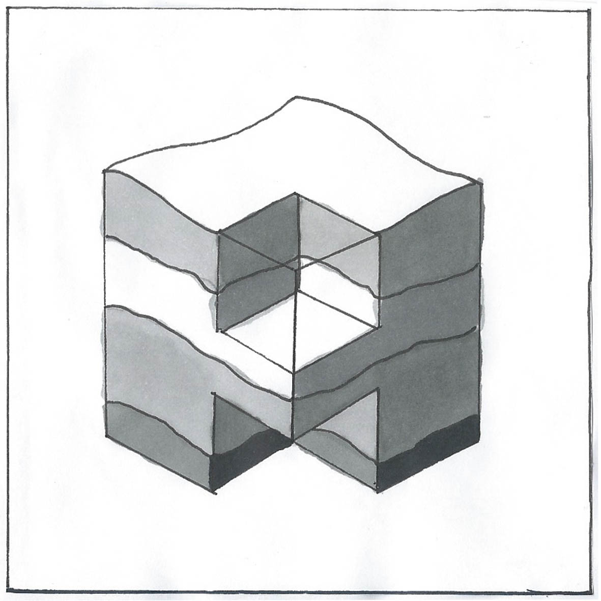
Out of all of my letterforms I designed based on 'Layer', I chose this one to develop on Adobe Illustrator because it it the most challenging while still being structured and would make a uniformed typeface. I also think it was my strongest letterform in terms of communicating the word 'Layer' instantly and visually.

I began by scanning in the letterform above, and opened up an isometric grid in Illustrator (downloaded from the internet as a PDF). Then, using the pen tool traced around the outline of the design, including the counter of the A. 


Using this as a guide, I highlighted the tracing and copied and pasted it several times all over the page and printed it off. This would help my development of the other letterforms to be of the same size and be unified around the shape of the counter.

I then used a black fineliner and pencil to sketch quick ideas for letterforms, taking inspiration from this, which I found in my research. But of course, it isn't a complete alphabet so i still had to overcome some design challenges.


The letterforms I found the most difficult to develop were E, K, N, Q, R, S, W, X, and Z. I found K particularly excruciating because it relies on diagonals, which was awkward to incorporate into this boxy, geometric style. 

The lower leg was out of balance with the rest  of the letterform,

The diagonal of the bottom leg needed to mirror the right arm , but this looked unusual and again, imbalanced.

By incorporating the same lower counter as the A, I was able to resolve both imbalances.

I then found that I could incorporate the diagonals by using them on N, X ,R and Q.


I also kept having the tendency to use just one side of the box as the letterform and the rest of the box as almost a drop shadow, which wasn't the concept at all, as I was trying to use the whole box to portray the letterform. Z, R and N also had the same problem as this.

Another problem I encountered was the fact that the counter wasn't quite the size of the isometric guidelines, and was a little bigger but when made to the correct scale seemed to be out of balance with the rest of the letterform and inaccurate to my original design. This was even more of a problem when the Pen tool or the line tool tended to automatically attach the anchor points to the grid as opposed to inbetween the lines.

Some letters, no matter which way I tried to mould them, couldn't be both 3d and chunky but instead had to have paper-thin like sides, such as X, top of B, top of R, V etc. I also had to ensure that U and V were properly distinguished so I used the paper thin style to make the V more angular.

I used the pen tool to draw out my designs on Illustrator, the grid helping me to map out on the matching grid on screen.


Now that I had all of my 3D letters, I needed to add the wavy lines to create the illusion of layers. I used the pencil tool haphazardly and quickly to create these lines:


I then created a new A1 document, for which my letters were to be printed from. I decided to leave the letterforms as they were as opposed to filled in like my original design because all of these lines were not joined up as shapes and it was hard to join these lines so that they were in the appropriate sections for the different colours. But, my final thought on the original letterform was that i thought that it would look more contemporary if it was just left as outlines.

When copying my letterforms over onto the A1 document, I discovered that I had left them only partially opaque as I felt that it helped me in creating them. But, as I now know, because I had copied them when their opacity was reduced, they would always be only partially opaque because their opacity settings go back to 100% in a new document, even if visually, they are still reduced. This was really annoying because I had continued adding wavy lines in the new document, so the design was mis-matching in opacity. But I decided to go along with the greyscale style anyway, as I warmed to it and it still stuck to the brief requirements but would be a little bit different to other designs.


I used the guide tool and rulers to make sure that my letterforms were presented evenly spaced. I found that although the letterforms had used the same cube size, they were not the same size. For example, the top of the A would have reached the top of the cube, but the H would not have. I had to be aware of this when creating grids, and used the 'E' as a guide for every space with the rule that the top of each letterform would hit the top of the space, or that the sides would be aligned with those letterforms either side.


Finally, I added this image that I found online (not my image) to help present the idea of 'layer' to the audience and the cross-section of land style I was trying to portray. I turned the opacity down so that it would not compete/interfere with the typeface itself.

Saturday, 20 October 2012

OUGD403 - Alphabet Soup - Typeface - Application of Typeface to product

After a couple of experimentations, using Adobe Illustrator, i replaced the simplistic logo of the Beats Headphones with that using my own typeface. 


Here are the results:


Thursday, 18 October 2012

OUGD403 - Alphabet Soup - Typeface - Ideas and Development

I began my drawing some quick sketches from the examples of art from Sarah Morris and the underground tube maps. Although this fit in directly to the style that Tristan liked, I thought it gave the impression of sci-fi, motherboards and sim cards as opposed to tube maps...


Quick sketches of designs inspired by Sarah Morris' work. 
Experimenting with different shapes of the London Underground map with letterforms.  I didn't really like where these ideas were going, because they could be mistaken for a more sci-fi theme and i wanted a more contemporary minimalistic feel. 
So I then began taking extracts from the artwork of Jelle Martens. The isometric angled, parrallel upward lines is very simplistic but contemporary. I began like this:


I slowly began to develop an alphabet that was based around the isometric oval shape. I also decided to make it really lightweight, after looking at successful modern fonts such as Helvetica Neue and inkeeping with the temporary theme.
So far i really liked my idea but felt that it looked quite weak and i wanted to create a display font not just a type font. I asked my partner Tristan to see if he liked the idea, and what he could suggest would give it depth. He said he really liked it but agreed it needed something. He showed me a few more images of examples of design he admired to help. My favourite was this one. And so i set about adding an isometric, unrealistic drop-shadow to my letterforms:


I was having trouble with creating my 'K', as i wanted it to follow the oval shape style and not be isometric but it wasn't really working. But otherwise so far i really liked the way my letters looked. I took these two sheets to the group crit, and it was suggested that my 'K' could incorporate the right half of the 'X'. I thought that this was such a good idea and set about improving my letterform.

I traced my letterforms in fine liner to make it a bit clearer:


I also sketched out some glyphs. I then scanned in the drawings into the computer, as i wanted to make sure that each one was accurate in terms of perspective, and of correct proportions to each other.

I traced over the initial shape of the letterforms (without drop shadows) using the pen tool. I also drew vertically ascending lines as guides. I started with the 'O', as it would then be used as the basic template for the oval shape in the whole alphabet. I also drew a simple 'stick' that could be used at the template for stems, tails etc:


I changed the position of arm of the 'f' from my original sketches to match it with the 't' as it looked out of place with the rest of the alphabet, as suggested in the group critical analysis. 

When i began drawing it out on the mac, i also decided that the dots on the exclamation mark, question mark, 'i', the speech marks and the comma should be made more contemporary than the clumsy circles i originally designed. And so i made them to be slim rectangles, a continuation of the stems of the letters which i felt  fit in much better.

I hid the 'guides' layer to leave just the letterforms. I then went to > effect > 3D > Bevel and Extrude to create the 3D shadow effect ( a new technique i recently discovered. Without it i would have relentlessly and most likely inaccurately drawn out each shadow). 
I fiddled around with the options and recreated my original drawing:


I changed the colour to white, so that when tracing it would be easier to distinguish between the light and dark tones. I also drew two boxes exaclty A3 size, to assist in printing.

I printed these two pages and taped them together. I then placed my A1 sheet of tracing paper over the top, ensuring there was an equal space of 14.8cm either side of the artwork. With this secured into place i began to trace over the letters using a fine liner. 

I still didn't know whether i wanted the type to be filled in or to leave it as outline, so I drew an outline. (If i wanted it to be filled it could be added)


From beginning to end, the tracing took me about two and a half hours. The most difficult being the curves, because they were freehand but i'm really happy with the overall result.


Sunday, 7 October 2012

OUGD403 'Layer' 10 Letters Idea Development and Final Designs


OUGD403 Idea Development and Final Designs - Alphabet Soup


Development for cross section of earth style 'A'. I started with sketching an isometric-style cube resembling the typeface i found in my research and then added a wavy top to resemble the stratum diagrams. I decided to add a 'lake' to the cube missing at the top of the A to make it more like a genuine land cross section image.
I then refined the letterform by making the counter smaller and the sides wider, which i much prefer.
I then corrected the proportions and shaded in with pantone markers on the final product:


I used pantone markers to give the effect of shadowing and to distinguish different layers.

------------------------


My initial sketches for the 3D effect were of a simple typeface such as helvetica, as it would be more modern, but i then decided that this could be quite unoriginal/dull and so i chose a little more elaborate typeface. I typed it on the mac, and drew the final image from that. I decided to not include the flick at the side of the letter so the letterform would not be completely copied:


I like the finished piece and i still think it shows the 3D effect in greyscale.

------------------------


I used the images of MRI scans from my research to produce simpler sketches, and started to identify letter-like shapes within them. I decided to create a 'C' from the back half of the head in the first image. This is a rather abstract approach to the word layer, but i still think the final piece is quite effective:

This 'C' could be flipped vertically to also create a 'D' if i were to create a whole typeface from this concept.
------------------------


To create the anthill-inspired typeface, i took this image and used layout paper to highlight shapes that could be potential letterforms. I tried to keep the unusual twists and turns of the chambers:


In the original tracing i found the capital 'E' on the left hand side to be the most prominent letterform and so developed it further, making the top half angled further forward. I was satisfied with this shape, but i didn't like my original shading and decided that block colour would make it simpler and more effective:


------------------------
My original sketch for my fried egg didn't develop much to the final piece. I wanted it to translate clearly in black and white and so drew it in a cartoon-like style:


------------------------

My eco- efficient typeface also didn't deter much from my original sketch:

------------------------

For this piece, i printed off an italic 'L' in Helvetica bold and sketched some bricks over the top onto layout paper. I then filled this in with black markers.

Using references of onions from my research, my initial sketch for this 'D' i used as my final piece as it was clear enough. 

I used black and grey pencil to execute this flipchart letterform. I think it clearly resembles those i found in my research.

This final letter was heavily inspired by my research into the 'Grease' musical logo, especially the 'quiff' I like this letterform the most because it flows nicely and is a clear representation of hair.