Brief
LIVE BRIEF: SECRET 7"About Secret 7"
Secret 7" is a project that combines music and art. Agter their success in 2012 the team are back with a new line up of artists, a new set of tracks and a new charity partner.
THE BRIEF
Secret 7" are inviting creatives from around the globe to take inspiration from one of the tracks from the artists below and design an original 7 inch vinyl sleeve.
The sleeve must not feature the name of the artists or title of the track.
ARTISTS
- Public enemy
- Elton John
- Naz
- Jessie Ware
- Hiam
- Laura Marling
- Nick Drake
Background/ considerations
You need people to see your work and the essence of graphic design as communication. There is no value producing work for it to be placed in a draw! Often the best work or best ideas are the ones that people have seen. You must get used to distributing your work at any available opportunity.Remember, DESIGN IS ABOUT DOING.
This is an opportunity to visually and conceptually exploit every possible angle of your ideas. We are expecting a visual feast of ideas before you even consider resolving the problem.
Mandatory Requirements
Full ResolutionExamples of the sleeves you didn't select to enter.
A minimum of 30 thumbnail possible design treatments and supporting design development work.
Documentation on your blog and design sheets.
Deliverables
FIVE visual variations of the record sleeve.Supporting work.
Studio deadline 15th February 2013
Module Deadline 3rd May 2013
------
I listened to all 7 songs, and pursued my favourites:
- Laura Marling - The beast
- Nick Drake - Rider on the Wheel
- Elton John - Bennie and the Jets
- Public Enemy - Harder than you think
Research into Laura Marling - 'The beast'
Lyrics:
Where did our love go, you will never know
How did you get home, you will never know
Did you catch yourself in the mirror?
It's a sight I understand
You considered it all for a second
And put it down to slight of hand
You know I've been running 'round for hours
Calling my egyptian(?) blood to bear me flowers
Calling sophia, goddess of power
Instead I got the beast
And tonight he lies with me
Tonight he lies with me
Tonight he lies with me
And here comes to beast
You're okay now, I suppose
You're not pulled by the rope
I'm pulled by the pull on my throat
I'm pulled by the rope
I swing from the trees into the slope
Hold my head high, just by the tip of my toes
And he lies, he lies so sweet that I choke
Tonight I choose the beast
Tonight he lies with me
Tonight he lies with me
Tonight he lies with me
And here comes the beast
Put your eyes away
If you can't bear to see your (the?) old lady
Laying down next to the beast
Tonight he lies with me
Tonight he lies with me
And here comes the beast
Look at yourself in the mirror
It's a sight I understand
You consider it all for a second
And put it down to slight of hand
I give you the best, the best that I can
I suggest that you be grateful
That it's your blood on my hands?
And assume yourself weaker, the fall of man (?)
And look out for the beast
Tonight he lies with me
Tonight he lies with me
And here comes the beast
Put your eyes away
If you can't bear to see your (the?) old lady
Laying down next to the beast
Tonight he lies with me
Tonight he lies with me
And here comes the beast
Brainstorming:
 |
| From assessing the lyrics of the song and the sound of the crescendo of the music, I came to the idea of it being like a fairytale or a folk tale, with talks of the woods and beasts. But I could not come to the conclusion as to whom the beast actually was, and so wanted to portray him metaphorically somehow. |
 |
| Researching into what a beast might look like. |
 |
| Researching into how the whimsical female character might be portrayed. |
A.


B.

C.

D.

E.

F.

G.

H.
Thumbnails based on Laura Marling :-
 |
| On this page I had a large diverse range of ideas. The first was inspired by image B (above) as a mixture of both photo and line work using an electronic bamboo tablet. The sketch below it is inspired by image D and A, combining both curly shapes and text using Adobe Illustrator pen tool. I really like the flow of image D and is a very different approach than my other designs. The top middle image is a plan of a digital illustration of the forest and trees surrounding a girl under a spotlight. The spotlight could maybe be beast shaped? The image below it is the light coming through the trees is the shape of the beast. To the right of that, the girl and the beast face each other, which I thought might look a bit misleading and so the thumbnail above have them facing upside to each other. |
 |
| (from left to right) In the first panel I am showing the idea of the girl and the beast going face to face. The girl is tearful and the beast is merciless. I thought that if they were upside down to each other, that it wouldn't appear as taboo as the same way up... I have also included some lyrics. The next image is inspired by image E (from research, above) and is actually for another song in the secret 7" list: Public Enemy - Harder than you think, because the song features brass instruments. The next image is of the girl free falling, symbolising loss of control surrounded by lyrics inspired by image F above. The next image is the same image of the girl free falling, but seen through the text as if it were a window. The next image on the left bottom row is a collection of hand-drawn eyes of all emotions, reflecting on the idea that the beast is her alter ego, not another person. The image to the right of that is a collage of images in the style of this piece called Cosmos by Coco and is image G above. It would feature hand drawn images of the woods, girl and tree branches with water colour. The next image is upward leaning typography surrounded by a pattern made up of the beast and the girl like in image H. The last image is an indie style hand drawn illustration of the girl and beast back to back with scribbly hand drawn lettering. |
 |
| (From left to right) The page is split in half with the girl and beast's faces as one. Next thumbnail is in the style of an eery victorian style portrait of the girl and the beast behind her with his hand on her shoulder. The next image is the girl's tearful eye with the reflection of the beast in her eye. Next image is a collection of beastly eyes looking out from the page. (second row, from left to right) the girl is leaning over the bathroom sink looking up at her beastly reflection in the mirror. The next image is another victorian style portrait but this time set in the forest. The next image is an overlay of two photos of the girl and the beast. The next thumbnail is my favourite on this page, and is of the girl suspended in the air in the foetus position like the beast when transforming in Disney's Beauty and the Beast. (bottom row, left to right) The girl is leaning over the sink again, but this time looking in the mirror at the beast behind her at the back of the room. The last image on this page is a closeup of the girl, expressionless with the beast in the background between the trees. |

I then I traced over this sketch, turning the sketch into the curls like in image D:

I then took this into the computer and traced over in Adobe Illustrator:

But I did not pursue this idea any further, as I was running out of time and didn't feel that I could make it work any further.
Research for Nick Drake - 'Rider on the Wheel'
Lyrics:
And now you know my name
But I don't feel the same
But I ain't gonna blame
The rider on the wheel.
You know my song is new
You know it's new for you
I tell you how it's true
For the rider on the wheel.
And round and round we go
We take it fast and slow
I must keep up a show
For the rider on the wheel
For the rider on the wheel.
And now you know my name
But I don't feel the same
But I ain't gonna blame
The rider on the wheel
The rider on the wheel.
But I don't feel the same
But I ain't gonna blame
The rider on the wheel.
You know my song is new
You know it's new for you
I tell you how it's true
For the rider on the wheel.
And round and round we go
We take it fast and slow
I must keep up a show
For the rider on the wheel
For the rider on the wheel.
And now you know my name
But I don't feel the same
But I ain't gonna blame
The rider on the wheel
The rider on the wheel.
From reading the lyrics and listening to the peaceful acoustic guitar I envisioned a carefree being riding the outstretching roads of America. (it could be the steering wheel of a car, or the front wheel of a motorcycle)
After watching this time lapse video of a road trip (presumably Route 66, if not something like it) I realised how different the scenery/ seasons can look when driving along.
From that, I then looked further into landscapes of road trips:


All of which were very beautiful but I wanted to do something that would blend them all together, and show all the different seasons, to represent the lack of clockwork borders a liberal personality feels - 'and round and round we go'.
And so my only idea for this song was a photomontage of different images that would represent all the different seasons/ scenery.
--------
Lyrics:
Hey kids, shake it loose together
The spotlight's hitting something
That's been known to change the weather
We'll kill the fatted calf tonight
So stick around
You're gonna hear electric music
Solid walls of sound
Say, Candy and Ronnie, have you seen them yet
But they're so spaced out, Bennie and the Jets
Oh but they're weird and they're wonderful
Oh Bennie she's really keen
She's got electric boots a mohair suit
You know I read it in a magazine
Bennie and the Jets
Hey kids, plug into the faithless
Maybe they're blinded
But Bennie makes them ageless
We shall survive, let us take ourselves along
Where we fight our parents out in the streets
To find who's right and who's wrong
From reading the lyrics and listening to the song, I envisioned a jazzy idealistic yet generic pop band that is amazing one minute, but disposable the next. I researched into the visuals of 'mohair suit' 'electric boots' 'spaced out' and 'electric music':
M7LWRz!~~60_35.JPG)


 |
| A Mohair jumper is a lot more garish and 'Elton John like' than a grey mohair suit in my opinion... |
I decided to research into 50's space culture because of the name of the band- '...Jets' in particular and the mention of 'electric music' and 'spaced out'. At the time that this was written and performed (1970's) the typical stereotype of a cool band could well have been something from the 1950's. In the same way, something stereotypical now may well be based on something from the 1980's, if you catch my drift...


Some of Elton John's garish album covers and style of fashion: (Goodbye yellow brick road was the B side to Bennie and the Jets)


My ideas for Bennie and the Jets:
 |
| My first idea was a photograph of a dingy dressing room backstage at a venue. The venue would be dingy and old to represent the music of the past compared to Bennie and the Jets: " Where we fight our parents out in the streets To find who's right and who's wrong". There will be a spotlight/ crepuscular sun ray shining on Bennies outfit of a mohair jumper and 'electric' glittery go go boots. The image to the right of that is a tacky-chic spray paint image of the planets, with the band playing on one of Saturns rings. Bottom left image is a photograph of (assumingly to the viewer) Elton John wearing typical sparkly glasses, and in the reflection is a Bennie and the Jets concert, as if he is in the crowd, as he appears to sing the song from a fans point of view. The image to the right of that is an equalizer with sparks flying off hence 'electric music', and a more old fashioned version on the right of that, with the arm of the vinyl player sparking on the record. |
Research into Jessie Ware - 'Still love me'
Lyrics :
(Verse)
See it in your eyes,
See it in your face
In your look, see it in you
If I make myself understood.
Will you treat me like you know you should?!
Uuuh uh
(Chorus)
Still love me, still love me
(Do you love me?)
Still love me, still love me
(Do you love me?)
Still love me, still love me.
(Verse)
See, it’s been a while
Looking through your eyes
I was taken in, taken by surprise.
Why did you want me, why’d you stayed so close?
You’re still not leaving?
Was I enough?
If I make myself understood.
Will you treat me like you know you should?!
Uuuh uh
(Chorus)
Still love me, still love me
(Do you love me?)
Still love me, still love me
(Do you love me?)
Still love me, still love me.
Still love me, still love me.
Do you love, do you
Do you love ,do you love,
Do you still love me.
(Verse)
You’re the one that’s more easy to adore
I don’t ever have to leave if you still want me.
If I make myself understood.
Will you treat me like you know you should?!
(Chorus)
(Do you love me?)
Still love me, still love me
(Do you love me?)
Still love me, still love me.
(Do you love me?)
Still love me, still love me.
(Do you love me?)
Still love me, still love me.
Do you love me?
Still love me, still love me.
Do you, do you, do you love me?
Still love me, still love me.
(If I make myself understood.)
Still love me, still love me.
Will you treat me like you know you should?!
Still love me, still love me.
Still love me, still love me.
Still love me, still love me.
If I make myself understood.
Still love me, still love me.
Will you treat me like you know you should?!
Still love me, still love me.
Do you love me?
Still love me.
See it in your eyes,
See it in your face
In your look, see it in you
If I make myself understood.
Will you treat me like you know you should?!
Uuuh uh
(Chorus)
Still love me, still love me
(Do you love me?)
Still love me, still love me
(Do you love me?)
Still love me, still love me.
(Verse)
See, it’s been a while
Looking through your eyes
I was taken in, taken by surprise.
Why did you want me, why’d you stayed so close?
You’re still not leaving?
Was I enough?
If I make myself understood.
Will you treat me like you know you should?!
Uuuh uh
(Chorus)
Still love me, still love me
(Do you love me?)
Still love me, still love me
(Do you love me?)
Still love me, still love me.
Still love me, still love me.
Do you love, do you
Do you love ,do you love,
Do you still love me.
(Verse)
You’re the one that’s more easy to adore
I don’t ever have to leave if you still want me.
If I make myself understood.
Will you treat me like you know you should?!
(Chorus)
(Do you love me?)
Still love me, still love me
(Do you love me?)
Still love me, still love me.
(Do you love me?)
Still love me, still love me.
(Do you love me?)
Still love me, still love me.
Do you love me?
Still love me, still love me.
Do you, do you, do you love me?
Still love me, still love me.
(If I make myself understood.)
Still love me, still love me.
Will you treat me like you know you should?!
Still love me, still love me.
Still love me, still love me.
Still love me, still love me.
If I make myself understood.
Still love me, still love me.
Will you treat me like you know you should?!
Still love me, still love me.
Do you love me?
Still love me.
From listening to the song and reading the lyrics, I got a really electro-vibe, and a retro futuristic style of art to go with it.
I really like the style of this mercedes advert:

And had the idea I could make an image like the girls outfit;
 |
| I liked the idea of having a human heart shape representing 'still love me' in this geometric futuristic style. It would have a metallic finish and appear 3d and reflective. My second idea was the same, except the heart would be spaced out with a glow coming from within. My last idea was feminine lips in this form. |
My final and most favourite idea I ended up using as my final product was for Nick Drake - Rider on the Wheel:

I created it using several different images of American road trips. I wanted to show as many different seasons/ scenery as possible to represent time passing and places travelled of the careless rider on the wheel.
Here are the images I used:
A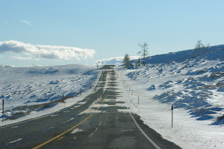

B

C

D

By using the eraser tool and magic wand tool, I was able to use the sunset from image B, the Mountains from image C, the trees from image D and the snowy road from image A.
I then filled a new layer with white and turned the opacity down to around 50%, to look like a misty car window, and found a handwriting font that I liked and wrote out the lyrics: 'And round and round we go'. I selected the writing itself and went on the misty car window layer, using the delete button to delete the area of the font off the window layer. This made it look like the writing has been drawn on the misty window .
I used this image to create the idea of condensation on the window. I used the eraser tool and turned the opacity down to make it more subtle:
 |
| I made sure that This image was royalty free. |
As a result, here is the final image again:
-------