Saturday, 26 October 2013

OUGD504 - What is design for print? Concepts and idea generation 18th Oct - 26th Oct

Design for print - Concepts and idea generation

After looking and exploring a range of different printing techniques, I starting playing around with different concepts and coming up with a few ideas.

The main thing I really wanted to include was, other than showcasing as many different techniques as possible, I wanted to have an element of interactivity in my final product. This is really important to me because this is why I love working with printed material rather than digital because it's physical and touchable - I wanted to show that the most.


Ideas

26th October 2013

I'm really struggling to come up with a good concept for my design - I want a theme that will run throughout the project as I already have a topic (print) I need another element!

Technologic Motivational Posters

A series of posters inspired by the (truly poetic) Daft Punk song, 'Technologic' and loads of printing and finishing processes.


For example:
  • Gloss it 
  • Matte it
  • UV it
  • Gum it
  • Emboss it
  • Etch it
  • Laser Cut it
  • Foil it


... Or something along those lines. The posters will fold out in one big piece, and be perforated so you can tear from the rest and display how you wish.

Motivational Print Posters

I was wondering what kind of content to include in my manual - I didn't want it to be all facts I wanted it to be enjoyed and interactive - maybe use some big quotes about print?

Of course, a lot of them will be out of context and perhaps be referring to tabloids and printed media as opposed to printing as an art form, but I think will maybe even be humorous because of this?:

'If all printers were determined not to print anything till they were sure it would offend nobody, there would be very little printed.'
Benjamin Franklin
'A beautiful print is a thing in itself, not just a halfway house on the way to the page.'
Irving Penn
'Sarcasm doesn't translate in print at all.'
Megan Fox
'Print is the sharpest and the strongest weapon of our party.'
Joseph Stalin
'Just because it's in print doesn't mean it's the gospel.'
Michael Jackson
'You can't stop people printing what they want to print.'
Alan Sugar

OTT Print

The idea of having a print manual overfilled with different that it looks over the top? 

Power Cut

If there were a power cut right now, who would see your website? But who would see your metallic inked, foiled, flocked business card?

Could feature this opening mechanism ripping through a 'cord' and revealing a lightning bolt behind to show the user cutting off the power.

Exploration and Discovery

A Jules Verne/ Victorian/ Steampunk style contraption made of paper, helping the user to 'discover' the power of print.

Print isn't dead

'Operation!' game made using print finishing processes

Print isn't dead 2.0

The idea that print is a zombie - reaches out to a younger audience of designers who might tend to design for web and digital media without realising that print is still very much alive and relevant!

I decided that I could combine a few of these ideas - the OTT Print and the 'Exploration and Discovery' ideas to create a juxtaposition with something silly that will entertain and humour the audience. I have decided to do a 'Posh Pass the Parcel!' 


The infinity folding card


The infinity card is a cool and interactive way to engage with the audience. There are many different sides and ways to view each panel - it could be a really cool way to showcase all my different print methods?

Thursday, 24 October 2013

Examples of good and bad website designs

Examples of good and bad website designs

Bad website designs

Historian of the Future

http://www.historianofthefuture.com/


I consider this a poor website design because of it's garish, glaring colour scheme which makes the text hard to read. To navigate around the site is extremely difficult as the busy background makes it hard to read. The lack of borders and a proper grid also makes this not very aesthetically pleasing.

Sixties Press

http://www.sixtiespress.co.uk/


Constellation 7

http://www.constellation7.org/Constellation-Seven/Josiah/Index.htm


Mr Bottles

http://www.mrbottles.com/


Water Services Ltd

http://www.arvanitakis.com/en/


Good website designs


Wednesday, 23 October 2013

OUGD504 - Design for web Content workshop

Today, we furthered our ideas for our websites by deciding on the content for our sites. We started off by listing around 5 or 6 main page titles, and then categorising our ideas onto these pages:

HOME PAGE
  • Menu bar for navigation to all other pages
  • Whole page image slider in background
  • Mini 

BIOGRAPHY / ABOUT PAGE

  • Wikipedia style basic info on the Basilica including who what when where and why.
  • From this page you can go to the interactive timeline
  • And the artists biography

EXPLORE PAGE

  • 360 degree walkthrough  inside the Basilica
  • Gallery of images
  • 3 tier/ storey interactive map
  • Map of Vatican City

BOOK PAGE

  • Booking drop-down boxes
  • Prices, charts
  • Opening times, entry requirements, directions to
  • Links to the 'Whats on blog'
  • Calendar
WHAT'S ON

  • Recent Events
  • Pope's Twitter account
GET INVOLVED PAGE

  • Connect with Facebook and upload your own photos
***

Examples of appropriate features for a website:

Home
  • contact
  • introduction to the site
Contacts
  • address
  • email
  • phone number
  • social media sites
About
  • relevant factual detail
  • manifesto/ biography
Gallery/ portfolio
  • images and info
  • careful subdivision according to quantity of body of work

Other features that could be included:
  • Forms
  • Posts
  • User posts/ submissions

Tips for useful website design:
  • Be simple and straightforward when naming pages
  • Careful not to subdivide down too far and make the categories too small
  • Have contacts on the front page - prioritise information what people most highly seek.
We then went on to quickly sketch out what we were visualising for our Home page design:


The background will be a photo slider and the menu, logo and text will be overlay on top of this photograph in a translucent manner. There will also be a mini booking facility on the home page.


The Booking page will be an elaborate version of the mini booking facility found on the home page. It will include drop down boxes and a calendar to accommodate all information needed to book for groups of 1 to large numbers.

We then all switched tables and wrote feedback for the designs on the table. This is the (anonymous) feedback I received for my home page:

'Hectic looking? The menu bar at the bottom looks interesting, fresh!'
I admit that the sketch looks rather crowded, because I started to sketch the content of the photo but I think that the actual design is contemporary and simplistic.

'Unclear what the central scribbles are about. Apart from that everything is clearly labelled'
Not very constructive feedback on my design, but my sketching skills...

'The main info is on the left or right / maybe try more layouts to create a balanced design'
I disagree with this because the images will be the centre of the design on the home page but the information will be central on all other pages, as shown on the booking page.

'Isn't there already a similar website? What makes this different?'
It's about St Peter's Basilica?

'Allowing two languages makes it more diverse and applicable to a larger audience. Simple and functional layout'
Thanks!

Tuesday, 22 October 2013

OUGD504 - What is design for web? Study Task 4 Part I and II

What is design for web? 

In today's workshop session, we started to think about and develop some ideas for direction of our website design based on the information we collected in the summer brief.

Web - Task 1 - Getting started

Part 1

'Your design for web brief is asking you to design a website using existing material / content. Within this session you are being asked to identify the following:'

What is your subject matter?
St Peter's Basilica, the Sistine Chapel and the Vatican City, Rome.

What are you trying to communicate?
Information on the Basilica, the Sistine Chapel and the Vatican City, along with facilities to purchase tickets for entry to these destinations.

Who will be / could be your audience or 'end-user'?
Tourists and any potential visitors.

What will be the most appropriate / effective form of content?
Tourist website including a gallery of images, facilities to purchase tickets, a biography about the destinations and information.

What is the function & purpose?
To exhibit and advertise the Basilica, Sistine Chapel and the Vatican city to potential tourists.

What 'sector' / industry you would be designing for?
Travel and tourism

I started to create a mind map of all the ideas I had for my website without even researching. This created lots of questions and things that I wanted to research into further and develop:


St Peters Basilica Website ideas:

Possible Features:

  • Music


  • Calendar


Whats going on - blog?
Videos
Pope's Twitter feed
Buy tickets
Booking facility
  • Biography


Imagery
Facts
Typography
Quotes
  • Interactive timeline


  • Imagery


Full screen slider
360 degree walkthrough 'google map' style
Interactive photos with 'hover over' information
Major zoom-in features on photos
Picture Rolodex
'Photograph' pile
Mosaic
Map - 3 layers showing all the different floors and rooms with interactive features

Audience

  • Large Groups


Offers on walking tours
Tour guides
Different languages
  • Vatican Residents


  • Schools


kids page
print off workbooks?
  • Tourists


Social media interactivity - send in your own pictures?
  • Families


Information to include

  • What it is
  • Where it is 
  • Why/ how they can visit
  • What's going on / when
  • Facts about scale, size, numbers
  • Artists involved
  • Symbolism / meaning / importance of the church
  • Info about artefacts
  • Designing and building process


Design elements
  • Heavily image/ photography based 
Translucent banners on top of photographs
  • Logo needed


  • Lettering/ typography


  • Soft colour scheme


Red, cream, gold
Gold, cream, brown

  • Hover over/ interactivity.


****

What do I need to research into further?

After coming up with a range of different (and complicated) ideas, I had a few of questions that I needed answering:
  1. What are other interactive features I can use in my design?
  2. What is the best way to illustrate a map design of this nature?
  3. What tourist opportunities are available at St Peter's? How much does it cost? When is the best time to go? What's on?
  4. What features are best to use when designing a tourist website?


Here I attempt to answer them through research. I also research into loads of different current site designs that offer cool features that could inspire me.

Part Two - write your own brief

Design and create ( or mock up ) a website that will advertise, showcase, promote and accommodate the booking features for and about St Peter's Basilica in Rome. You will need to include some contextual/ historical information about the Basilica, what's currently going on in the Vatican City, and build a way for people to book their trip. The audience is tourists of all kinds; large groups, tours, families, couples, schools etc and so will need to appeal to all kinds of audiences except maybe children as they won't necessarily be visiting the site without an adult.
The site will need to be elegant and respectful in a non-corporate style that is complimentary to the beauty and intricacy of the building itself.
The site will need to be finalised (mocked up ready to be built) by 10th December 2013.

Sunday, 20 October 2013

OUGD504 - Assembling and Analysing initial Cool nets

OUGD504 - Assembling and Analysing initial Cool nets

'Cool nets' is not the most professional name to call these prototypes - but that's the best way to describe the reason I chose them! They have the most 'cool' opening mechanisms / look the most unusual.


Box 1


I really like this box, the inverted curved top is a really nice effect. Although it's not very easy to open/ figure out how to open and I think that the user may damage it if not too careful.

Box 2


The current design of this net means that this box does not easily retain it's shape. The bottom of the box is hinged and doesn't match up with the other hinges. It would need a lot stronger glue. The top closes by overlapping the different panels, and, like the first box, I think this is difficult to open and close for the user.


 Box 3


I don't really understand this box as none of the hooks reach each other at all ... ? I think it's supposed to be an overlapping hooks but it doesn't currently function like the image in the book, but I really like the concept and may wish to develop this further.

Box 4


The choice of stock became apparent as I tried to assemble this net - it's too thick! The shape of the box is really unusual and the mechanism on top is fiddley but I got a couple of people to try opening and closing it (Few of my housemates); although they found it difficult at first, they found it very impressive and unusual. I don't think the cylindrical shape is useful in this case and may change it - I might even just use the opening!


Box 5


The assembled net of this box is surprisingly sturdy - for most of it. When it comes to the ends of the box, the wavy tab doesn't match up properly and I don't see a quick resolution to this.

Box 6


This box has a really beautiful opening mechanism which is easy to undo and redo. The interior is spacious and an easy shape to work with.
 Box 7


Again, the hooks don't reach each other in any way and I don't understand how the box is supposed to close...

 Box 8


This is a really amazing box that once folded properly, will retract back closed when gently closed by the user. It folds completely flat once opened - like when opening a pass the parcel made of paper. Although it's octagon in the middle, a square based box would fit snugly at an angle (if measured correctly). I think this would be the best box to use as the biggest, outer box.

Friday, 18 October 2013

OUGD504 - What is design for print? Studio session 2

What is design for print? Studio session 2

Today, we each brought in a collection of 5 logos and their associated branding stationary. We intended to disassemble the logos and decide on the messages they convey.

We started off with the NASA logo as an example:


Background info:

  • Logo from the 1980's 
  • Displayed on all the space shuttles


Why red? 

  • Red can symbolise danger
  • One of the main colours in the US flag - patriotism
  • 'Red blooded' Americans


Why the rounded edges?

  • Futurism
  • Helps legibility from a distance
  • Represents the tubing used on the space shuttles and tubing between astronauts and space shuttle itself.
  • can represent areodynamics
The letters are joined and in my opinion represent unity. They also remind me of bent metal and ironwork so it has an industrial, futuristic feel.

The logo was changed after the crashing of space shuttle Challenger in the mid 1980s. There are lots of reasons why companies choose to rebrand - in this case it was the end of an era.

Then we start to discuss and analyse the logos and brands that the rest of the group had brought in.

Ellen Setterfield

Apple brand


There are usually little to no colours in Apple branding to make it simpler and unify the audience. The sans serif type usually used makes it modern and timeless - this reflects in the products, that don't seem to age!

The tone of voice usually used in Apple adverts and branding is conversational yet formal. This could be because they are trying to be less corporate/ less intimidating and making the idea of state of the art technology as accessible and easy to understand by all.

Liz Earle Brand


The logo is a flower with an atom symbol. This represents the company well in that it unites both science and natural remedies. The mint green seems to symbolise freshness and natural beauty and the grey text represents the science behind the company.

The serif font used makes it look very elegant and quite feminine despite the unisex colour scheme.

Ogio Wine brand


The combination of sans serif text and the fact that the label has a whole in it gives the impression that it is good quality wine, because they let the product speak for itself. It's quite trendy packaging, which appeals more to a younger audience, because an older more experienced audience wouldn't be swayed by fancier packaging.

The gold top on the red wine symbolises maturity, whereas the serif font on the rose wine shows a more elegant, feminine audience.

Next brand


The black, white and grey colour scheme unifies the audience as it is neither masculine or feminine. It's modern and a little bit quirky, which represents the company well. 

Bagel Nash brand


The rounded typeface reflects the roundness of a bagel and in doing so looks young and fun. The lower case used gives it a humble feel, which matches the size of the company and their matchbox shops. 

In my opinion, the doodle style image of the bagel suits a younger audience because it is playful, but reminds me of the infinity symbol. Bagels are infinite!

Laura Wallbridge Bruce

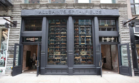
All Saints brand


Has this authentic vintage feel.  The grunge effect on their bags and tags portrays an industrial, warehouse setting. It looks young and trendy, with the added 'skull' stamps it looks edgy with an element of danger.

There are a number of different logos which shows the eclectic style to the brand.

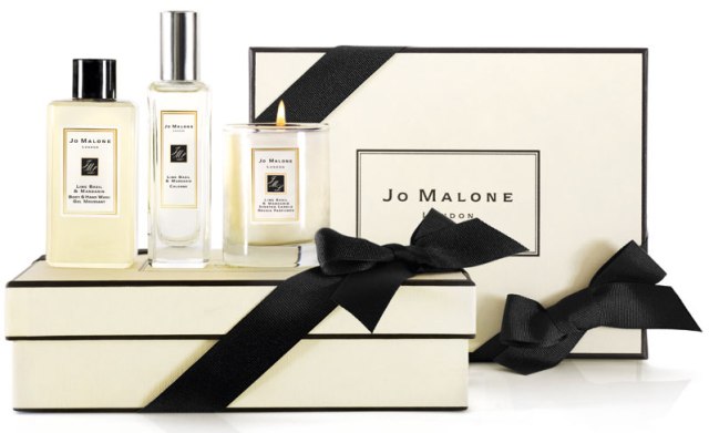
Jo Malone brand


The black and cream colour scheme is clinical yet sophisticated. It represents luxury and gives the setting of a boudoir. The logo is left uncomplicated, left to speak for itself.

The Botanist brand


The lettering in the logo reminds me of Victorian wrought iron work - like a greenhouse. It has an established feel but is sketchy as if it humble and informal at the same time. The rest of the branding has a handwritten feel and combined with the brown grainy paper feels a lot like a friendly gardening scene.

Elemis brand


The grey and white colour scheme feels very scientific. The wave motion on the 'E' represents being cleansed with water. There are no bright colours used giving the overall impression of a clinical feel. They have an alternate logo which looks a lot like the Ying Yang symbol, which adds another angle of the logo - a more natural, trustworthy feel.

Chloe brand


The rose gold and champagne colour scheme not only give this an expensive but also an elegant and feminine vibe. Because it's French and there is an accent on the the e in Chloe it projects French style and chic elegance. The logo is plain and simple, as if they don't need to dress it up to impress viewers.

Harrison Park 

Food Writer's Guild


The fountain pen nib uses the negative space to show a spoon - quirkily incorporating both the writing and the food in a modern twist. Really easily applicable to any source of print or web.

Pan Am


Blue colour can symbolise either the sky or tie in with the fact it looks like a globe. According to Pan Am themselves it 'defines driving ambition' but in my opinion its the curves lines in the logo that remind me of the red arrows in the sky or even an altitude reading meter inside an aircraft. Either way, it all gives the feel that this is an aviation company.

Elephant and Castle shopping centre


Good incorporation of negative space but to me this looks dated and awkward - the edges aren't rounded but quite angular and doesn't look professional.

'Customs'

Has the worn off feel of a stamp or a lino print, not unlike the stamps they actually use on their boards. The logo itself is the shape of either a surfboard or an early skateboard.

Priesh Desai

Puma


The jumping/ pouncing action of the animal itself is determined, focused and powerful which reflects well with the brand. In my opinion the logo looks quite dated because of the typeface used but still reflects a sports brand so is still true to it's purpose.

Twining's Tea


Because of the serif used it looks like Twinings is aimed at an older audience. The Victorian style of the logo puts trust in the viewer as if this product has been around a long time and has a lot of heritage. It's tried and tested and established as a trustworthy product, and it shows. It's a very stereotypically British product, because of the crown and patriotism.

Vaio


The logo (and possibly even the name) was comprised of the analog and digital symbols incorporated into letterforms. In my opinion this makes the logo not very legible but still fluid and modern looking. 

Braun


The whole logo has a proportional scale of 1:1 and so is perfectly mathematically designed and yet has smooth, rounded edges and a friendly approachable feel. This reflects in their products that they're state of the art technology used everyday.

Kandoo


This logo is fun and playful because of the unisex colour scheme and squishy 'leapfrog' typeface.

Joe Leadbeater

Hutchins Center


The cross bar over the 'H' creates an 'A' shape. The serif typeface makes it sophisticated and established, reflecting the university but the splash of lime green makes this very contemporary and up to speed. 

The Butcher Shop


Has a local, traditional feel to the logo because of the stamp style. The red has been described as 'meat red' which might be a little too close to home for some people, along with the image of the pig, which in my opinion gives a traditional farm like feel. The logo overall is quite vintage looking, giving the impression they have really fresh meat and use traditional methods of tending to meat.

NBC


The peacock in this symbolises the network with the increasing amount of colour channels - more than any other channel in the United States at that time. Each colour of the peacock also represents and corresponds with a different department of NBC's website. The peacock is a proud creature and to be shows an established company you can trust.

Belle Minon 


This logo and set reflects French Elegance - to me the colour scheme reminds me of fine china and marbled hallways - perhaps inspired by the architecture of the shop?

National Geographic


The yellow border around the the magazine is distinctive and is now used as the main logo for the TV channel. The Kodak yellow is also very relevant because it says cameras, and the shape is not actually around the type but next to it, almost like a snapshot or a freeze-frame.

Sarah Butler

BarCode


Good use of negative space that gives the logo a contemporary feel. The incorporation of both a barcode and a pint of beer is both playful and quirky.

Wave


Wavey, fluid typeface gives a good indication to the feel of the company.

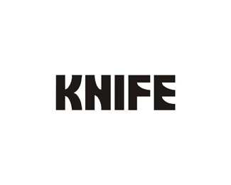
Knife


A subtle use of negative space in the lettering makes this look like a contemporary, classy horror film.

Horror Films


I don't like this logo that much - I don't think that the use of the negative space is subtle enough to be clever - the screaming face within the film reel is a bit too obvious for me. 

Lizzy Gosney

Propaganda


Indie, colourful illustrations reflect a younger, fun audience. The word 'propaganda' seems a bit contradictory to the look of the flyer though - although in a sense, there is a peaceful rebellion against mainstream culture in this Indie night and the look of the flyer.

The Smoothie Company


Simple products accompany a sans serif, straight to the point logo.