Sunday, 13 April 2014

OUGD503 - Responsive - Sun and Moon Vintage Fashion Logo

OUGD503 - Responsive - Sun and Moon Vintage Fashion Logo


I started off by creating the sun/ moon basic shape using the elipses tool.


Here, I am starting to add the details of the moon's eye and the changing of the line thickness


I copied and flipped the eye of the moon for the eye of the sun and added some details. I decided to keep the moon's eye closed to make the differentiation between the two faces easier.


Using the rotate and copy tool, I made the beams for the sun around the edge


I made sure there were different line thicknesses for variation in the beams.


I added text and the logo was finished! I just had to now send it to the client to get their feedback, and a last chance to make any changes that they may request.


Thursday, 3 April 2014

OUGD505- Studio Brief 3 - Jack Nicholson Movie Poster

OUGD505- Studio Brief 3 - Jack Nicholson Movie Poster

The task for this studio brief is to create a movie poster about a given film starring Jack Nicholson. I have been given 1963's 'The Terror' as my film. Only 2 colours plus stock must be used to create the poster.

Firstly, I watched the film as research, which can be found here. After I watched the film, I realised that it was very much a 'B Movie' Gothic Horror, a common occurrence in 1960's cinema. Many low budget horror films were created during this time for teenage and young adult audiences spurring the regular movie theatre culture. This film in particular re-used the sets from various other films because of it's particularly low budget!

So I looked into B-Movie Horror posters, inspiring my style of lettering for the movie title. I also looked into movie poster artist Tom Whalen because of his frequent use with a limited colour palette and vector imagery.

Development and final product:

I started off with a quick sketch:


My sketch included the castle from the film as the backdrop and quirky 1960's style lettering as the main feature.

So I began to develop the lettering first and foremost.


Subtle differences such as moving the crossbar in the 'E' down and refining curves in my opinion made the word as a whole stronger.

Experimentations

After looking at the work of Steve Simpson, I was inspired by his heavily rendered vector lettering and thought that this technique would come into good use for this poster.


So I duplicated my lettering, added an outline in white but made sure the line was on the inside of the path.


This left a slightly smaller, trimmed version of the lettering.


I added a gradient to it but wasn't sure how I felt about the result and so continued with the rest of the poster for the time being, before finally deciding that flat colour was most probably suitable for this poster.

Experimentation with sea and castle details


In my drawing, the main feature is the castle looming over with steep perspective, and the rough ocean splashing up the bottom. I began to draw most of the ocean using the charcoal brushes in adobe illustrator.


Even with the text laid over, I felt that the imagery was starting to make the design look a bit dated rather than retro, even with flat text. I was also finding it hard only using 2 colours whilst trying to make the text stand out.

Final Resolution development


After looking at a few more movie posters, in particular a werewolf poster by Tom Whalen, it came to me that the text would stand out best on a white background. In true horror movie context, I chose the moon, meaning I could still use my ready-drawn castle!


In the previous design I felt like the castle and text were competing with each other because of size and colour and so I made the main feature of the poster the text and the castle an added feature.

I added the ocean like in the last poster design but showed the reflection of the moon on the water, too and made waves in a lot simpler style.


At first, I found the text difficult to work with, because I wanted to use more than one font as the one I had chosen only had one weight and was quite short and stumpy and so needed a contrasting style. At first I added a cheesy B-Movie tagline to the top but later decided that it competed too much with the rest of the design and was removed.


I wanted to include the bird from the film but was struggling on where to place it...


The final resolution saw the bird a lot smaller flying over the words. To add to the centrally aligned design, I also added Andre on a horse at the bottom of the design. Although I think red works best, I couldn't choose between these three colours!

The brief was only to be set for 1 week maximum, and I watched and completed the poster in 2 days.

Friday, 28 March 2014

OUGD505 - Studio Brief 1 - Research book - final images/ outcomes

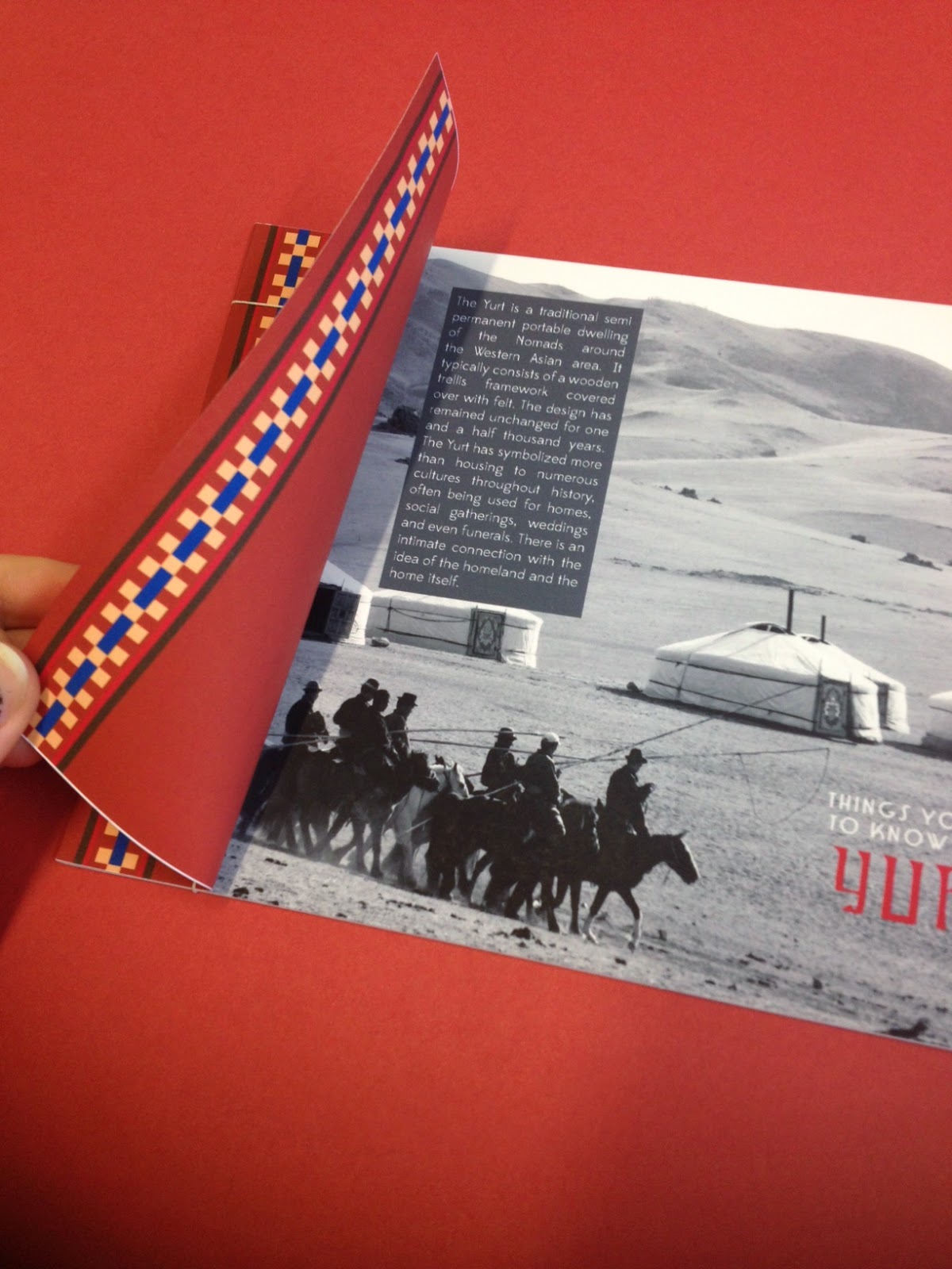
Here are the final images of my finished research book based on Kazakh Yurt:


binding


packaging

Tuesday, 25 March 2014

OUGD505 - Studio Brief 2 - Proposition presentation

OUGD505 - Studio Brief 2 - Proposition presentation

Here is the slideshow I presented to my peers promoting my plans for studio brief two and how they have fed from studio brief 1. 


Thursday, 20 March 2014

OUGD505 - Studio Brief 2 - re-writing the brief

OUGD505 - Studio Brief 2 - re-writing the brief

After establishing what I wanted to achieve through this studio brief, it was time to write the brief to secure what the outcomes are now.

BRIEF TITLE

Koryem Yurt Hotel & Spa

THE BRIEF

Create the branding and identity for Koryem Yurt Hotel & Spa.

BACKGROUND

Koryem is a unique style of resort, blending the great outdoors with unusually luxury surroundings. 

CONSIDERATIONS

Considerations must be made about how the incorporation of the great outdoors, sustainability and the campers lifestyle can be combined respectfully with luxury hotel branding in a way that pleases/ suits the audience. How will you bring the outside in?

CONCEPT / PROPOSITION

Proposal of a number of things such as full- scale signage, vehicle branding and toweling etc may be necessary to show the full range of items suitable to this unique resort.

TARGET AUDIENCE

A more mature audience with background experience in camping and are perhaps need an easier but equally as enjoyable camping experience. They are interested in outdoor activities, all the great outdoors has to offer, have a medium to high holiday budget and like to treat themselves every once in a while. 

MANDATORY REQUIREMENTS

Establish a look of the overall brand with a logo, chosen typefaces and colour schemes. Think about materials how they will reflect nature whilst still remaining sustainable.

TONE OF VOICE

Tone of voice is mature and friendly suited to the audience's needs. They're on holiday to relax, fulfil their hobbies and enjoy the peacefulness.

DELIVERABLES

Mandatory deliverables:
  • Signage - front sign, navigation around the site, labelling of individual yurts (symbolism)
  • do not disturb sign
  • room key
  • welcome pack - mini brochure
  • toiletries - shampoo, conditioner, showergel & body lotion

Wednesday, 19 March 2014

OUGD505 - Studio Brief 2 - Workshop & further development

OUGD505 - Studio Brief 2 - Workshop

Today, we had a workshop session exploring our chosen subject from our research book to see how it can be developed for studio brief 2.

We began by listing words associated with our chosen research subject. We were asked to star the ones that stood out or we felt were most important: 

YURTS

  • Dwellings
  • Nomads
  • Traditional*
  • Ritual
  • Spiritual
  • Cultural*
  • Felt
  • Portable
  • Tribal
  • Hospitality*
  • Design*
  • Trellis
  • Food 
  • Shelter
  • Family*
  • Generations
  • Travel
  • Landscape
  • Heritage
  • Honour
  • Wealth*
  • Poverty
  • Peasants
  • Mongolia
  • Asian
  • Folk Art
  • Decor
  • History
  • Weather
  • Embroidery


We then were asked to list processes we were most interested in trying still:

PROCESSES

  • Packaging*
  • Branding & Identity*
  • Photography
  • Layout/ Editorial*
  • Foiling
  • Web Design
  • 4d products*
  • 3d programs - 3d printing*
  • Embossing


Combining the two lists, we then made a few mind maps to explore how we could translate our ideas.

My firm idea was that I could combine the idea of Mongolian and Kazakh Yurts and brand a 'yurt hotel'. I never really do branding so it would be a nice change. The hotel would be marketed as a luxury camping hotel and spa. It would be a good challenge to get across the great outdoors theme with luxury and comfortable mood.

Identity
'Do not Disturb' sign
Room Key
Brochure > Augmented Reality?

Promotional
Advert
Website

Packaging
Bottles > toiletries >Soap > Shampoo/ conditioner 
              > Boxes

Branding
Ethos
Signage >Room Numbers > Front sign 
Logo >colours > symbols

This would cover:

  • Branding & Identity
  • Packaging & product
  • Information & Wayfinding
  • Retail & Promotion


We then had to establish the audience:

AUDIENCE - What DON'T I know?

  • How old they are?
  • Where do they live?
  • What kind of income do they have?
  • Do they enjoy pamper leisure or adventure leisure? 
  • Where do they holiday? Who do they holiday with?
  • Why are they interested in my subject matter?
  • What is their sense of humour like?
After the session I decided to refine my ideas further to help me write the brief for myself!

Definite final features:
Logo & Identity
Signage - front sign, navigation around the site, labelling of individual yurts (symbolism)
Business card/ letterhead
do not disturb sign
room key
welcome pack - mini brochure
toiletries - shampoo, conditioner, showergel & body lotion

Possible final features: 
Outdoor activities
Branded transport
sports activity guide

spa guide
towels, decor
key card passes

Friday, 14 March 2014

OUGD505 - Studio Brief 1 - Research Book Development

Based on the patterns I found in my research, I decided to make feature pages in my research book that have this kind of decor and colour palette: 


 Here I am creating the staggered pages intended for my publication:


My first layouts of my research book didn't go to plan all too well, and I think that these layouts look really unprofessional, to say the least. They need a lot of work, but not sure yet!