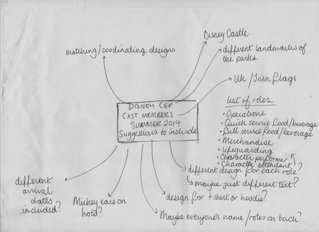
Because I am going to work in Walt Disney World next summer, it was suggested among the Cast Members group that I produce some hoodie designs. Since it was very informal IE there isn't a specific client so much as the target audience each chipping in their own requests, I asked everyone to write what they think should be included in the designs:
I did a bit of research into different ideas. I started off with objects associated with each of the roles:
Here is a description into each of the roles. At first, I wanted to do a design to cater to each of these, but it didn't go to well as I couldn't think of many different imagery ideas for all of the roles:
As you can see, my ideas are rather sparse!
So I tried a few more different ideas like emblems including flags:
I even thought of having a 'cast member' stood in front of the emblem in a different costume, but there are literally hundreds of costumes to choose from, and illustrating people isn't one of my strong points!
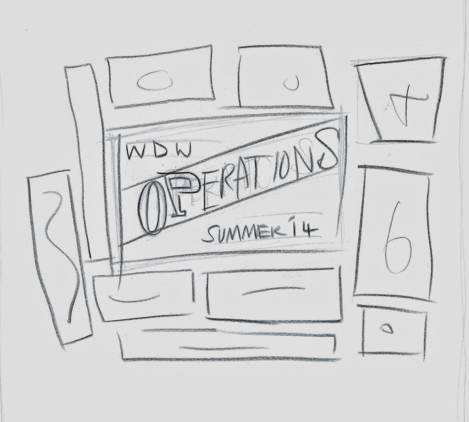
A banner idea
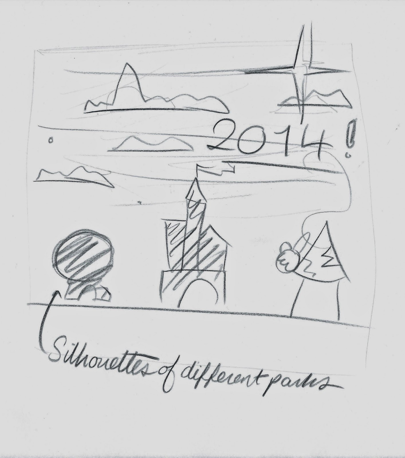
And idea of all the different silhouettes of the different parks under a starry sky, but this design already existed, practically!
I started to get somewhere when I thought that I could keep the same design for all of the hoodies, only changing the personalised details, but not changing imagery, so having a little icon to represent each of the roles on all of the hoodies.
I started to look at 1950's and 60's illustration and how different illustrations can be compartmentalised in misshapen colourful squares. Like the opening title sequence to Monster's Inc!
I started sketching all of these little components such as notorious DisneyWorld food treats.
I finally had an idea I really liked! Thus far I have a 'dole whip' aka Epcot's famous ice cream for food and beverage role, the mickey hat for the character and character assistant roles, the pushchair for operations and including a flag and some other bits and pieces, with the main focus on '2014'.
I decided to take this idea straight onto computer and develop it further digitally.
Computer Development:
I started off tracing over my drawing, but I felt like it was too short so I added a banner at the top and bottom.
And some stars.
Here I am starting to pick colours. It was difficult choosing bright and colourful imagery but trying to keep to a select colour scheme.
To make it stand out, I added a gradient to the banner at the top of the design.
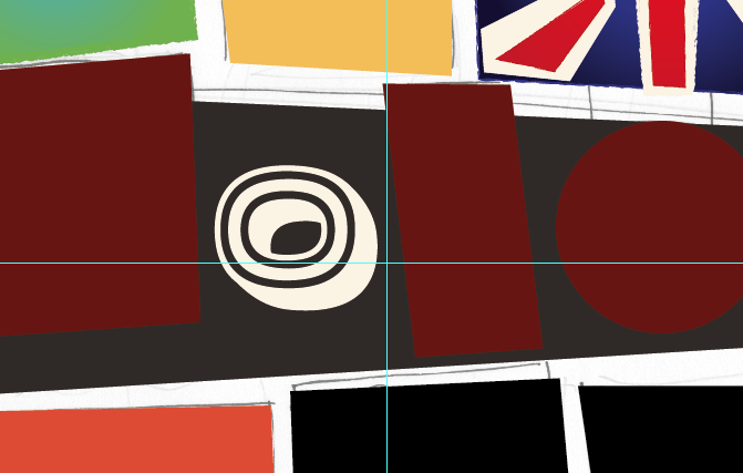
Here I am developing the Union Jack.
I started to trace over my sketch of Epcot's Dole Whip!!
I even bought a typeface, Horseshoes and Lemonade, so that I would be clear on distribution.
I wanted the overall look to be quite eclectic, so I put some numbers on different shapes and left others on the flat page.
The Design so Far
I decided to pull back the colours of the Union Jack to be more stylised and had started placing some of the icons into place.
The top banner was in, so was the Mickey hat, but I felt like the Top banner was looking like an afterthought, and needed incorporating into the design more.
So I swapped it around to be in amongst the design.
I also wanted to centralise the flag!
I decided for operations, that I would represent it with a ticket, as the operations cast members handle all the ticket booths, fast passes and hotels etc.
I drew a quick-snap camera for the characters and character attendant cast members, as they help to take photos! I also didn't want to have to include an empty Mickey Mouse costume!
The whole design so far! It was really coming together and I was really pleased with it but I was struggling to fill the top left hand corner box.
So I put a lifering in it to represent the lifeguarding cast members. I also added a little varsity flag above the ticket box to break up the composition a little.
A few more suggestions came in from the group from Irish cast members, wanting their own Tricolour to be included:
 I also had a shocker and realised I was using logos without permission, so before it was distributed, I change the DisneyWorld Logo to just lettering. I was still questioning the Mickey hat, as I had drew it myself and I knew that the designs were for nonprofit, I was wondering if this affected any copyright laws. So I contacted somebody on twitter and I was strictly advised against it, so I took this cautious advice and needed something to replace the Mickey Hat whilst still representing the Merchandise Cast Members.
Here I am smartening up my castle silhouette.
So I eventually went with a shopping bag, mug and pen to represent the Merchandise cast members. I was really disappointed because I felt like my design was now nothing to do with Disney at all. I was up in running against another member of the group, which included all Disney designs on theirs, meaning that mine was downloaded very little in the end in comparison.
After hearing lots of praise about my work, I decided to create a quick promotional Facebook cover photo banner:


No comments:
Post a Comment