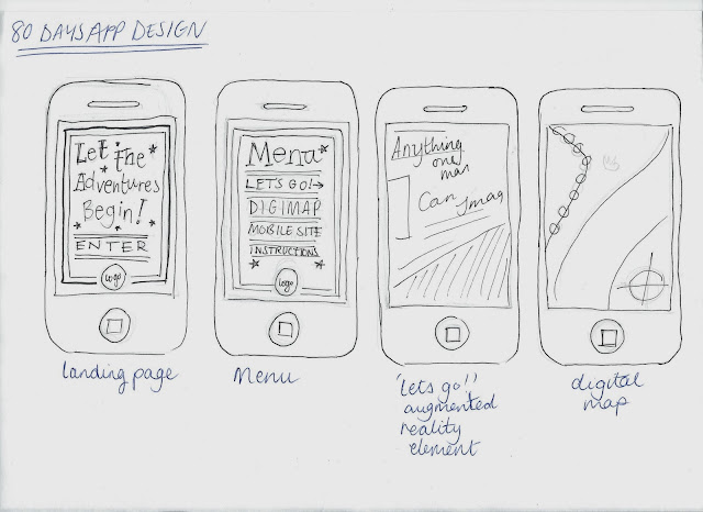
Like the rest of my designs, I started off with my sketches. Because, I confess, this was the very last thing I designed, I already had all the typefaces, colour schemes and compositions to work with. It was just a case of putting it together - as a result I encountered next to no problems to overcome.
App Design
For the app design, I knew I wanted a 'landing' or startup page, to prepare the user - again appealing to younger audiences by getting them hyped up. For the main menu, I wanted a collection of different typefaces just like the book tokens, bookmarks, and lanyard design compositions.
Unfortunately, I knew that I would have to mock up the Augmented Reality part of the app because I could not do this for real but I knew how I wanted it as I had imagined it since the start of the project.
I was also going to include the map of london, so the user could use the app without having to purchase the lanyard as well if they didn't want to.
Augmented reality mock ups:
To demonstrate how I imagined the Augmented reality app, I used Adobe Photoshop to skew and warp text so it appears as though it's hanging along the buildings and across the bridge. If this was as 3D as it seems, then the user would be able to read it as they moved along the road.
This is the final mockup of the app design according to my original sketches. I really like the way it turned out, however I am disappointed that I could only mock up the Augmented Reality part of the app. So, stemming on from this I have arranged for a placement in a studio that designs and builds Augmented Reality apps so I can learn a bit more about them and hopefully create my own - authentically!
Website Design
Here is my very basic plan for my website. Since I was mainly focusing on the print side of the project IE playing to my strengths, I realise that my web element is weak. I wanted to include a facility to purchase the app and the pack, and the map that users could print off for free.
Home page:
Here is the final home page design. I decided that the site would look a lot better if it were centre aligned because of the circular logo. I used all the same graphics throughout the project to put together this piece. This page would include links to all the other pages, and an introduction to the site, the event and world book day as a whole.
Map Page
Here is the finished Map page design - it would feature an introduction as to why is it necessary for the user to have at the event - with a button to print it and a full PDF to view it. I used quite big text and a large icon so that younger audiences feel welcome to use it easily.
Shop Page
Here is the finished shop page for the App download. It has a decorative item description, and a short summary also. It has the price, a still from the event to demonstrate what it will do, the app icon and the app store purchase button.
App Shop Page
Here is the finished page for the Lanyard pack. It includes a picture of what you would expect from the pack, a typographic description and a summary also. It has a purchase button, price and name of the product.
Here is all the pages of the site. I have made each page have a different coloured background for each of the pages to make it easier for the user to distinguish between them. Further developments would include coding it for real, using better images, and a map of the worldwide event. I would also have an 'about' page that elaborates on what the event is and World Book Day in more detail.


No comments:
Post a Comment