I began my drawing some quick sketches from the examples of art from Sarah Morris and the underground tube maps. Although this fit in directly to the style that Tristan liked, I thought it gave the impression of sci-fi, motherboards and sim cards as opposed to tube maps...
 |
| Quick sketches of designs inspired by Sarah Morris' work. |
So I then began taking extracts from the artwork of Jelle Martens. The isometric angled, parrallel upward lines is very simplistic but contemporary. I began like this:
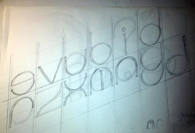
I slowly began to develop an alphabet that was based around the isometric oval shape. I also decided to make it really lightweight, after looking at successful modern fonts such as Helvetica Neue and inkeeping with the temporary theme.
So far i really liked my idea but felt that it looked quite weak and i wanted to create a display font not just a type font. I asked my partner Tristan to see if he liked the idea, and what he could suggest would give it depth. He said he really liked it but agreed it needed something. He showed me a few more images of examples of design he admired to help. My favourite was this one. And so i set about adding an isometric, unrealistic drop-shadow to my letterforms:
I traced my letterforms in fine liner to make it a bit clearer:
I also sketched out some glyphs. I then scanned in the drawings into the computer, as i wanted to make sure that each one was accurate in terms of perspective, and of correct proportions to each other.
I traced over the initial shape of the letterforms (without drop shadows) using the pen tool. I also drew vertically ascending lines as guides. I started with the 'O', as it would then be used as the basic template for the oval shape in the whole alphabet. I also drew a simple 'stick' that could be used at the template for stems, tails etc:
I changed the position of arm of the 'f' from my original sketches to match it with the 't' as it looked out of place with the rest of the alphabet, as suggested in the group critical analysis.
When i began drawing it out on the mac, i also decided that the dots on the exclamation mark, question mark, 'i', the speech marks and the comma should be made more contemporary than the clumsy circles i originally designed. And so i made them to be slim rectangles, a continuation of the stems of the letters which i felt fit in much better.
I hid the 'guides' layer to leave just the letterforms. I then went to > effect > 3D > Bevel and Extrude to create the 3D shadow effect ( a new technique i recently discovered. Without it i would have relentlessly and most likely inaccurately drawn out each shadow).
I fiddled around with the options and recreated my original drawing:
I changed the colour to white, so that when tracing it would be easier to distinguish between the light and dark tones. I also drew two boxes exaclty A3 size, to assist in printing.
I printed these two pages and taped them together. I then placed my A1 sheet of tracing paper over the top, ensuring there was an equal space of 14.8cm either side of the artwork. With this secured into place i began to trace over the letters using a fine liner.
I still didn't know whether i wanted the type to be filled in or to leave it as outline, so I drew an outline. (If i wanted it to be filled it could be added)
From beginning to end, the tracing took me about two and a half hours. The most difficult being the curves, because they were freehand but i'm really happy with the overall result.


No comments:
Post a Comment