After researching into Victorian and Art Deco art (here) I made a sort of, 'mood board' of ideas. Throughout this post I will keep referring to this mood board as I picked it apart for all different aspects of the artwork:
Design of Artwork for Octagon net
After scribbling all of the ideas possible for the details that could be included on the mood board, I started to jot some down onto an actual net, seeing how it would fit, what might look good etc. I really liked this design revolving around the centre, an ever-symmetrical composition.
Then I had an idea. Going back to one of my original ideas of a Jules Verne style piece about Victorian-era adventure, I sort of thought I could have illustrations of print equipment sort of 'orbiting' the boxes in the middle:
I only did one rough panel and I was hooked on this idea. Again, a mixture of all the different things on the mood board, this idea included all different equipment orbiting and floating around the centre surrounded by swirls and stars, and bordered by the titles of different kinds of print. I wanted it to look like some sort of circular Victorian astrology chart.
I don't normally do this, but I liked this idea so much I didn't pursue initial ideas any further and jumped straight into the development of this one!
I wanted the illustrations to be of realistic resemblance, but with a Victorian etching-style execution.
Here I am refining my drawings so they can be reproduced easily on Adobe Illustrator.
Here is one of the finished illustrations after being taken through Adobe Illustrator. I used the pen tool to go over the sketch and the fill tool. I played around with the stroke tool to create this sketched effect digitally.
I used this font quite often throughout the project, so it was nice to include it on the little ink can
I jumped straight onto the main design with no other sketches for this (!)
I immediately drew several borders to create the outside of the design.
I had to go through quite a few typefaces to see what suited the best! 'Connie' was the best because it was bold and had big bowls on the letters so was easy to read even if small, and was elegant yet striking - very Victorian!
closeup of the design:
Taking different sketches from my original research into Victorian and Art Deco illustrations, I create a bike- spoke resembling design for the second layer of the rose boxes. Here is the final design for this:
Never Ending/ inner card design artwork development
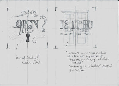
For the never ending card design, I wanted to play to the fact that it had some really interesting opening mechanisms. I thought that maybe it could feature a lock that would open, or some windows/ doors that would 'reveal' the possibilities of designing for print.
With a less rough mock up of the original, I start to draw the intended graphics on a working model:
Using the idea of unveiling the possibilities of print, the front cover features two curtains opening. This could feature flocking so it could look like actual curtains?!
It then goes into a description about the features on the cover.
The next 'page' shows a lock opening -it including foiling through screenprinting.
The last page - another unveil/ reveal feature - thermochromic ink!!
Digitising the designs:
Using the patterns and fonts used all the way through the project, I created these designs, according to my sketches.


No comments:
Post a Comment