Motive - 'Get someone to drink tea'
| Brief |
You have been given a task. You are required to produce a graphics response that engages with a specific audience. Your response should consider the context and environment in which you aim for it to be delivered. You will need to identify this as part of your initial concept proposal.
You should aim to identify, analyse and use existing means of distributions in order to select an appropriate method of communication. Y
|
| Background / Considerations |
What do you want to say? How do you intend to say it? What language would be appropriate?
Will the content be communicated primarily through type or image? If it is both what is the relationship between the two?
What are you aiming to achieve? Are you directing your audience to a website, encouraging them to attend an event? Will it be interactive or encouraging them to change their lifestyle?
A limited colour pallet, two colours plus stock, will allow for reproduction of your designs across a range of media.
You should resolve this problem by the deadline stated below. However, if you have plans to extend the scope and ambition of your response beyond this deadline you should include these proposals in your presentation.
|
Your response should remain within legal boundaries. NB – Any activities that may cause damage, personal offence or involve acts of an illegal nature are not encouraged or supported by the deliver of this brief. You must seek appropriate permission for all activities associated with this brief.
Deliverables
Design development sheets.
Concept/proposal appropriate to your idea.
3 x A2 presentation boards identifying:
Concept
Content
Method of delivery
Presentation
Studio Deadline
Friday 8th March 2013
First, as a group we need to identify what our initial problems are and initiate our main idea:
Why should people drink tea?
- famous
- iconic
- British
- patriotic
- can be good for you
- refreshing
- soothing
- welcoming
- Tea is better than coffee for your health
- there are cool people associated with tea
Who could be an interesting market to drink tea?
Flavours of tea - what flavours could we invent to remodel tea?
Famous tea drinkers - who could appeal to a potential tea audience?
165 million cups a day drank as a nation - that's 3 cups of tea per day per person on average in the UK.
Health & Tea
Other ideas
The day ran smoothly, raising a grand total of £65. Some re-arranging of the stand was required to accommodate the customers' needs which arose throughout the day but otherwise we were efficient.
The presentation
We were required to present our ideas and executions to the class in a 10 minute presentation.
- Americans (it's more of a British drink)
- Young people - let's make it 'cool'
- Everyone - a family drink that comes in all shapes and sizes
- People on the go - tea doesn't have to be a static, relaxing, time consuming task
- The general public - how can we remodel tea?
Flavours of tea - what flavours could we invent to remodel tea?
- biscuits and tea
- cucumber sandwiches and tea
- marshmallow tea
- jelly bean flavour tea
Famous tea drinkers - who could appeal to a potential tea audience?
- The queen
- Stephen Fry
- David Beckham
- Beatrix Potter
- Maggie Smith
165 million cups a day drank as a nation - that's 3 cups of tea per day per person on average in the UK.
Health & Tea
- Keeps teeth clean- a natural source of flouride
- when taken on it's own it has no calories
- contains manganese, essential for general physical development.
- can have cancer preventive properties
- contains calcium
- containing flavonoid antioxidants, thiamine and caffeine.
- contains less caffeine then a cup of coffee
- may help in maintaining a healthy heart.
- helps to maintain daytime alertness
- good for your daily fluid intake and staying hydrated
Other ideas
- 'what kind of mug are you?'
- takeaway afternoon tea pack
- Red nose Day - Charitea brew up
- tea tasting - do you know your Yorkshire from your PG? (product loyalty novelty test)
- Stereotyping characters by what tea they like ie, earl grey = posh
- 'The golden cup' - winning cup receives a prize (more tea?)
- tea packs for students with drawstring tote bag that looks like a tea bag
- viral interaction - 'face in the hole' personalised cover photo on Facebook like British seaside boards. Patriotic
- Personified teapot by flavour of tea inside - ie, earl grey = posh
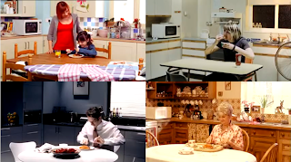
- showing the same scene (Ie, someone pouring a pot of tea and then drinking it) but in different settings with different people to show that tea is for everyone.
Out of all of these ideas, we decided to combine a few, and wanted to create a takeaway tea set for Red Nose Day - naming it Charitea.
Initial character ideas by Danielle
My concept for the packaging of the mug
A concept for the refill tea bag set by Danielle
Logo ideas and concepts by Beth
Our charitea pack would include a mug with the bottom half of a face printed on - complete with a red nose. The face would be that of one of the celebrities participating in one of the charity events. Which face would be dependant on the flavour. We started to list celebrities form this years RND events and possible corresponding flavours (we looked on the Whittards tea site to find flavours that actually exsist):
Mary Berry - Berry flavoured tea
Keith Lemon - Lemon tea
Miss Piggy - Pink Lemonade tea
Jessie J - Blackcurrant and Vanilla flavour
Fearne Cotton - cotton candy flavour
Jonathon Ross - Breakfast tea
Lenny Henry - ?
Helen Skelton - ?
Jason Donovan - ?
The idea of the Charitea pack was to provide the facilities to host your own tea party for charity - a motive to get people to drink more tea in favour of other drinks. To accompany this, we were to design an app for the iPhone that would observe which flavours were being bought - almost like a competition. We figured that this would appeal to a younger market - if Jessie J was their favourite celebrity, they might ask their parents to buy more so she could win.
Early app concepts by Harrison
We had to source these very specific flavours from Whittard's - but wanted to receive permission or perhaps donation because they were very expensive. We went down to the store and we were put in contact with management but they never responded so we had to think of an alternative.
After our presentation to the tutors and found that we would actually have to conduct whatever it was we were planning - we decided to resource our mugs and change the angle of our marketing. It couldn't be in shops - we didn't have enough time to make a substantial amount of stock or get permission off sellers. We also couldn't have an app - none of us were confident enough in creating successful software.
We decided to change the angle of our idea by turning it into our own tea party - by hosting a Red Nose Day Charitea stand, held in uni. The mug idea would slowly change into disposable cups with red noses on the bottom, and different flavours of tea with different character tea bag designs.
Our character tea bag idea inspiration
Our definitive brief that we wrote:
And rather than re-package tea as our own for our own profit, we would market the fact that it was for charity. We found our chosen flavours from local supermarkets:
We narrowed it down, graphic-design-wise to this list:
- belly band designs for tea cups
- tea bag character designs
- poster advertisement
- menu design with prices
- floor stickers to guide customers to the stand around uni
- advertisement email design
- logo / brand & identity
- Price cards next to the products on the table
At first, I was left without a job - only to help anyone that needed it. I decided to help Danielle with the illustration designs as I have strong skills mostly on Adobe Illustrator - to help digitise the drawings.
Danielle's drawings;
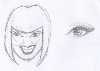
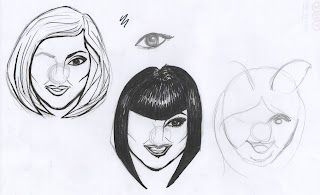
I tried to assist in that, in my opinion, although her illustrations were great, that we needed them to be more cartoon-like, even for just the practical reasons for them being the same size for the same format. I drew up a couple of sketches to demonstrate what I meant to the group, which they then liked and agreed to proceed with instead:
Jessie J. I over-exaggerated her smile in this to make it seem more cartoon like, but it mate her look more like Dawn French!
The initial sketch for Fearne Cotton (top left) didn't look a lot like her, I needed to refine her eyes and jawline. I only drew one eye by hand, with the intention of copy and pasting it once digitised to have perfectly symmetrical eyes. Drawing Mary Berry was difficult, as she has no particular definitive features that I could emphasis on, so I had to just focus on her hair and eyes.
The second Fearne Cotton sketch was a lot more refined and in the groups' opinion, looked a lot more like her. I also drew a second Jessie J, which was a lot less scary! I started to draw a Miss Piggy cartoon, but it wasn't persued as she was dropped from our flavours list.
Sketch for the Keith Lemon teabag
The second group critique - week 2
A quick mock up of our main idea so far was looking rather limp - but our peers were understanding and could see where it was heading.
We received very helpful constructive feedback:
- try and keep costs low of sellable products
- look into college contributions for charity (Printing Credits for printing promotional material. Recommended we speak to Mike Flower or Dan Hill the head of the IT department)
- Think about designing a Charity/Donation Box to raise extra money for Comic Relief
- perhaps biscuits/snacks available to buy for extra cost?
- 'Charitea' stickers on balloons also
As a group after the critique, we decided on our chosen fonts for our menu designs, which Danielle and Beth were working on. We talked about our plans for the belly bands and possible box designs.
A few of the menu designs we deliberated over.
We also agreed that the dynamic of the tea bag designs wasn't working, as the card the design was printed on was not strong enough to grip the heavy teabag over the side. We -reluctantly- decided to make the illustration design smaller and attach (sew) the design onto the stringless teabags with cotton for a string.
We painstakingly sewed around 100 teabags the day before the Charitea stand was to be held.
Harrison was the one to finalise the belly band designs, which were minimalistic in style and printed on red card to match the rest of the colour scheme. Laura quickly designed a box to hold all of the coins in.
We also had a tally chart to record which characters were being sold the most - going back to our original idea of the app. The floor stickers were placed around uni that morning.
Thursday - Charitea stand Day
The presentation
We were required to present our ideas and executions to the class in a 10 minute presentation.
The script we accompanied to our presentation;
To read the evaluation click here.


No comments:
Post a Comment