Wednesday, 20 November 2013

OUGD504 - Creative Suite Session 3 - InDesign

Creative Suite Session 3

Like in Adobe Illustrator, InDesign can work with global swatches. This means that they are linked to whatever artwork they fill. 
We can even have a number of tint filled artwork and when the original colour is changed, all the tints change accordingly.


Preparing image for InDesign in Photoshop - the rules
  • Colour mode - save for CMYK for InDesign because it's a print program.
  • Image size - prepare the image at actual size of use in InDesign. Too big, file size is unnecessarily large therefore is a burden when saving and takes longer to print, especially digitally. Too small becomes pixelated when stretched to size.
  • Resolution - set to 300 dpi
  • File format - save as either a TIFF file or a .psd. If you need transparency in your image, DO NOT SAVE AS TIFF but .psd instead as it preserves the transparent elements of your image.
Preparing image for InDesign in Illustrator - the rules
  • Colour mode - work in CMYK mode or spot colour modes.
  • File format - save as an .ai document
  • Resolution - There is no such resolution for .ai documents because it's vector based and recalculates according to size.


Tuesday, 19 November 2013

OUGD504 - Design for web session 3

 Design for web session 3

Creating the rest of the buttons and making them link to each other and work:


'h ref' is the reference of the number that leads nowhere.

By replacing the hashtags with the name of the pages the buttons will be linking to, we can make the buttons link to each of the other pages.

By writing, for example 'this is the home page' we can determine whether the links are working properly and legitimately linking to each of the four pages. I replace 'hello there!' with 'this is the home page' and I click save. 

I then replace 'this is the home page' with 'this is the about page' and instead of clicking save, I click save as. I then rename 'index.html' to 'about.html'. I do this for all the pages! All the pages are basically the same except for the name of the page and the one line of text. But in this way we can test the buttons and check they all work.


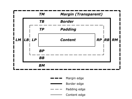
The CSS box model


By creating a wire frame design; IE a quick sketch and working out all of the margins, padding and borders you can then work out all the requirements for your CSS coding before you jump on the computer. 


<p> means paragraph break for bodycopy.


<br /> means title break for bodycopy.


selecting the font size.


it makes the font size smaller.


selecting the font colour

it changed the font colour.


Determining the title from the rest of the text:


in CSS, write 'h1' to determine the specs for the title/ heading. I type in the font size and colour like in the previous font determining sequence.


Then, in the html code, to determine or 'call' the text that you want as a heading, put <h1> </h1> either side. I save and then refresh my website:


The heading is determined as a separate part of the text.

Inserting an image:


After working out your wireframe design, you'll be able to know what size and where you want your image. In this case, I have found the image on Google images. I took it into Photoshop and then with the square tool I went to fixed size and typed in the desired size of the image. I then selected the area I wanted of the image to include.


Then, in the 'right' section that I already determined (above) I went to image > and picked the image.


Useful tools for creating a comprehensive website:

  • Vimeo is a service will compress videos for website design.
  • Soundcloud for sounds
  • Lightbox for image galleries


Saturday, 16 November 2013

OUGD504 - Design for Print - Development of Print Pack artwork

OUGD504 - Design for Print - Development of Print Pack artwork

After researching into Victorian and Art Deco art (here)  I made a sort of, 'mood board' of ideas. Throughout this post I will keep referring to this mood board as I picked it apart for all different aspects of the artwork:


Design of Artwork for Octagon net


After scribbling all of the ideas possible for the details that could be included on the mood board, I started to jot some down onto an actual net, seeing how it would fit, what might look good etc. I really liked this design revolving around the centre, an ever-symmetrical composition.

Then I had an idea. Going back to one of my original ideas of a Jules Verne style piece about Victorian-era adventure, I sort of thought I could have illustrations of print equipment sort of 'orbiting' the boxes in the middle:


I only did one rough panel and I was hooked on this idea. Again, a mixture of all the different things on the mood board, this idea included all different equipment orbiting and floating around the centre surrounded by swirls and stars, and bordered by the titles of different kinds of print. I wanted it to look like some sort of circular Victorian astrology chart.

I don't normally do this, but I liked this idea so much I didn't pursue initial ideas any further and jumped straight into the development of this one!


I wanted the illustrations to be of realistic resemblance, but with a Victorian etching-style execution.


Here I am refining my drawings so they can be reproduced easily on Adobe Illustrator.


Here is one of the finished illustrations after being taken through Adobe Illustrator. I used the pen tool to go over the sketch and the fill tool. I played around with the stroke tool to create this sketched effect digitally.


I used this font quite often throughout the project, so it was nice to include it on the little ink can


I jumped straight onto the main design with no other sketches for this (!) 

I immediately drew several borders to create the outside of the design.


I had to go through quite a few typefaces to see what suited the best! 'Connie' was the best because it was bold and had big bowls on the letters so was easy to read even if small, and was elegant yet striking - very Victorian!


closeup of the design:


Taking different sketches from my original research into Victorian and Art Deco illustrations, I create a bike- spoke resembling design for the second layer of the rose boxes. Here is the final design for this:


Never Ending/ inner card design artwork development

For the never ending card design, I wanted to play to the fact that it had some really interesting opening mechanisms. I thought that maybe it could feature a lock that would open, or some windows/ doors that would 'reveal' the possibilities of designing for print.


With a less rough mock up of the original, I start to draw the intended graphics on a working model:


Using the idea of unveiling the possibilities of print, the front cover features two curtains opening. This could feature flocking so it could look like actual curtains?!


It then goes into a description about the features on the cover.


The next 'page' shows a lock opening -it including foiling through screenprinting.


The last page - another unveil/ reveal feature - thermochromic ink!!

Digitising the designs:


Using the patterns and fonts used all the way through the project, I created these designs, according to my sketches.


Thursday, 14 November 2013

OUGD503 - Responsive - Rewriting the brief, Concept Statement and why my submission will WIN

I am writing a concept statement to dictate what I'm going to be doing for my main responsive brief.

Concept Statement

What are you going to do?

A carton board food holder to accommodate a meal for 2 people.

Why are you going to do it?

To experiment with practical packaging design and challenge myself to make a feasible, functional everyday product that people can envision on the shelves of real stores. I want to gain real world experience and exposure of my work.

Who are you going to do it for?

My desired audience of tourists, families, groups, adventurers, kids, festival goers etc. I am also doing it for the company the Benson Group, and Starpack who are my initial audience that my packaging has to appeal to and impress.

How are you going to do it?

Go to supermarkets and other takeaway food outlets to look at the packaging, how it interacts with the user and the supermarket shelves itself. I am going to experiment with the materials and different nets. I will most probably use laser cutting to cut the final product net and digital print to achieve the graphics.

What do you aim to produce?

A sustainable, reusable piece of packaging that interacts with the user in a way that is ergonomically relevant for their use such as on public transport, alfresco or even on a bike! I aim to produce a product that is interchangeable so that it will appeal to a large audience - something for all the family!

****

Because I have chosen a new brief, and because I have interpreted and thought about the brief in a different light, I am re-writing the brief.

The chosen brief can be read here.

Responsive - Re Writing the Brief


Brief Title: The Great British Summer

Brief: 
I am being asked to produce a carton board food-on-the-go carrier to hold enough food for 2 people.

Considerations:

It must use predominantly carton board, with the ability to be fully recycled or reused. It must accommodate a meal for 2 people, and keep it relatively fresh. It must have high-street/ supermarket price range / accessibility and have strong shelf presence. Consideration of how the audience will interact with the product is paramount. 

Concept/Proposition:
Some features I would like to include that may be useful for the target audience would be the ability for the product to go flat pack once it's been consumed, because if it's reusable then the audience don't want to be carrying round a big empty box! I would also like the product to interact with the user in an interactive way for easy use when eating off of your knee or on a tray table of public transport. It may be nice to have different variations of designs for different occasions; by the seaside, at the park, at a national park, at a music festival, for a school trip? It would also be useful to include different ways of combining different products within the box to suit all audiences. 

Background:
Benson Group is one of the UK’s leading privately owned printed folding carton suppliers, producing packaging product for both the food retail and healthcare industries for a wide range of UK and European customers.

Target Audience:
The target audience is people who go food shopping, whether online or in store. These are people who live on their own or have a family, and are responsible for getting the food for the household. These can range between parents, grandparents, couples and people who live on their own. It is for people who care about the quality of the food and where it comes from as it is a premium brand, and you need to look at how the packaging will impact on the environment. It is for people who cook fresh food and have time to cook good food, as it is quality meat and sold fresh, not frozen.

Tone of Voice:
The tone of voice will be playful, instructional and persuasive. It must persuade the user to choose this particular product for lunch, it needs to be playful - it's not a serious situation! It also needs to be instructional in a language that everyone can understand so they can understand the concept of the product.

Mandatory Requirements:
  • Must have strong shelf presence 
  • Must be predominantly carton board used
  • Must accommodate a meal for 2 people
  • Must consider how audience interacts with product
  • Must have high-street accessibility / price range

Deliverables:

    • One good quality mock up to withstand transport and handling.
    • Development boards: 3 x A3 boards showing concise and clear presentation of ideas from your initial ideas through to the final concept.
    5 Reasons why my submission will WIN


    • It will be flexible in its functions - increasing it's appeal to a mass audience.
    • It will be reusable and therefore be able to be produced on mass because of it's minimal environmental impact.
    • It's graphics will avoid generics such as gingham and hopefully Union Jack flags and stand out from other designs in this manner.
    • It will be interchangeable and customisable defined by the user - loads of different combinations to suit all users needs.
    • It will use minimal materials and I will strive to only use ones that may be recycled.

      OUGD503 - Responsive session 2

      Analysing our chosen brief

      In analysing our briefs in more detail we can start sprouting ideas and really deepen our understanding of our briefs.

      What are the 5 most important words in your brief?

      British, fun, alfresco, supermarket, variety.

      What are the 5 most important considerations of your brief?

      1. Must have strong shelf presence 
      2. Must be predominantly carton board used
      3. Must accommodate a meal for 2 people
      4. Must consider how audience interacts with product
      5. Must have highstreet accessibility / price range


      What are 5 related products to your brief?

      1. Sandwiches
      2. Dairylea lunchables
      3. Sandwich meal deals
      4. Picnic blankets
      5. Wicker baskets


      What are 5 related places with your brief?

      Supermarket shelves
      Beach/ seaside
      Park
      Festival
      Tourist points of interest 

      Who is the brief saying the audience is?

      'The Great British Public'

      Who should the audience be?

      Families, friends, groups aimed at people usually aged 16+ who have the income and initiative to prepare for an outing by buying lunch beforehand at the supermarket.

      Who COULD the audience be?

      Festival goers, younger audiences such as children shopping with their parents, groups of teens, maturer audiences.

      Why could this be the audience?

      By marketing in more locations such as actually in the places where these people go / would take this product, there is a more likely chance of expanding the audience out of the supermarket-goers.
      Children and festival goers are not fussed / choose to eat outside on the go and so would be good to appeal to.

      What do they do?

      Go on days out, like to learn, entertain themselves, enjoy their time off work.

      Where do they go?

      The seaside, museums, theatres, parks, theme parks, festivals, castles, tourism places of interest.
      How do they go?
      Coaches, cars, bikes (bike rides) buses.

      What do they want to be?

      Refuelled/ full/ not hungry, organised, not out of pocket!

      After answering all these questions about our briefs, we swapped briefs and answered each others. When we realised we had similar answers we knew that we have to think outside the box when coming up with ideas because if we all have similar responses to the brief, we will all have similar answers!!

      Additional thoughts

      The JUDGES of the competition will be your INITIAL AUDIENCE that your work will have to appeal to.
      Remove yourself from your initial responses and come up with something un-obvious and innovative.

      Additional notes

      Could the pack go flatpack once the food has been consumed? How does it interact with the user and their surroundings? Their transport? Eating off their knee? Re-usability? Sustainability? Inter-changeability?


      Wednesday, 13 November 2013

      OUGD504 - Design for Print - Posh Pass the Parcel Logo Ideas & Development

      Design for Print - Posh Pass the Parcel Logo Ideas & Development


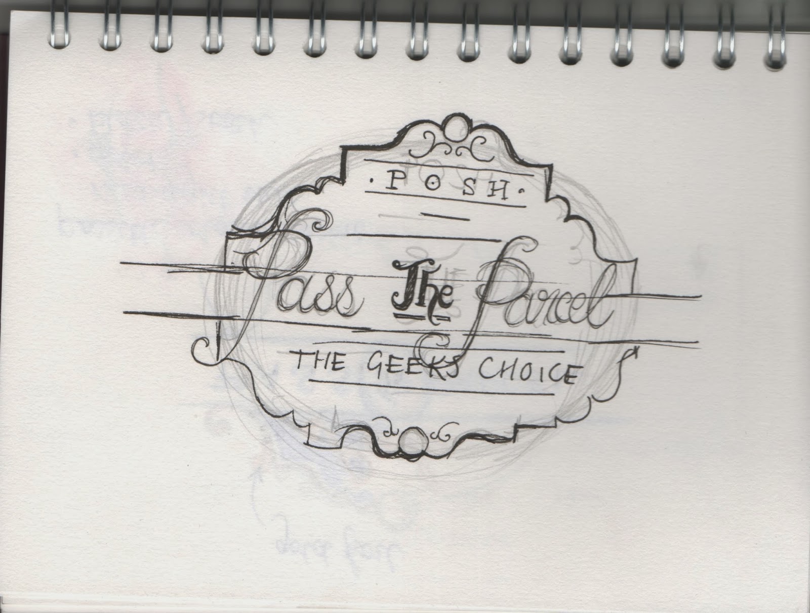
      As inspired by the Victorian design work I researched I started to sketch up some logo ideas. 


      I knew I wanted the outline to be poignant and strong, but still art deco and ornate. It was just fitting 


      Trying to refine the logo and break it down into different sections


      I am also trying to incorporate a belly band for the product-  how would this work?


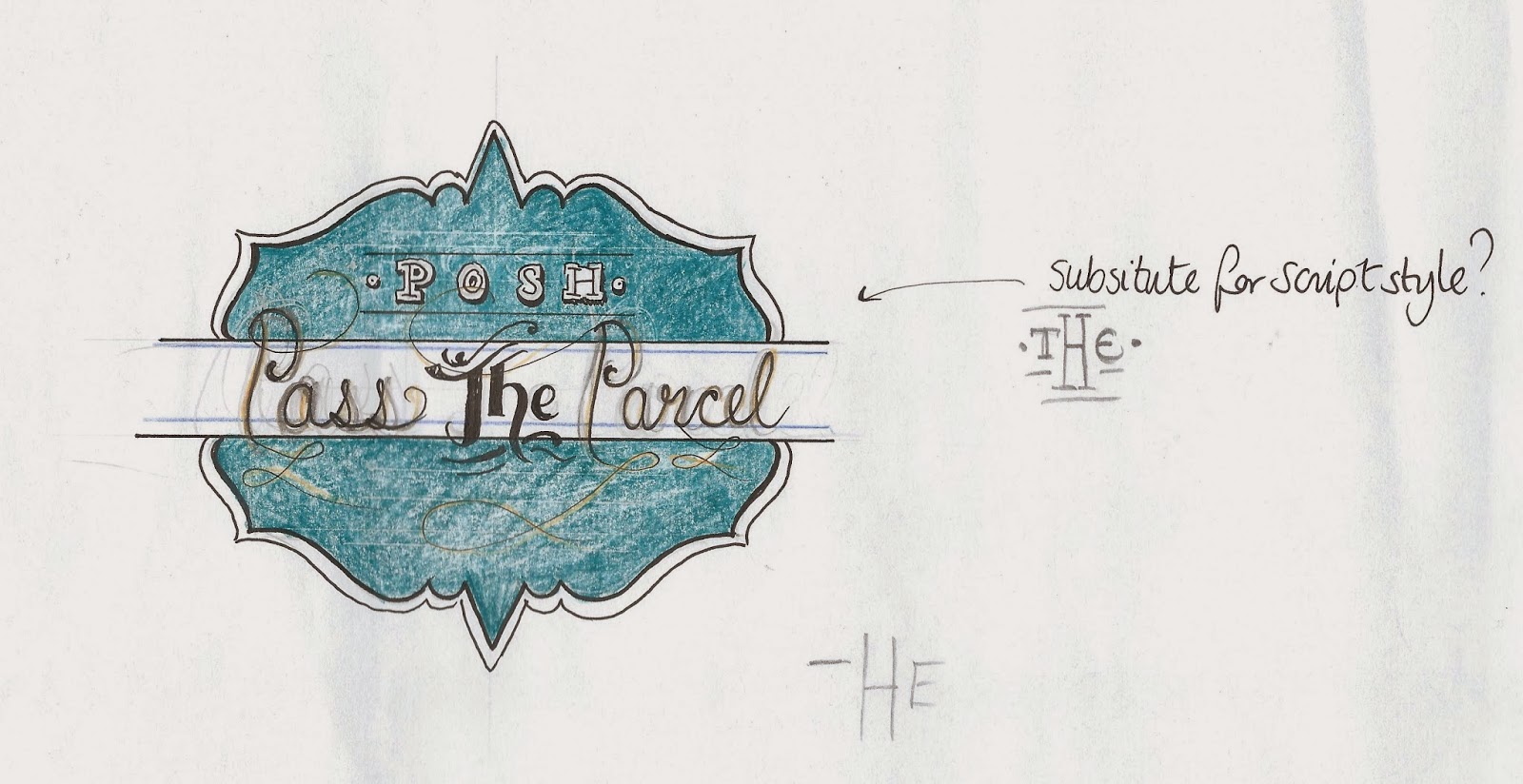
      Deciding on colours and trying out different word placements


      A calligraphic typeface accompanied with a plain serif typeface is a good juxtaposition adding balance to the logo:


      going over the design using the pen tool


      The whole logo is nearly finished!


      I added a gold effect as I intend to add foil to this logo! All finished!