Saturday 20 October 2012

OUGD403 - Alphabet Soup - Typeface - Application of Typeface to product

After a couple of experimentations, using Adobe Illustrator, i replaced the simplistic logo of the Beats Headphones with that using my own typeface. 


Here are the results:


Thursday 18 October 2012

OUGD403 - Alphabet Soup - Typeface - Ideas and Development

I began my drawing some quick sketches from the examples of art from Sarah Morris and the underground tube maps. Although this fit in directly to the style that Tristan liked, I thought it gave the impression of sci-fi, motherboards and sim cards as opposed to tube maps...


Quick sketches of designs inspired by Sarah Morris' work. 
Experimenting with different shapes of the London Underground map with letterforms.  I didn't really like where these ideas were going, because they could be mistaken for a more sci-fi theme and i wanted a more contemporary minimalistic feel. 
So I then began taking extracts from the artwork of Jelle Martens. The isometric angled, parrallel upward lines is very simplistic but contemporary. I began like this:


I slowly began to develop an alphabet that was based around the isometric oval shape. I also decided to make it really lightweight, after looking at successful modern fonts such as Helvetica Neue and inkeeping with the temporary theme.
So far i really liked my idea but felt that it looked quite weak and i wanted to create a display font not just a type font. I asked my partner Tristan to see if he liked the idea, and what he could suggest would give it depth. He said he really liked it but agreed it needed something. He showed me a few more images of examples of design he admired to help. My favourite was this one. And so i set about adding an isometric, unrealistic drop-shadow to my letterforms:


I was having trouble with creating my 'K', as i wanted it to follow the oval shape style and not be isometric but it wasn't really working. But otherwise so far i really liked the way my letters looked. I took these two sheets to the group crit, and it was suggested that my 'K' could incorporate the right half of the 'X'. I thought that this was such a good idea and set about improving my letterform.

I traced my letterforms in fine liner to make it a bit clearer:


I also sketched out some glyphs. I then scanned in the drawings into the computer, as i wanted to make sure that each one was accurate in terms of perspective, and of correct proportions to each other.

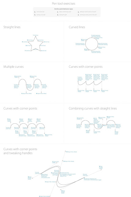
I traced over the initial shape of the letterforms (without drop shadows) using the pen tool. I also drew vertically ascending lines as guides. I started with the 'O', as it would then be used as the basic template for the oval shape in the whole alphabet. I also drew a simple 'stick' that could be used at the template for stems, tails etc:


I changed the position of arm of the 'f' from my original sketches to match it with the 't' as it looked out of place with the rest of the alphabet, as suggested in the group critical analysis. 

When i began drawing it out on the mac, i also decided that the dots on the exclamation mark, question mark, 'i', the speech marks and the comma should be made more contemporary than the clumsy circles i originally designed. And so i made them to be slim rectangles, a continuation of the stems of the letters which i felt  fit in much better.

I hid the 'guides' layer to leave just the letterforms. I then went to > effect > 3D > Bevel and Extrude to create the 3D shadow effect ( a new technique i recently discovered. Without it i would have relentlessly and most likely inaccurately drawn out each shadow). 
I fiddled around with the options and recreated my original drawing:


I changed the colour to white, so that when tracing it would be easier to distinguish between the light and dark tones. I also drew two boxes exaclty A3 size, to assist in printing.

I printed these two pages and taped them together. I then placed my A1 sheet of tracing paper over the top, ensuring there was an equal space of 14.8cm either side of the artwork. With this secured into place i began to trace over the letters using a fine liner. 

I still didn't know whether i wanted the type to be filled in or to leave it as outline, so I drew an outline. (If i wanted it to be filled it could be added)


From beginning to end, the tracing took me about two and a half hours. The most difficult being the curves, because they were freehand but i'm really happy with the overall result.


OUGD403 - Adobe Illustrator workshops

To assist in the creation of artwork and designs, every week we will, as groups undergo an Adobe Illustrator workshop. The new skills learned and old ones perfected will be very helpful for current and future projects.


11th October 2012

Our first Illustrator tutorial was all about the pen tool. Although I am quite confident in using Illustrator and the pen tool, I still found these exercises very useful and good practice. We started with this:
 
Although I frequently use the pen tool there was still a lot of features I was unaware of. By dragging my cursor to the different points i was able to create all this different types of curves and lines.


 Next, we had to trace around this scanned-in-sketch using the new pen tool skills that were acquired from the last exercise:
I went to file > place to put the scan into Illustrator. I named the layer that this image was placed onto 'Raster Image', turned down the opacity to 50% and locked the layer. I wanted the pen tool drawing to be on a separate layer so it was easier to manage.

 I began by drawing around the shape. I turned off the 'fill' option and only used the outline fill so that it was a line and i could see what i was tracing around.
 I found it quite easy to trace around the image quite smoothly.
 For the counters, i decided to use the elipse tool because it would produce a neater edge than that of a freehand pen tool.
 I selected both the counters and the outline and clicked fill. I then opened the pathfinder window and clicked exclude. This meant that the counters were cut out of the outline and the letterform was complete:

Sunday 7 October 2012

OUGD403 'Layer' 10 Letters Idea Development and Final Designs


OUGD403 Idea Development and Final Designs - Alphabet Soup


Development for cross section of earth style 'A'. I started with sketching an isometric-style cube resembling the typeface i found in my research and then added a wavy top to resemble the stratum diagrams. I decided to add a 'lake' to the cube missing at the top of the A to make it more like a genuine land cross section image.
I then refined the letterform by making the counter smaller and the sides wider, which i much prefer.
I then corrected the proportions and shaded in with pantone markers on the final product:


I used pantone markers to give the effect of shadowing and to distinguish different layers.

------------------------


My initial sketches for the 3D effect were of a simple typeface such as helvetica, as it would be more modern, but i then decided that this could be quite unoriginal/dull and so i chose a little more elaborate typeface. I typed it on the mac, and drew the final image from that. I decided to not include the flick at the side of the letter so the letterform would not be completely copied:


I like the finished piece and i still think it shows the 3D effect in greyscale.

------------------------


I used the images of MRI scans from my research to produce simpler sketches, and started to identify letter-like shapes within them. I decided to create a 'C' from the back half of the head in the first image. This is a rather abstract approach to the word layer, but i still think the final piece is quite effective:

This 'C' could be flipped vertically to also create a 'D' if i were to create a whole typeface from this concept.
------------------------


To create the anthill-inspired typeface, i took this image and used layout paper to highlight shapes that could be potential letterforms. I tried to keep the unusual twists and turns of the chambers:


In the original tracing i found the capital 'E' on the left hand side to be the most prominent letterform and so developed it further, making the top half angled further forward. I was satisfied with this shape, but i didn't like my original shading and decided that block colour would make it simpler and more effective:


------------------------
My original sketch for my fried egg didn't develop much to the final piece. I wanted it to translate clearly in black and white and so drew it in a cartoon-like style:


------------------------

My eco- efficient typeface also didn't deter much from my original sketch:

------------------------

For this piece, i printed off an italic 'L' in Helvetica bold and sketched some bricks over the top onto layout paper. I then filled this in with black markers.

Using references of onions from my research, my initial sketch for this 'D' i used as my final piece as it was clear enough. 

I used black and grey pencil to execute this flipchart letterform. I think it clearly resembles those i found in my research.

This final letter was heavily inspired by my research into the 'Grease' musical logo, especially the 'quiff' I like this letterform the most because it flows nicely and is a clear representation of hair.