Thursday 23 January 2014

OUGD503 - Responsive - Individual Practice - Great British Summer Benson Group brief - critique 23/1

Responsive - Great British Summer Benson Group brief - critique 23/1

Today, we had a 'final' critique for our main Responsive briefs. Here is the work I presented:


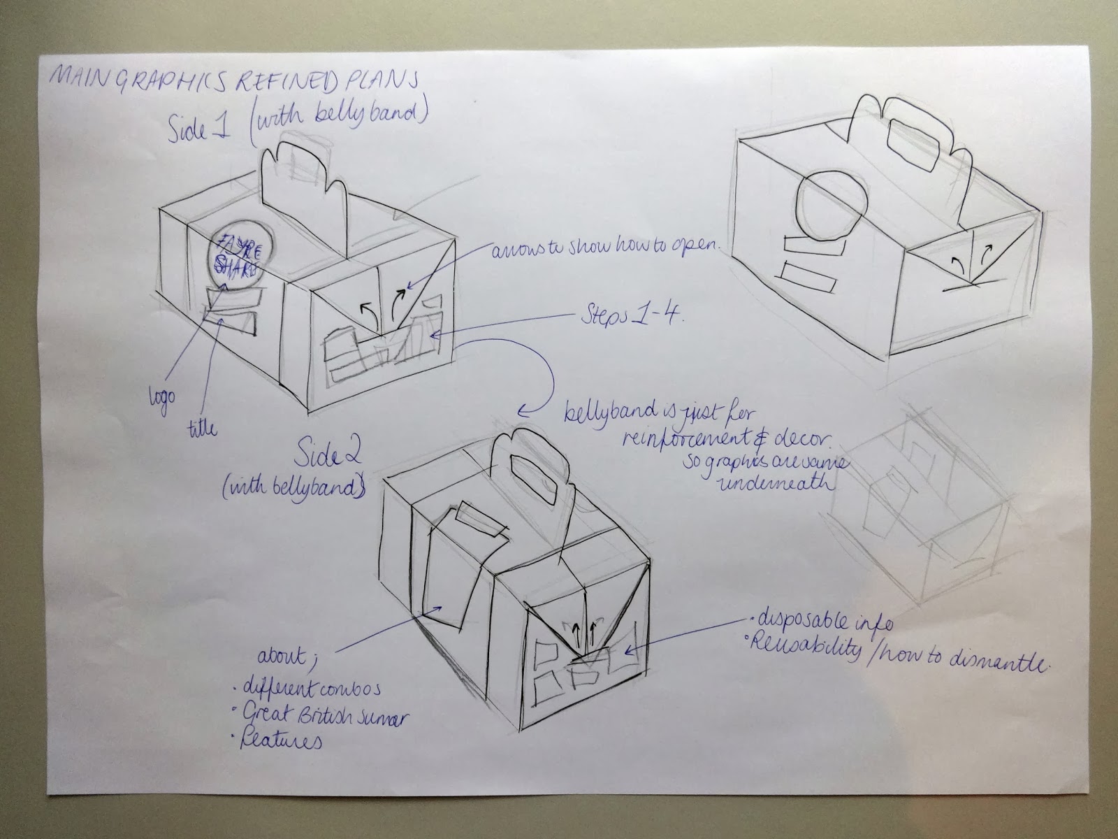
I managed to get a colour mockup of the main carrier box, it's bellyband, the sandwich box and it's pull out plate, the dessert box, pasticceria paper and stickers to secure it.


back view of the sandwich and dessert boxes.


front view of the sandwich and dessert boxes.


Pull out plate and pasticceria paper.


closeup of bellyband on carrier box.


Details on the carrier box.

I also brought along to the session 5 design boards, which explained the project so that I could be properly critiqued on how well I had answered the brief.


I also included the Evaluation and 5 questions I wanted answering about the work I had presented:

Evaluation

In response to the brief set by the Benson Group and Starpack to create an on-the-go food pack for two people, I created a design which I feel fulfilled the necessary criteria to accommodate for the associated audience. I found in my research that for a pack like this to work, it has to give lots of choice. Each person gets a main, snack, dessert and drink of their choice all of which will fit inside the box! I also thought about how the user will interact with the product and where, so I ensured that the product will fit on the user’s lap and so can be consumed on public transport, for example. 
I originally intended for the box to be able to go flat-pack once used to ease customer reusability as they could transport it more easily once empty. If I have more time before the official deadline I will improve these elements and reduce the glued elements. This would also improve on environmental impact, which is important for an intended mass-produced product. 
It is proposed that this pack would be able to clip onto the frame of a bike to accompany the user on bike rides etc.
Further development of this product would include co-ordinating in store point of sale design, large instructional posters, and in store shelf signs for prices and to colour co-ordinate the steps 1,2,3 & 4 to assist the users. 

 5 Questions about the work:

Do you think that the packaging inflicting with the inside of some of the windows is a problem? IE the top of the dessert box and the sandwich tray showing inside the sandwich box.
In your opinion, in terms of colour and style, do you think that my design answers to the requested ‘Great British Summer’ theme?
Do you think that this pack suits a wide audience of the general public or does it appeal to a smaller audience?
Are there any glaringly obvious improvements that need to be made on my current design?
In a practical sense, do you think my submission for this competition will stand out from other submissions? why?

Here is the feedback I received:


There has obviously been some confusion that was inadequately explained in my design boards with accordance to the delivery of the final products; as no 2,4, or 6 is required in this scheme. 
I also failed to demonstrate my inner holding system to them through my design boards also, making them question how the products will be held in place.

My fears were confirmed when they said that the design appeals to young children and families. This is a really negative sign, as I have narrowed my audience in half. Since the pack as defined by the brief should accommodate meals for only 2 people, this doesn't work either!


I agree with the numbering of products, I made a big mistake on this! But since it was only a visual mockup, I decided to leave it for this particular critique. The shape of the products is fine though, it's just not generic. This needs to be demonstrated more professionally with the products inside before being presented finally for the competition.

To do list as suggested from the critique:

  1. The products need to be shown in-store and distribution must be explained and demonstrated.
  2. The numbering system needs to be fixed.
  3. The inner holding system needs to be demonstrated - maybe illustrated?
  4. professional photography of the pieces with the products inside will help the viewer to visualise the final outcome.

Monday 20 January 2014

OUGD503 - Responsive - Individual Practice - Great British Summer Benson Group brief net development

Responsive - Great British Summer Benson Group brief net development

Initial ideas


My initial ideas for this brief were very broad. As I discovered when I asked around a few people who I thought to be the targeted audience for this brief, I found that if people were going to share a pack, then they would want to be able to have as much choice as possible without it inflicting on what the other person chooses to have.


So my main aim for the boxes themselves would be that the shapes of the 2 main boxes I would create could host a large range of different products and that the space they would be accommodated in could fit everything in - whatever combination!


Inner holding system for Main holding carrier

One of the first things I started working on alongside deciding on my main 2 nets was how everything was going to fit in the box.


This plan was like the top of a McDonald's straw holder - it has push-through sections that would grip onto the products and hold them in place. I found this difficult to work with as it made the outer box bigger and bigger and the bridges and walls in the different sections would be weaker if made smaller. So this idea was scrapped and a new system was adopted.


this system featured the criss-cross of lots of different panels making up the grid. This also meant that when empty it could twist and go flatpack - a feature that I wanted to play with and see if I could make the whole design flatpack and therefore reduced environmental impact because of it's transportability and reusability.


This quick demonstration taught me that carton board (the requested material to use) is extremely sturdy and can withstand lots of wearing before it tears. 


Here I am working out all of the correct measurements so it can be digitised ready for possible laser-cutting.

Dessert box net

My dessert box was heavily inspired by this wrap box from Tesco:


I really liked the opening mechanism and use of the window. 


So here I am re-working all of the dimensions into the correct format ( I measured a slice of cake! )


And drawing them out by hand accordingly.


After a mock- up assembly, I started to sketch out the possible artwork for the product. I already had the logo, colours and pattern figured out, it was a case of handling all of the required information and playing around with the layout.

Step by step digital development of dessert net:


Following the format of the pattern I created, I created a series of frames to contain all of the information.


I used all the things necessary for authenticity: nutrition levels, barcode, ingredients, Waitrose logo, sell by date, disposing and recycling instructions and item description.


I decided to show how the products would be distributed in-store by designing my own shelf banners!


 Main meal / sandwich net


Main holder carrier net development


Here are lots (and lots) of ideas for how the main carrier box could support itself whilst remaining in the same material as the others, but being able to support it's weight. I had the idea that the handles would come up through the entire box and be secured by a bellyband. This would have probably been the most secure way but it interfered too much with my existing inner slot system, and so I pursued a normal box with a bellyband wrapped around:


Some ideas for the main carrier graphics:


I wanted the logo to be large across the sides and over the lid, with the pattern also featured on it somewhere. I would learn to develop it a lot more digitally. 

Bellyband attachment idea:


I wanted to be able to use minimal glue wherever possible, and I wanted the bellyband to be reusable with the box and so created a simple hook and eye attachment so that it could be reused.


OUGD503 - Responsive - Individual Practice - Great British Summer Benson Group brief illustrations and visuals

Responsive - Great British Summer Benson Group brief

Visuals


Starting with mind maps and my research, I began to build a catalogue of sketches and ideas for the visuals and artwork for my food pack.


I wanted my food pack to be able to hold as many different kinds of foods as possible, and so making this mind map really helped me to consider all shapes and sizes of food, hot or cold and see how I could incorporate it into my design to please all audiences.

I researched further into visuals for the Great British Summer after I created this mind map, but again, this really helped me brainstorm my illustrations and ideas.


Preparing the logo


I type out all of the letters to 'fayre share' as separate letters and place them on a 100mm by 100mm art board.


I then change them to my desired font; Anderson Stingray.


I then go to type > create outlines. This enables me to resize and reposition the letters. I want them all different sizes, but to also intertwine and work around one another. 


Here I am tweaking the capital 'F' and the tail of the 'y'


The logo taking shape.


Because lots of the same letters are used, I typed out both lower and upper case letters to mix up the appearance. Here I am making the bottom 'R' as different to the top one as possible.


Adding the circle to the background, I am starting to really like where this design is going!


I decided to make the lettering white and place it inside of the circle. I decided to do this because I thought that a logo contained inside of a circle would be easier to apply to further designs.


However, I still felt that the 'H' needed tweaking further, as the negative space below it left the design unbalanced.


Done!

Preparing the illustrations

The speech bubbles


A large part of my artwork design depends on the speech bubbles.


On my sketches, I am starting to form some sort of pattern that depends on the use of quirky speech bubbles.


I wanted to feature the 'mis print' effect that I saw featured in my research.

I started by first scanning in my sketches and then drawing from them in Adobe Illustrator. Using my current catalogue of 1950's fonts, I started to play around the placement of the lettering.


I decided to change the font.


Like the logo, I start to resize each letter and move them around a bit.


I then added a brush effect around the edge of the lettering and the circle itself, so it would appear hand rendered like I found in my visual research.
To balance the design, I added a line under it.

At this point, I wasn't totally sure on colours, and so I just filled in the background with any colour to get an idea.

I followed the same process for the other five speech bubble designs:


Illustrations for the pattern

It was intended that to coordinate the collection of packages together, They would be united by colour and pattern. I wanted the pattern to be made up of speech bubbles, illustrations of food and things that represent the Great British summer.


Based on my visual research, I started to create stylised sketches of food and the great british summer. I scanned in these sketches and began digital development.


Here is my (very rough) sketch alongside it's original digital development illustration.


I then added a brush stroke effect to give the appearance of hand rendering.


I applied this same process of using the pen tool, playing around with the line weights and thickness along with the brush strokes, to all of my illustrations. 
(from left to right; ice cream, apple, carton of juice, ham sandwich, ketchup/ drink bottle, slice of cake, glass of water, burger, chocolate bar, muffin, stick of rock)


I awkwardly jumbled all of my illustrations and speech bubbles together, with the accompaniment of words associated with the Great British summer, in the hope that it would start to work as a pattern!


I did a few more sketches on paper, but found it difficult to visualise the pattern so I continued to play around on screen by resizing and repositioning all of the different components. I then repeated the pattern and tried to see how it would fit together repeatedly.


I decided to apply one of my original colour schemes I scribbled together on one of my sketch pages, as inspired by my visual research.


To be honest, I really didn't like where it was going! To me it looked tacky as opposed to vintage and so I felt like I had to completely start over! I also felt that the illustrations were lost in the background and the idea that it was food packaging had to be emphasised.


After going back to my visual research, I saw that some designs were split up into different frames, in some sort of informal grid. I felt like this was a good way to emphasise my food illustrations.


I also adopted a new colour scheme, as I didn't feel like the Great British theme was being communicated strongly enough. I begrudgingly used a muted Union Jack colour scheme. I say begrudgingly because at first I dubbed this as being too obvious and cheesy.


After carrying on with this plan of using frames, the pattern was finally coming together!


Further progress on the design made me broaden my colour scheme further, til I was working with about 6 different colours.


However, although the muted colours made it quite stylish, I thought that it was a little dull looking and maybe even too dark for printing, so I made some of the colours brighter and lighter.


After research into my fonts after my troubles with my Disney hoodie design (other responsive brief), I realised that the fonts I previously used were only free for personal use so I set about finding new fonts that were appropriate for public distribution.


All of the replaced fonts with new colour scheme.


After repeating the design and filling in the gaps with a secondary design, the pattern was finished! My main fear was that it was too child like, but I was reassured that the style although childish, was old fashioned and therefore nostalgic in style.