Sunday 27 January 2013

OUGD401 - Essay


This is the old essay draft. I have kept this post here for the links to the images temporarily.

You can find the finished, amended and full essay here.

Thankyou!


Images:


‘Stop Nuclear Suicide’ by FHK Henrion (1963):


‘Easter March 1966’ by Ian McLaren (1966):


'A Tribal Stomp' by Wes Wilson (1966):


Poster for a Bill Graham production by Wes Wilson, (1967):


'Job' by Alphonse Mucha, (1898): 


'Moby Grape' poster for Bill Graham production by Lee Conklin, (1968):


-----------------


Tuesday 22 January 2013

OUGD404 - Design Principles - Colour Theory - Part 5


Colour Theory - Part 3 - Colour and Print

In the studio session we had to come up with a list of 10 personal 'burning' questions about colour theory in graphic design. Then, as a group, discussed what we thought were the most important mutual questions and condensed them into just 5. As other groups had done the same, we swapped questions in an attempt to answer each others questions.

I will attempt to answer my ten 'burning' questions using online resources and what we learnt after the questions were written in the session.

My ten 'burning questions:


1. Can colour assist hierarchy in design?

In a word, yes! Dependant on your colour scheme, the words that stand out the most determine what order the text is to be read in, or what part of the text is the most important. For example:


However, there is no particular 'rule' for this, and can only be achieved in experimentation because it depends on your individual colour scheme!

2. What are the best colours to use for titles to make them stand out?

Again, your individual colour scheme will determine what stands out the most. For example, black on white, white on black, red on white/black and so on. But usually the colours with the highest contrast of tone and saturation are the ones most likely to stand out.

3. What are the most popular combinations of colour best suited for designs that will be viewed outside in daylight?

After re-thinking through this question I have come to the conclusion that you should generally avoid colours that are sky-colour, as simple as it sounds, especially for billboards. This is because if they are high up or interferred with light they can almost become invisible when they blend. The material to which the design will be attached should also be considered if possible. If it is a brick wall, avoid loads of red tones and try white, for example. A simple observation of the environment will benefit your designs greatly. 

4. What is the best colour combination (excluding black and white) for best readability of bodycopy text?

Any colour combination with high contrast of tone is the best resolution for readability issues. 

5. Are there any colour schemes that should be purposely avoided?

It depends on what you intend for your design! If you want crazy colours or even just plain black and white it is only because you are reaching out to a certain audience. But I would say that the only colour schemes that should be avoided where audiences attention is concerned are dull, pastel colours as they are not very eye catching. Dull colours like brown and grey should try to be avoided.


6. Are there any more complex emotions to colour theory?

Yes! As well as all the simple answers such as red meaning love/anger, blue meaning sadness and green meaning nature/ jealousy, there are a lot more subconscious emotions in colour theory. See http://www.artyfactory.com/color_theory/color_theory_3.htm and for a more in-depth study, http://www.brainpickings.org/index.php/2012/08/17/goethe-theory-of-colours/ .

7. How many colours maximum should be used in  1 design?

(see group answers below, as question is repeated)


8. What different colours will appeal to different audiences?


(see different emotions above) & http://www.3sixty.co.uk/our-thinking/design/colour-theory-and-web-design


9. How can colour convey a message?

It can convey a message through colour psychology, and when combined with a design style. See 'different audiences' and 'complex emotions' question.


10. How does scientific colour theory relate to graphic design?

By thinking about the scientific aspect of colour theory you can come to understand what colours will stand out the most, due to our eye colour receptors. For example 
taken from http://www.perret-optic.ch/optometrie/Vision_des_couleurs/Vis_couleur_images/spectre-longueur-ondes.jpg
Colour has the shortest wavelength and so will stand out the most (in the case of immediate impact). This can be applied to designs for effectiveness for attention of audience.

The other groups' 5 'burning' questions:

1. Whats the maximum number of colours you should use in a design?

When you pick a colour scheme for your design, you are in a balancing act between too bland and too busy. You want your design to be memorable, but you don’t want your audience to be confused or overwhelmed. You want to improve your design, but you don’t want to sacrifice simplicity. How many colours should you pick for your design?        Remember that three main colours is often ideal. Too few colours is always better than too many. Many designs agree that picking three major colours – and colours that match – is a great place to start. If you are going for a more minimalist design, two colours is a great choice.
       Know the 60-10-30 rule. Many web designers use a primary colour, a secondary colour, and an accent colour. The primary colour is used about 60 percent of the time, while the secondary colour is used 30 percent of the time. The accent colour is used sparingly – about ten percent of the time.
       Add shades and tones for more depth and complexity. If you have lots of design elements you may need more than three colours. In these cases, consider using different shades and tints of your three main colours. 
          I researched further into what an accent colour was as we haven't learnt this term as of yet. Heres the definition I found:
          Accent colours are colours that are used for emphasis in a colour scheme. These colours can be bold or vivid and are used sparingly, to emphasize, contrast or create rhythm. Using a very bright or warm colour like red or yellow on a large piece of furniture can be overwhelming if not done right. Not everyone can balance out a very bold colour, but a they can be judiciously used as accent colours.


I also found websites that strengthen this ideology: 
          The 60-30-10 rule seems to come up quite often when i researched the question. And using tone & shades of the chosen colours in the palette helps to enhance the design without it looking very tacky. Three seems to be a popular number of colours to use although it does depend on what you are designing.
http://blog.virtuemarttemplates.org/virtuemart_templates_news/the-best-resources-to-choose-colors-for-great-design.htmlThis website shows the kuler programme which created the colour palettes for design.
http://www.tigercolor.com/color-lab/tips/tip-01.htmlThis website explains it in indepth detail and uses diagrams to show the triadic color scheme.


2. Should colour be chosen in natural light? If not, what is the most appropriate context it would be used in?

Colour should not be chosen in natural light, even if this is the lighting it is intended to be viewed in when printed/ on show to the audience. This is because natural light is inconsistent and so the colour will constantly be in different contexts. It is best to view colour in none-natural light with no interference of other lights, and ideally, a bill over a matte-finish screen to ensure that the colour shown is the colour that will print. A note of a pantone colour will ensure that no matter what screen you are looking at, you can refer to the printed copy to envision what the printed version will definitely look like.

Research sources : 22/1/13 colour theory session!

3. Is it ever appropriate to use complementary colours? (and why are they called complementary colours if they don't go together?)


4. How can colour theory be applied to metallic colours?


5. Should a different colour theory be used for screen?


Thursday 17 January 2013

OUGD405 - Adobe InDesign Tutorials 2

Adobe InDesign Tutorials 2


Continuing from the last session, we ask, why does the Adobe Illustrator image of the bird logo look so pixelated? This is because that it is rasterized for a preview version for InDesign.
A link is established between the image and the separate image file. You can view this link information in the 'links' panel.


If you click on and individual image from the list, it shows the full information about the location of the image file:


The image files should be kept in the same folder as the InDesign document to be organised. InDesign needs to know where the original image is, the original images cannot be deleted because then the images in the document will not have a full resolution or will disappear as the links no longer exist. 

Sometimes this can also happen if the image has been moved or has been but in the bin. It may still exist on the computer, but cannot be found by InDesign.


If you do want to view the images in full quality mode to check what the whole document will look like, go to view > display performance > High Quality Display. This will make the program slower so is not recommended while you're working. And vice versa, if you want the document to run even faster, you can change it to fast display but the images will just be blank boxes.

--------

From the information displayed about each individual image in the links panel we can see how far we have scaled up or down an image (this SHOULD be done in Photoshop)


--------

In the finder window, locate an image and press command + I to view information about the image.


It will tell you what the default software is for opening this document. I changed it from Preview to Photoshop so whenever I open it I can edit it, too.

In an InDesign, Illustrator, Photoshop document etc if you hold alt then double click on the image it will open it using default software in another window. In this case, if I hold alt and double click on the image it will open it in Photoshop.

Because resizing should be done in Photoshop, I am going to resize it properly knowing that I should be resizing the image by 47.3% (see above)

To resize the image while retaining maximum quality, do it in Photoshop. To do this, go to image > image size and change the 'centimeters' to 'percent' and type in the percentage you want it to be.


Now, after we go back into InDesign we can see in the links panel that the percentage has changed from 43.7% to 100% because the original file has been scaled down:


This just shows how closely the previews in InDesign are related to their original files and how you can retain good resolution when resizing, even when going smaller. This is how your images should be prepared for InDesign.

---------

In Photoshop, to change the background image to a normal, unlocked layer, double click it:


You can then erase the background and it will retain it's transparency. Make sure when you save it it is a Photoshop document, and that the layers box is checked.


When placed in InDesign:


Illustrator artwork automatically does this.
--------

In InDesign, you can resize the image/ frame but it is independent from one another. You can drag them to make each other fit, or jump to object> fitting. This menu has lots of options:


-------

press 'w' on the keyboard to view the document to see what it looks like without frames / guides etc. To see it isolated in presenter view, press shift + 'w'.


----------

To fit text around an image, you must be viewing the text wrap palette:

To wrap the text around the bounding box, select both the images and the text, and then click the second icon: 


by increasing the offset, you can create a small border around the image.


You can text wrap around other text, such as titles, by applying the same techniques.

---------

If you want to wrap around the actual objects shape as opposed to just the bounding box... 


you click the third icon in the text wrap palette. Then click on the contour options and click alpha channel ( when applying to transparency ) : 


In this instance, just select the image as opposed to both the image and the text.


By experimenting with text wrap, there are lots of different options to explore using the same principle. For example, using shapes: 


And the pen tool:

Just like Adobe Illustrator, you can use the pen tool and white arrow tool in the same way. Text boxes are simply vector shapes and can be moulded easily using anchor points:

-----------

You can directly copy and paste images from Illustrator so they are not linked files, but are actual vector images, as InDesign can host this.. which also means you can edit, or fill it with text! :

--------------

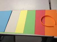
Using colour in InDesign:


The colour palette is similar to those of Illustrator and Photoshop, but the swatches palette is better to use in InDesign instead because they can be Pantone accurate and can be used again and again in large documents because they are saved to the library:


To fill a shape with colour, simply draw a shape and select a colour from either of the colour palettes:


To apply colour to a text frame, select the text frame and adjust using the two coloured icons (similar to illustrator, shown in this image top left):


To change the colour of the text itself, you just select the text using the type tool and select a colour : 


To create a new swatch, you can drag a colour from the colour palette, or click on the 'new swatch' icon in the swatches panel. You need to work in CMYK mode for this as this is what will print. Drag the sliders until you reach the desired colour. This will add your new colour to the swatches library.

----------

Printing in InDesign is quite similar to that in Photoshop and Illustrator ....


to use the printer in the studio, you must set the paper size to 'defined by driver' then go to page setup and select the paper in there:


------

PDF is the most common way to print in InDesign:


smallest file size will create the document that is suitable for email, high quality print is for final prints and the other PDF options are the happy medium along with the press quality.

save the export to a location and check 'view pdf after export' to see what your document looks like:


Tuesday 15 January 2013

OUGD404 - Design Principles - Colour Theory - Parts 3 & 4 - Study task 4

Colour Theory - Part 3 - Colour and Contrast.


Johannes Itten's Seven Contrasts of Colour:

Contrast of Tone

In a sentence, the difference between the light and dark of colours. 

Contrast of Hue

A higher contrast of hue means a higher contrast in colour shade. IE, the colours being discussed are far away from each other on the colour wheel.

Contrast of Saturation

Contrast of saturation describes the strength of colour next to another shade. 

Contrast of Extension

Also known as the contrast of proportion, this is used when describing the proportional field sizes in relation to the visual 'weight' of colours. Darker colours = 'heavier colours and vice versa. 
Lots of 'light' colour to a small portion of 'heavy' colour can almost balance the colour.
Hierarchy of text can be assisted when contrast of extension is considered.

Contrast of Temperature

What it says on the tin. For example, Scarlett Red is 'warmer' than magenta pink, because it is closer to a violet hue.

Complementary Contrast

complementary colours are those that are at complete perceptual opposites. A high level of most contrasts is found in complementary colours. This does not mean that they go together! It just means that they are at opposites, and so stand out the most.


Simultaneous Contrast

Formed when colour boundaries perpetually vibrate. If a colour is absent in a piece of artwork, if you stare at it long enough, a shade of this missing colour will appear.


-----------

Identifying different contrasts

Study 1 - Orange Headband

Orange
Contrast of Tone
headband ever so slightly lighter in shade, little to no contrast
Contrast of Hue
little to no contrast because of same colour

Contrast of Saturation
little to no contrast because of same strength of colour

Contrast of Extension
little to no contrast because of little contrast in tone

Contrast of Temperature
little to no contrast because of similar shade

Complementary Contrast
no contrast in this case

Simultaneous Contrast
no contrast in this case


Red

Contrast of Tone
Some contrast, headband is a lot brighter than the red
Contrast of Hue
little to no contrast in hue
Contrast of Saturation
headband stands out because it is a stronger orange, and the background is a weak red
Contrast of Extension
the headband is lighter and brighter, and so the red is darker and 'heavier' so there is quite a contrast
Contrast of Temperature
although red is 'warmer', the orange in this instance is the warmer one because it is higher in saturation
Complementary Contrast
no contrast in this case
Simultaneous Contrast
little to no contrast in this case
Green
Contrast of Tone
hardly any contrast of tone, both of similar brightness
Contrast of Hue
quite a stark contrast of hue because of the variation of shades
Contrast of Saturation
slight contrast because of weak green and strong orange
Contrast of Extension
little to no contrast because of similar shade of tone
Contrast of Temperature
Cool green against warm orange equals stark contrast
Complementary Contrast
quite a stark contrast because of the difference in the two ranges the colours come from
Simultaneous Contrast
slight contrast in this case


Yellow
Contrast of Tone
little contrast - the orange is slightly darker
Contrast of Hue
little contrast in hue because of similarity of colour range
Contrast of Saturation
slight contrast in saturation because the orange is a stronger orange than the yellow is yellow
Contrast of Extension
The orange is heavier than the yellow because it is darker in tone
Contrast of Temperature
the orange is warmer
Complementary Contrast
little to no complementary contrast
Simultaneous Contrast
quite a lot of contrast because the colours are so close together on the colour wheel.
Biege
Contrast of Tone
little to no contrast because they are both quite light
Contrast of Hue
very high contrast of hue - completely different colours
Contrast of Saturation
the biege is very dull, whereas the orange is a lot stronger
Contrast of Extension
because the orange is stronger, it is also heavier, creating a high contrast in extension
Contrast of Temperature
The orange is a lot warmer than the beige
Complementary Contrast
quite a stark contrast in oppositions
Simultaneous Contrast
little to no contrast
Blue
Contrast of Tone
little contrast in tone, because the orange is bright but the blue is light
Contrast of Hue
very high contrast of hue - completely different colours
Contrast of Saturation

quite a large contrast in between the strengths of these colours
Contrast of Extension
little to no contrast since they are both quite dense colours
Contrast of Temperature
large contrast between temperatures as blue is far into the cold range and the orange being the opposite
Complementary Contrast
large contrast because of the contrast in temperature
Simultaneous Contrast
little to no contrast

Study 2


Contrast of Tone
little to no contrast of toneContrast of Hue
little to no contrast in hue - same colour spectrumContrast of Saturation
little contrast of saturation - both quite weak bluesContrast of Extension
little to no contrast in extension because of little to no contrast of tone
Contrast of Temperature

little to no contrast in temperatureComplementary Contrast
little contrast because of similar colour shadeSimultaneous Contrast
little to no simultaneous contrast


Contrast of Tone
little contrast of toneContrast of Hue
little to mid contrast of hue - blue and yellow are relatively close colours but this yellow is slightly warmer than the blue and so is nearer the red spectrumContrast of Saturation
little contrast of saturation - yellow is stronger than blueContrast of Extension
little to no contrast in extension because of little to no contrast of tone
Contrast of Temperature

little - mid contrast in temperatureComplementary Contrast
high contrast because of immediate appearance in photoSimultaneous Contrast
mid- high simultaneous contrast


Contrast of Tone
minimal contrast of toneContrast of Hue
little contrast of hue - blue and green are relatively similar coloursContrast of Saturation
little contrast in saturationContrast of Extension
minimal contrast in extension because of minimal contrast of tone
Contrast of Temperature

little - mid contrast in temperatureComplementary Contrast
little complementary contrast Simultaneous Contrast
little to no simultaneous contrast


Contrast of Tone
little contrast of toneContrast of Hue
high contrast of hueContrast of Saturation
high contrast of saturation - orange is very strongContrast of Extension
little to no contrast in extension because of little to no contrast of tone
Contrast of Temperature

high contrast of temperatureComplementary Contrast
high complementary contrast - colours are perceptual oppositesSimultaneous Contrast
mid- high simultaneous contrast


Contrast of Tone
mid contrast of toneContrast of Hue
high contrast of hueContrast of Saturation
high contrast of saturation - red is very wholesome and strongContrast of Extension
mid contrast of extension because of mid contrast in tone
Contrast of Temperature

high contrast of temperatureComplementary Contrast
high complementary contrast - colours are perceptual opposites
Simultaneous Contrast

mid- high simultaneous contrast

Study 3 - orange handle of a pair of scissors


Contrast of Tone
mid contrast of toneContrast of Hue
high contrast of hueContrast of Saturation
high contrast of saturation - orange lot stronger than blueContrast of Extension
mid/high contrast of extension because of mid contrast in tone and high contrast of saturationContrast of Temperature
high contrast of temperatureComplementary Contrast
high complementary contrast - colours are perceptual opposites
Simultaneous Contrast

mid- high simultaneous contrast


Contrast of Tone
little to no contrast of toneContrast of Hue
little to mid contrast in hueContrast of Saturation
little contrast of saturationContrast of Extension
little to no contrast in extension because of little to no contrast of tone
Contrast of Temperature

little contrast of temperatureComplementary Contrast
low complementary contrast Simultaneous Contrast
mid- high simultaneous contrast


Contrast of Tone
little to no contrast of toneContrast of Hue
high contrast of hueContrast of Saturation
little contrast in saturationContrast of Extension
little to no contrast in extension because of little to no contrast of tone
Contrast of Temperature

mid- high contrast of temperatureComplementary Contrast
high contrast in this caseSimultaneous Contrast
mid- high simultaneous contrast


Contrast of Tone
mid contrast of toneContrast of Hue
little to no contrast of hueContrast of Saturation
little to no contrast in saturationContrast of Extension
little contrast of extension because of mid contrast in tone
Contrast of Temperature

mid- high contrast of temperatureComplementary Contrast
little to mid complementary contrastSimultaneous Contrast
little to no simultaneous contrast


Contrast of Tone
no contrast of toneContrast of Hue
no contrast of hueContrast of Saturation
no contrast of saturationContrast of Extension
no contrast of extensionContrast of Temperature
no contrast in temperatureComplementary Contrast
no complementary contrastSimultaneous Contrast
possibility of simultaneous contrast in that they are practically the same colour - you cannot tell where one colour ends and the other begins if not for the shadow of the object.

Study 4


Contrast of Tone
high contrast of tone between the vivid piece of paper and the dull blue backgroundContrast of Hue
very high contrast of hueContrast of Saturation
very high contrast of saturation - blue is very weak Contrast of Extension
high contrast of extension because of high contrast in tone
Contrast of Temperature

high contrast of temperatureComplementary Contrast
high complementary contrast - colours are perceptual opposites
Simultaneous Contrast
mid- high simultaneous contrast


Contrast of Tone
little contrast of toneContrast of Hue
little to mid contrast of hueContrast of Saturation
quite high contrast of saturationContrast of Extension
little to no contrast in extension because of little to no contrast of tone
Contrast of Temperature

little - mid contrast of temperatureComplementary Contrast
mid complementary contrastSimultaneous Contrast
mid amount of simultaneous contrast


Contrast of Tone
little contrast of toneContrast of Hue
little to no contrast in hueContrast of Saturation
mid contrast of saturationContrast of Extension
little to no contrast in extension because of little to no contrast of tone
Contrast of Temperature

little to no contrast of temperatureComplementary Contrast
little to mid complementary contrastSimultaneous Contrast
little to no simultaneous contrast


Contrast of Tone
notable contrast of toneContrast of Hue
high contrast in hueContrast of Saturation
little to no contrast of saturationContrast of Extension
little to mid contrast of extension because of notable contrast in tone
Contrast of Temperature

high contrast of temperatureComplementary Contrast
high complementary contrast - colours are perceptual opposites
Simultaneous Contrast

mid- high simultaneous contrast


Contrast of Tone
little contrast in toneContrast of Hue
little to no contrast in hueContrast of Saturation
little to mid contrast of saturation - background is slightly weaker that foregroundContrast of Extension
little to no contrast in extension because of little to no contrast of tone
Contrast of Temperature

little to no contrast of temperatureComplementary Contrast
little to mid complementary contrast
Simultaneous Contrast

little to no simultaneous contrast

Study 5 - orange in the wings of a toy


Contrast of Tone
high contrast in toneContrast of Hue
high contrast in hueContrast of Saturation
high contrast of saturation  - wings of toy are a lot stronger than the duller backgroundContrast of Extension
high contrast of extension because of high contrast in tone
Contrast of Temperature

high contrast of temperatureComplementary Contrast
high complementary contrastSimultaneous Contrast
mid- high simultaneous contrast


Contrast of Tone
little to no contrast in toneContrast of Hue
little to no contrast in hueContrast of Saturation
little contrast in saturationContrast of Extension
little to no contrast in extension because of little to no contrast of tone
Contrast of Temperature

little- mid contrast of temperatureComplementary Contrast
little to mid complementary contrastSimultaneous Contrast
little to no simultaneous contrast


Contrast of Tone
little to no contrast in toneContrast of Hue
high contrast in hueContrast of Saturation
little contrast in saturationContrast of Extension
ittle to no contrast in extension because of little to no contrast of tone
Contrast of Temperature

mid contrast of temperatureComplementary Contrast
mid complementary contrast Simultaneous Contrast
mid- high simultaneous contrast


Contrast of Tone
notable amount of contrast in toneContrast of Hue
little contrast in hueContrast of Saturation
mid contrast of saturationContrast of Extension
mid contrast of extension because of mid contrast in tone
Contrast of Temperature

little - mid contrast of temperatureComplementary Contrast
little to mid complementary contrastSimultaneous Contrast
mid simultaneous contrast


Contrast of Tone
notable amount of contrast in toneContrast of Hue
no contrast in hueContrast of Saturation
little to no contrast in saturation - both oranges of similar strengthContrast of Extension
little amount of contrast in extension because of little tonal rangeContrast of Temperature
little to no contrast of temperatureComplementary Contrast
little to no complementary contrastSimultaneous Contrast
little to no simultaneous contrast

Study 6
Contrast of Tone
great contrast of toneContrast of Hue
mid contrast of hueContrast of Saturation
mid to high contrast in saturation - background is very strong compared to dull objectContrast of Extension
high contrast of extension because of high contrast in tone
Contrast of Temperature

mid contrast of temperatureComplementary Contrast
high complementary contrast - colours are perceptual opposites
Simultaneous Contrast

mid- high simultaneous contrast


Contrast of Tone
little contrast in toneContrast of Hue
little contrast in hueContrast of Saturation
mid contrast in saturationContrast of Extension
little to no contrast in extension because of little to no contrast of tone
Contrast of Temperature

little to no contrast of temperatureComplementary Contrast
little to no complementary contrast
Simultaneous Contrast

little to no simultaneous contrast


Contrast of Tone
great contrast in toneContrast of Hue
little - mid contrast of hueContrast of Saturation
high contrast in saturation - background a lot stronger than objectContrast of Extension
high contrast of extension because of great contrast in tone
Contrast of Temperature

little contrast of temperatureComplementary Contrast
little complementary contrast
Simultaneous Contrast

little to mid simultaneous contrast


Contrast of Tone
little contrast of toneContrast of Hue
high contrast of hueContrast of Saturation
high contrast of saturationContrast of Extension
little contrast in extension because of minimal contrast of tone
Contrast of Temperature

high contrast of temperatureComplementary Contrast
high complementary contrast
Simultaneous Contrast

little to no simultaneous contrast


Contrast of Tone
high contrast of toneContrast of Hue
high contrast of hueContrast of Saturation
high contrast of saturationContrast of Extension
high contrast of extension because of high contrast in tone
Contrast of Temperature

high contrast of temperatureComplementary Contrast
high complementary contrast - colours are perceptual opposites
Simultaneous Contrast

little to no simultaneous contrast

Study 7


Contrast of Tone
Dramatic contrast in tone - the box is drastically darker than the paperContrast of Hue
little to mid contrast of hue - if the tone of both colours was adjusted to the same, the box, I think, would be a stronger blue than the weaker paper colour.Contrast of Saturation
little to mid contrast in saturationContrast of Extension
high contrast of extension because of high contrast in tone- proportionally imbalanced
Contrast of Temperature

Not a great contrast in temperature - in fact none at all.Complementary Contrast
high complementary contrast because of tone
Simultaneous Contrast

mid amount of simultaneous contrast


Contrast of Tone
Drastic contrast of tone between the bright yellow and nearly black boxContrast of Hue
mid contrast of hueContrast of Saturation
mid contrast in saturation
Contrast of Extension
high contrast of extension because of high contrast in tone- proportionally imbalanced
Contrast of Temperature

mid- high contrast in temperature
Complementary Contrast
high complementary contrast - colours are perceptual opposites
Simultaneous Contrast

mid- high simultaneous contrast


Contrast of Tone
High contrast in tone between bright lime green and nearly black boxContrast of Hue
mid contrast of hue Contrast of Saturation
mid contrast of saturationContrast of Extension
high contrast of extension because of high contrast in tone- proportionally imbalanced
Contrast of Temperature

mid- high contrast in temperature
Complementary Contrast

high complementary contrast because of toneSimultaneous Contrast
mid- high simultaneous contrast


Contrast of Tone
High contrast in toneContrast of Hue
high contrast of hueContrast of Saturation
little to no contrast in saturation - not sure?Contrast of Extension
high contrast of extension because of high contrast in tone- proportionally imbalanced
Contrast of Temperature

mid- high contrast in temperature
Complementary Contrast

high complementary contrast because of tone
Simultaneous Contrast

mid- high simultaneous contrast


Contrast of Tone
High contrast in toneContrast of Hue
high contrast of hueContrast of Saturation
high contrast of saturation Contrast of Extension
high contrast of extension because of high contrast in tone- proportionally imbalanced
Contrast of Temperature

mid- high contrast in temperature
Complementary Contrast

high complementary contrast because of tone
Simultaneous Contrast

mid- high simultaneous contrast

Study 8


Contrast of Tone
Mid - high contrast of toneContrast of Hue
little to mid contrast of hueContrast of Saturation
little contrast in saturationContrast of Extension
mid- high contrast of extension because of tonal contrastContrast of Temperature
little contrast in temperatureComplementary Contrast
high complementary contrast because of tone
Simultaneous Contrast

little to no simultaneous contrast


Contrast of Tone
High contrast in toneContrast of Hue
mid contrast of hueContrast of Saturation
mid to high contrast in saturationContrast of Extension
high contrast of extension because of high contrast in tone
Contrast of Temperature

little - mid contrast in temperatureComplementary Contrast
high complementary contrast - colours are perceptual opposites
Simultaneous Contrast

mid- high simultaneous contrast


Contrast of Tone
High contrast of toneContrast of Hue
little to mid contrast of hueContrast of Saturation
little to mid contrast of saturationContrast of Extension
high contrast of extension because of high contrast in tone- proportionally imbalanced
Contrast of Temperature

mid contrast of temperatureComplementary Contrast
high complementary contrast - colours are perceptual opposites
Simultaneous Contrast

mid- high simultaneous contrast


Contrast of Tone
mid- high contrast of toneContrast of Hue
high contrast of hueContrast of Saturation
mid - high contrast of saturationContrast of Extension
mid contrast of extension because of mid contrast of toneContrast of Temperature
mid- high contrast of temperatureComplementary Contrast
high complementary contrast - colours are perceptual opposites
Simultaneous Contrast

mid- high simultaneous contrast


Contrast of Tone
High contrast of toneContrast of Hue
high contrast of hueContrast of Saturation
high contrast of saturation - foreground is a lot duller than backgroundContrast of Extension
high contrast of extension because of high contrast in tone
Contrast of Temperature

mid- high contrast of temperatureComplementary Contrast
high complementary contrast - colours are perceptual opposites
Simultaneous Contrast

mid- high simultaneous contrast

Study 9


Contrast of Tone
mid - high contrast of toneContrast of Hue
high contrast of hueContrast of Saturation
high contrast of saturationContrast of Extension
high contrast of extension because of high contrast in tone- but proportionally balanced
Contrast of Temperature

mid- high contrast of temperature
Complementary Contrast

high complementary contrast - colours are perceptual opposites
Simultaneous Contrast

mid- high simultaneous contrast


Contrast of Tone
little contrast of toneContrast of Hue
little to mid contrast of hueContrast of Saturation
mid - high contrast of saturationContrast of Extension
little to no contrast in extension because of little contrast of tone
Contrast of Temperature

little- mid contrast of temperature
Complementary Contrast

mid complementary contrast because of tone
Simultaneous Contrast

little to no simultaneous contrast 


Contrast of Tone
little to no contrast of toneContrast of Hue
mid to high contrast of hue
Contrast of Saturation
little - mid contrast of saturationContrast of Extension
little to no contrast in extension because of little to no contrast of tone
Contrast of Temperature

little- mid contrast of temperatureComplementary Contrast
little to mid complementary contrast because of tone
Simultaneous Contrast

mid- high simultaneous contrast


Contrast of Tone
little contrast of toneContrast of Hue
little to no contrast of hueContrast of Saturation
little - mid contrast of saturationContrast of Extension
little to no contrast in extension because of little to no contrast of tone
Contrast of Temperature

little to no contrast in temperatureComplementary Contrast
little complementary contrast because of tone
Simultaneous Contrast

little to no simultaneous contrast


Contrast of Tone
no contrast of toneContrast of Hue
very little to no contrast of hueContrast of Saturation
little to no contrast in saturationContrast of Extension
little to no contrast in extension because of little to no contrast of tone
Contrast of Temperature

little to no contrast in temperatureComplementary Contrast
no complementary contraste
Simultaneous Contrast

little to no simultaneous contrast

Study 10


Contrast of Tone
high contrast of toneContrast of Hue
very little to no contrast of hue
Contrast of Saturation

mid- high contrast of saturationContrast of Extension
high contrast of extensionContrast of Temperature
little contrast in temperatureComplementary Contrast
high complementary contrast because of tone
Simultaneous Contrast

little to mid simultaneous contrast


Contrast of Tone
high contrast of toneContrast of Hue
little contrast of hueContrast of Saturation
little - mid contrast of saturationContrast of Extension
high contrast of extension because of high contrast in tone- proportionally imbalancedContrast of Temperature
 high contrast of temperature
Complementary Contrast

high complementary contrast - colours are perceptual opposites
Simultaneous Contrast

mid- high simultaneous contrast


Contrast of Tone
high contrast of toneContrast of Hue
mid contrast of hueContrast of Saturation
mid - high contrast of saturationContrast of Extension
high contrast of extension because of high contrast in tone- proportionally imbalanced
Contrast of Temperature

 high contrast of temperature
Complementary Contrast

high complementary contrast - colours are perceptual opposites
Simultaneous Contrast

mid- high simultaneous contrast


Contrast of Tone
high contrast of toneContrast of Hue
high contrast of hueContrast of Saturation
mid contrast of saturationContrast of Extension
high contrast of extension because of high contrast in tone- proportionally imbalanced
Contrast of Temperature

 high contrast of temperature
Complementary Contrast

high complementary contrast - colours are perceptual opposites
Simultaneous Contrast

mid- high simultaneous contrast


Contrast of Tone
high contrast of toneContrast of Hue
high contrast of hueContrast of Saturation
little - mid contrast of saturation
Contrast of Extension
high contrast of extension because of high contrast in tone- proportionally imbalanced
Contrast of Temperature

 high contrast of temperature
Complementary Contrast

high complementary contrast - colours are perceptual opposites
Simultaneous Contrast

mid- high simultaneous contrast