


 |
| The lower leg was out of balance with the rest of the letterform, |
 |
| The diagonal of the bottom leg needed to mirror the right arm , but this looked unusual and again, imbalanced. |
 |
| By incorporating the same lower counter as the A, I was able to resolve both imbalances. |


 |
| Following on from the child-like/ storybook theme I immediately thought that a pop-up would be an appropriate idea. These designs here show V-fold mechanisms with several different themes. The first being a snapshot from Snow White, connecting with my poster design. 'Once upon a time' would be written along the bottom with some sort of reference to political correctness. I didn't really like this idea, only because I'm not entirely sure what the message would be from this. If unaccompanied by the poster then this mailer wouldn't make to much sense... Again, I do not think that my Jack & the beanstalk pop up mailer has a strong enough message without an effect-ruining lengthy paragraph! The Baa baa black sheep idea would be the sheep jumping over the fence, as if it were a childrens bedtime storybook. Along the bottom it would say baa baa black sheep, with 'black' scribbled out. I like this idea as it portrays the same themes and idea but still different to the poster designs. And finally, a Mickey Mouse in Steamboat Willie pop up book. Through my research I found that it is quite politically incorrect, with one scene showing Minnie being craned up by her underwear onto the boat. This wouldn't need any censor bars and would still communicate the message well. |
 |
| My first idea on this page would be the 'postcards from the past' mailer. It features vintage postcards/ images turned into postcards from around the 1940s/50s showing typical housewives/ 'sexist' roles from that time. On the back of the postcard it would question these roles in a politically correct manner. I quite like this idea as it reflects on times that weren't so politically correct but at the same time weren't actually offensive and making the reader think about how times have changed. 40s and 50s art is very in trend at the moment and would appeal to a large audience. My envelope front cover design consists of a close-up of the 'most offensive' part of my image poster - Minnie's censored underwear, with big block letters reading 'THIS CONCERNS YOU". Perhaps a little odd, but this would confuse the reader and make them curious as to what is inside. Another idea would be the interactivity surrounding a sliding mechanism. There would be an image of Minnie with the censor bar and when you pull the tab it reveals the same image but without the censor bar. This would disappoint the reader, as not much changes, but that is the point. It would prove that hypersensitivity is unnecessary because the offending article isn't actually offensive. Another, simpler concept of this, would be a card with a tracing paper front. The image of Minnie would be printed on the inside with the censor bar covering the outside and when you open the card the bar is taken away. My final idea on this page is the army-style recruitment leaflet for the 'battle against PC'. I do not think that this is a very strong idea because of it's loose themes and typical style of contemporary advertising. |
 |
| A few more ideas for my direct mail piece were actually taken from my poster design ideas. Here, we have a fake (or possibly real?) order form for a golly-wog toy. It would either be readily filled out with the name of the recipient and would shock them with the association of their name with a supposedly 'racist' toy. This would make them realise that it is just a doll and perhaps part of history as being just a doll and there was no need for offence, even when it was made. My original idea about stereotypes for my poster design could be used like a postcard, with questions on the back like 'Do you find this offensive?' and 'What is the first word that comes to mind?', hoping to challenge the readers beliefs on what is offensive. There could be other postcards of this style, such as 'baa baa black sheep', 'jack and the beanstalk' and 'merry christmas folks!' because there is room for explanation of their meanings in this format. |


 |
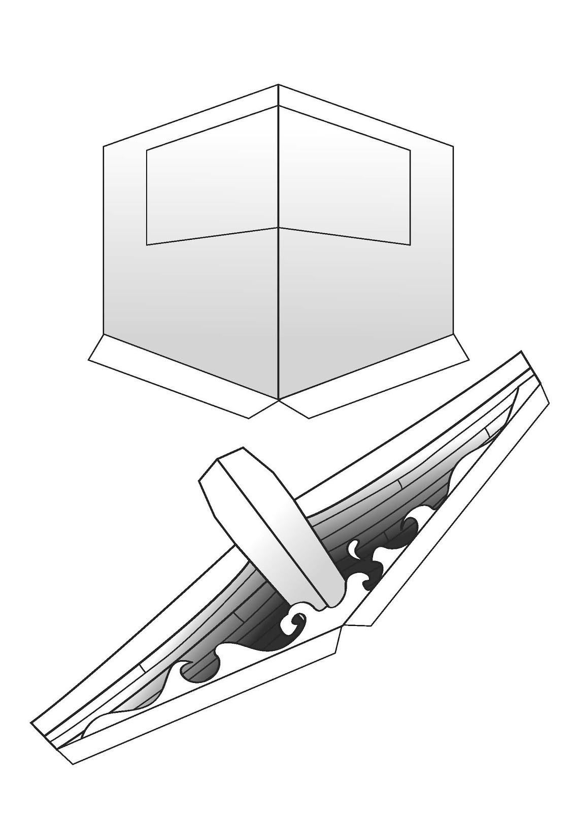
| Although in my design ideas I drew a V-fold mechanism, I began my investigation with a normal pop-up mechanism, as I thought that the inclusion of the skyline with smoke was necessary. I began experimenting with different sizes. |
 |
| ... and started thinking about how they could be applied. The problem with this sort of mechanism was that the further forward (towards the viewer) the pop-up is, the smaller it has to be, which wasn't very good when you're trying to create the illusion of perspective. I decided that my original idea of the V-fold was the best resolution to this problem. |
 |
| The first trial of this practice was in fact very successful. I drew the cabin of the boat in a dramatised 3d style with a cut-out window, and the front of the ship a lot shorter with the front beam being the tallest thing. |
 |
| I stuck these onto a piece of paper double the width of the correct dimensions of the required envelope. IE, this would BE the envelope. I had to trim down any parts that stuck out of the envelope when closed. I then pulled apart the design and scanned it into the mac. |
 |
| This tiny v-fold was to accomodate a flying arm mechanism. Meaning that Minnie could be attached to this on an arm and appear to extend out on an angle from the page. But after testing this, I found that it was unsuccessful in that Minnie always came out a different angle or that she stuck out of the envelope when closed. So I discontinued this idea. |
 |
| I used the pen tool to trace half of each design. I then highlighted it with the black arrow and copied and pasted it so that each of the two were symmetrical. I played around with gradients to give the effect of shadows. I also used a thick brush stroke to enhance the cartoon style. I also kept it black and white because they are my chosen colours. (and it's a black and white cartoon) |
 |
| Again, using the pen tool I traced around images of stills from the cartoon itself and used gradients and block colours to bring the characters to life. I then used the 'live trace' tool to turn an image of a boat steering wheel into a black and white vector image. I didn't include arms or any more particular details of mickey because these would be hidden behind the steering wheel. |
 |
| I didn't want the outside of the envelope to be over-complicated, but have an initially curious yet short title to invite the viewer in. I chose to write 'Do you feel OFFENDED?', which stands out from other front covers of direct mail envelopes. I kept it really simple with colours and used type to entice the reader. The writing on the back of the envelope is in fact upside down when you come to open it, and the tab is over the text when closed. This was done on purpose, as the reader would want to know what the text says, and in doing so opens the letter. |
 |
| The inside of the envelope is also very simple, so as not to distract the viewer from the pop up mechanism. I chose the same font as the Mickey Mouse trademark and a suitable script font to mock-up a scene from the cartoon. I used the same scribbly style font to highlight the political incorrectness of this scene, thus uniting the mailer with the posters. |
 |
| Once completed and assembled, I think that the pop-up is a strong and interesting way of communicating to people of all ages, even if the style is mock-cartoon. The message is clear yet simple and portrayed in clear yet simple aesthetics. |
 |
| Minnie mouse sits within the gap between the front of the boat and the cabin on a small V-fold of her own and stays vertical with a small piece of paper keeping her distance from the cabin. |
 |
| Mickey drives the boat. |


  |
| On this page I chose to explore mainly typographic design ideas. Because these were only quick ideas, I didn't draw any specific format and, only when I were to develop these would I play around with scale and format. I started with the theme of censorship, and really wanted to emphasise its use on things that most people would question as to why. I started with Christmas, because in my research I found that 'Christmas' is usually avoided in marketing campaigns for politically correct reasons in USA. I thought that maybe censoring it out with a typical black bar might be comical or perhaps the illusion of the word being ripped off the page might reflect my anger about the matter. I then thought that the actual identity of the word might be lost so i thought that the word could be literally cut out the page, so still readable but making a point. I also played with the idea of 'Baa baa black sheep' because of the infamous political correctness attack on this due to 'racism'. I thought that emphasizing the 'offending' word by making it larger or bolder might shock the reader, then maybe lead them to question their own reaction? I liked the idea of using children's nursery rhymes/ stories because of their innocence, labouring the fact that I do not think that editing or altering non-offensive material is necessary. I took Snow White and the seven dwarfs. With 'White' referring to the colour of her skin, and 'dwarf' being a partially offensive term, I liked the idea of the 'offensive' words being scribbled out in scruffy, graffiti writing. The rest of the poster would be ornate and beautiful, showing that political correctness is often more offensive than the 'offending' articles themselves (in my opinion). I then played around with the idea of the asterisk, because its almost an interruption to the otherwise complete artwork. I liked this idea a lot because it could be used across all 3 posters because of it imagery and typographic categorization. |
 |
| Again, on this page I was mainly focused on typographic design ideas. I thought that 'pretty fly for a caucasian guy' would have appeal to younger generation with reference to the offsprings 'pretty fly for a white guy' song. This would also have a comical appeal. Again, going along with the idea of graffiti, I thought that a mock advert for Marks and Spencer Christmas cake could be changed to 'winter cake'. But with a limited colour scheme, this may not be as effective as hoped. Going back to the idea of the asterisk, the words 'Its a free country' with '*conditions apply' at the bottom, because you could consider this country not free because the limited use of free speech. I used the asterisk idea again with a quote from the bible, with the controversial theme that holy words are flawed. Because of the use of political correctness, sometimes the truth cannot set you free. This would be presented in ornate, beautiful, 'book of hours' style typography for emphasis on its holiness. |
 |
| Now focusing on the imagery based poster, I continued with the theme of political incorrectness through the innocence of a child's eye with the idea of a child's toy shelf with a golly-wog doll in amongst other toys. The point being that it's just a doll, only children would see it as a doll and it shouldn't have racial connotations. After researching into stereotypes, I found that (online, in forums, chatrooms etc) that watermelon, kool-aid drink and KFC were all (wrongly) associated with black people. The idea of having these three images simply displayed with no text would at first, offend the viewer, but then, hopefully make them realise that their offence has come from themselves, and that these three images are not offensive or racist in any way. Through my research I found that disney characters usually feature nudity obviously in a non-explicit, none offensive way, but this could be taken to ridiculous, politically correct proportions, with censorship coming into practise. This again, would add a comical effect and I also think that this would communicate my message clearly. After finding out that some fast food chains around London and Manchester are now only serving halal meats, if any. Halal meats are meats that have been produced in religious slaughtering conditions and rituals and also have all of the blood drained. The idea of the blood being drained could be should through an image of a vampire, with the Mcdonald's logo as a typical vampire headress. Although I like the symbolism of this idea, its not a clearly communicative message and would require (a lot of) text to explain, which would ruin the effect. I thought that, if I were to use the asterisk in my other designs , I could incorporate it into my image-only poster by using it to censor politically incorrect images. Such as a housewife washing up, circa 1950s, the asterisk reflecting on no tolerance of sexism. The fairytale theme of Snow white /Jack and the beanstalk used in my typographic posters could be continued with a knight rescuing a princess with the asterisk over their face as they are about to kiss. This would be communicating that women are independent and don't need rescuing in political correctness. |
 |
| The top two ideas are inspired by Banksy's work I found in my research. I don't think that they are very strong ideas because they are quite stereotypical but at the same time unrealistic. Punch and Judy, a traditional children's pastime could be considered a form of domestic violence from a politically correct point of view. |
 |
| In this image, I am experimenting with different layouts and ideas for my just image based poster. I thought that including logos with words in theme may be counted as text, so I just used the pictorial logos for Kool-Aid and KFC. Out of the two designs I prefer the one on the left, because the images are static and so give a neutral mood, the effect I want to create. The sketchy style of the golly-wog on the toy shelf was inspired by a book I had as a child called 'Old bear stories' (investigated in my research). I did not take these ideas any further, for the fear that when executed that the message would be lost in a sort of 'cloud' of offence from the initial images. Although this is what the exact opposite of what I'd hoped, verbal peer feedback led me to believe that people wouldn't take long enough to extract the message without the justification of (a lot of) text. |
 |
| Here, I am developing the aesthetics my 'Jack and the Beanstalk' idea. I really wanted an accurate storybook feel, and decided that, between the two, 'Jack and the Beanstalk' would benefit more from being both image and text, and that Snow white would still work if it was just text based. I looked at Jessica Hische's storybook cover designs for inspiration. A scribbly, 'hand written' note at the bottom would read 'Why is it never Jane?' I eventually dropped the Jack and the Beanstalk idea because I didn't think that it was strong enough to communicate my message, and that the message could be distorted into a pro-feminism campaign. |
 |
| Here, I develop my idea for Snow White and the Seven Dwarfs further. Because I wanted this to be purely text based I looked at Jessica Hisches' designs for inspiration. But, with the limited time available I didn't want to risk wasting time by drawing out my typography perfectly, and decided that I was going to take it onto the mac and research into fonts. |
 |
| I started off experimenting with script fonts, trying to achieve the typical whimsical and fairytale style. I decided to do the poster portrait, like a mock movie poster or storybook cover. Although while keeping it traditional, I still wanted a contemporary feel like the work of Jessica Hische and so I wanted to try it with the typography slanting upwards? I also thought that this font was a little old fashioned... |
 |
| I tried another typeface, experimenting with the intertwining of the letters. Although I like this effect, I also think that this font is a bit old fashioned. The 'and the' part also looked a little bit awkward and out of place. I stuck with the upward slant and the intertwining letters but tried yet again another font... |
 |
| I really liked this typeface for the 'Snow White' part because it is elegant and feminine but I thought that it didn't suit the 'seven dwarfs' part because of this. I also found it difficult incorporating 'and the' into this and so i knew that further development was needed. |
 |
| With the incorporation of both diagonal and horizontal typography, the design seemed to work better and in a more storybook style, too. |
 |
| I decided to stick to the horizontal type for the 'seven dwarfs' part, to contrast with the femininity of the 'Snow White' part. I picked a folksy, old european typeface, much like the style found in the Disney film. |
 |
| I chose yet again another typeface for the 'dwarfs' part so that it would enhance the 'offensive' word. I made sure that the size of the word would unify and centre the design, balancing it out. I added another line under this again, in old story book style. |
 |
| To emphasise (and personalise) the 'snow white' typography, I used the pen tool to create even more swirls off of the letters, with the most similar brush stroke I could find. |
 |
| I added the censor bars, but felt that they were almost too prominent, and that the actual words were almost being lost ( I know that's the purpose of a censor bar, but it wasn't clear why they were being censored, according to my peer verbal feedback). And so I removed them and continued with the rest of the composition until I had come up with another idea! |
 |
| To make it more of a movie poster, and to balance out the vertical space, I added an infamous quote from the movie along the bottom. |
 |
| I felt that the colourless composition was a little bit dull and wouldn't catch peoples attention and so I added a simple curtain-like shape to the background. I verified that this didn't count as an image with my tutor just to be sure. This would bring attention to the poster and unite it with not only movie posters, book covers but stage productions as well, all aimed at children, the perfect style I was trying to achieve. |
 |
| To resolve my problem with the censor bar, I reverted back to my original idea of political correctness graffitiing the poster and used a wispy brush stroke to achieve this. This meant that the words could still be read (or at least predicted) but the censorship was still clear. But again, I asked my peers for an opinion and they said they still weren't instantly sure as to why these particular words were being censored. Which in my opinion is perfectly feasible because that is the point I was trying to make, but I still wanted the message to come across. |
 |
| So, to the bottom of the image, I used a scribbly font and my original idea of the asterisk to show exactly what I meant. The most important thing in this case is to communicate the message. The fact that it looked messy, in my opinion added to the effect because it represents how I think that political correctness is essentially ruining the 'fun'. |
 |
| I experimented with the angle of the graffiti so that it looked hand written and scribbly. |
 |
| This is an extract from a Christmas Brochure for a fictional company that I have previously designed (unpublished etc). It fits perfectly with my current colour scheme and perfectly communicates a festive mood. I knew that I could use extracts from this for my Christmas poster. |
 |
| I used the same font as I felt that it was perfectly appropriate and took extracts from the imagery. I wrote 'Happy Christmas, Folks!' to focus on American dialogue (since I found in my research that in USA 'Christmas' is usually avoided in marketing campaigns for politically correct reasons) And added a few stars to balance the design. |
 |
| To unify the posters, I went for the same scribbled out effect of the Snow White poster. The 'offending' word being Christmas. |
 |
| Again, to follow the same style I used the same font and the asterisk to very clearly communicate my message. |
 |
| I began on Adobe Illustrator with using the pen tool to trace around an image of Minnie Mouse ( picture found in research) I picked this particular pose because it reveals a lot of her underwear. I experimented with line thickness, using the brush stroke to make the line thicker and thinner where appropriate. I learnt this through the Adobe Illustrator tutorials. |
 |
| I used the fill tool in certain sections before adjusting her skirt so that even more of her underwear was showing, to really emphasise my message. I used the white arrow tool to click and drag the anchor points. |
 |
| I used the same techniques for Donald Duck. I picked this character instead of mickey because he's not wearing pants... I also flipped the Minnie Mouse image so that she is looking toward Donald. |
 |
| Because these two tracings were off different images, I had to play around with proportions to get the characters to look like they're from the same image. I used the black arrow to highlight, and , while holding the shift button, dragged the drawing bigger without distorting it. I liked how the image was going so far, I just needed to add the censor bars. |
 |
| I tried to follow the same style as the previous two posters, but I found that the paintbrush effect really didn't suit this image and probably just made it more politically incorrect... And so I went back to my original idea of the censor bar. I didn't like this idea, because the posters may not work as a set because of this. I tried to apply the brush stroke effect to the characters themselves, but this only left them unrecognisable and the overall design too complicated. I hoped that the theme of political correctness 'over-censorship' along with their colour scheme, would be enough to unite the posters. |
 |
| I added the black censor bars with the rectangle tool. I played around with the length and size of the censor bars for a more comical effect. |
 |
| Again, with the black arrow tool I adjusted and experimented with the size of the characters on the background. At first, I didn't like the amount of white space, but I grew to like it because I didn't want anything else to take the attention away from the simple line drawings of the characters. |
 |
| Finally, I thought that the censor bars were being lost on the black-on-black colour scheme. To make them more prominent, I used the same red as on my Snow White poster for the characters. This makes the characters more unrealistic, but I didn't want them to be associated with the Disney company in their traditional format. |