Roxxie Blackham

&

Joe Leadbeater

Typogateaux Development
The 'Upside-Gingerbread House' & the 'Battenberg Press'
 One of my initial ideas was a gingerbread house, but with a totally typographic twist.... I wanted to turn the house completely upside down, so that the slope of the roof made a 'v' (and so would be angled in such a way so it can't fall over), the candy-cane fence could be 'w's and 'j's ... the idea got really out of control! Since none of us in the group had actually made gingerbread before we researched into it and found out that there could be lots of things that can go wrong, especially if you've never made it before. We thought about the scale, and that to be effective it would have to be somewhat very large. We decided to not pursue this idea any further than paper.
Joe, another member in the group suggested his idea of making the 'Battenberg press' - a battenberg cake made to look like the lead pieces from a letterpress. We all really liked this idea, there was little chance of it going wrong. The only reason we didn't pursue this was because of our other idea was the most favoured...
'The Bauhaus Kuchen' ('the Bauhaus Cake')

Our final idea was to create "The Bauhaus Kuchen" (The Bauhaus Cake). We thought it's relevance to typography was through the fact that the Bauhaus played an important part in the start of Graphic Design through typography. We thought that although it was a building, it shouldn't be too dificult to execute because of its simple, cuboid shape.
But we also wanted to consider the inside, because the Bauhaus is quite plain on the outside (white and grey).
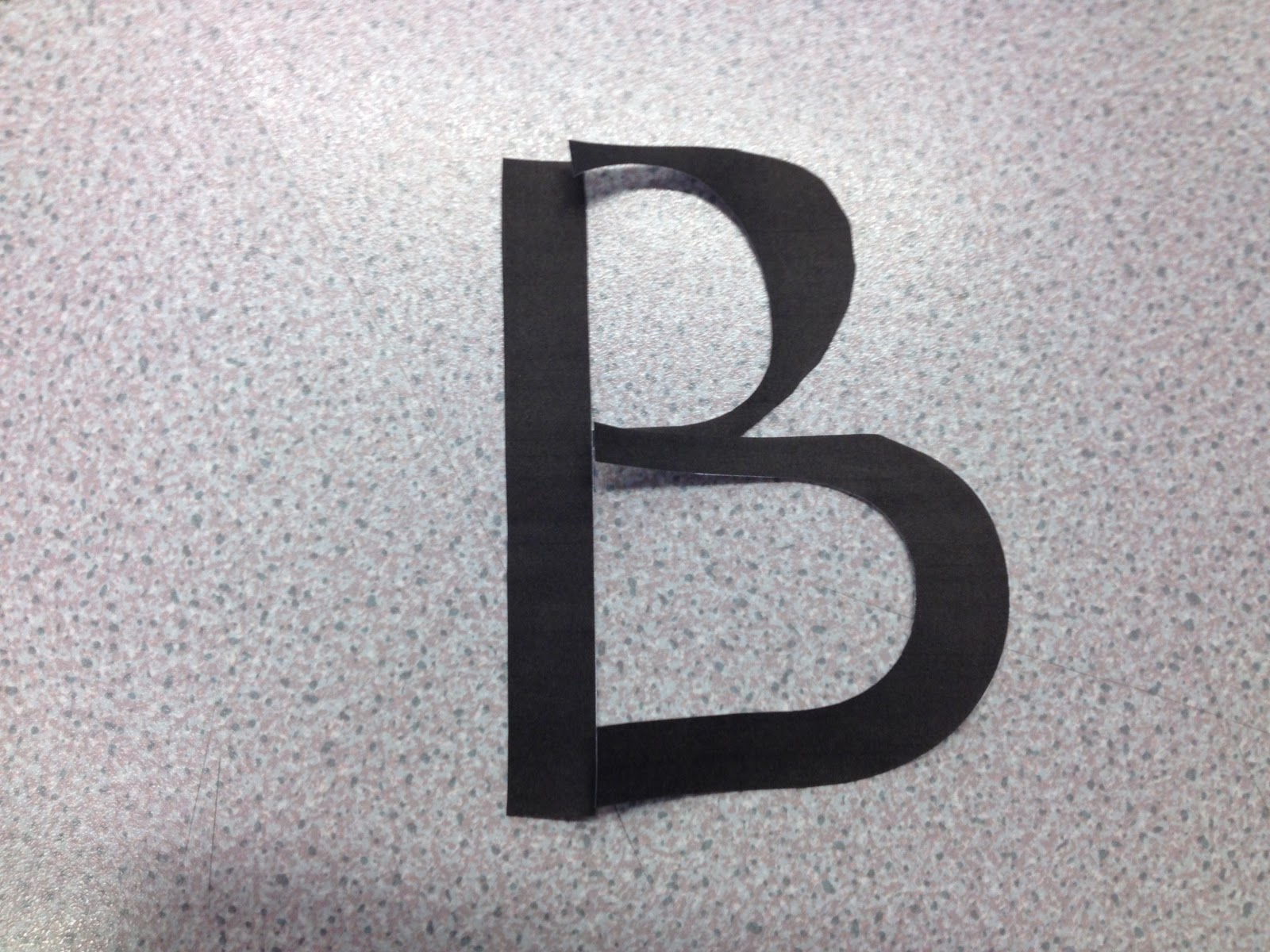
At first, we envisioned the cross section of the cake to be a 'B' (in the bauhaus font) which we really liked, but then decided that the 'b' would have to be really long in length to run the length of the building, meaning we'd have to bake the whole building around it in one go.... and we didn't have a big enough tin.
We still wanted something clever on the inside, so we decided upon rainbow. The rainbow colours would represent the phrase associated with the Bauhaus: 'The centre of creativity'.
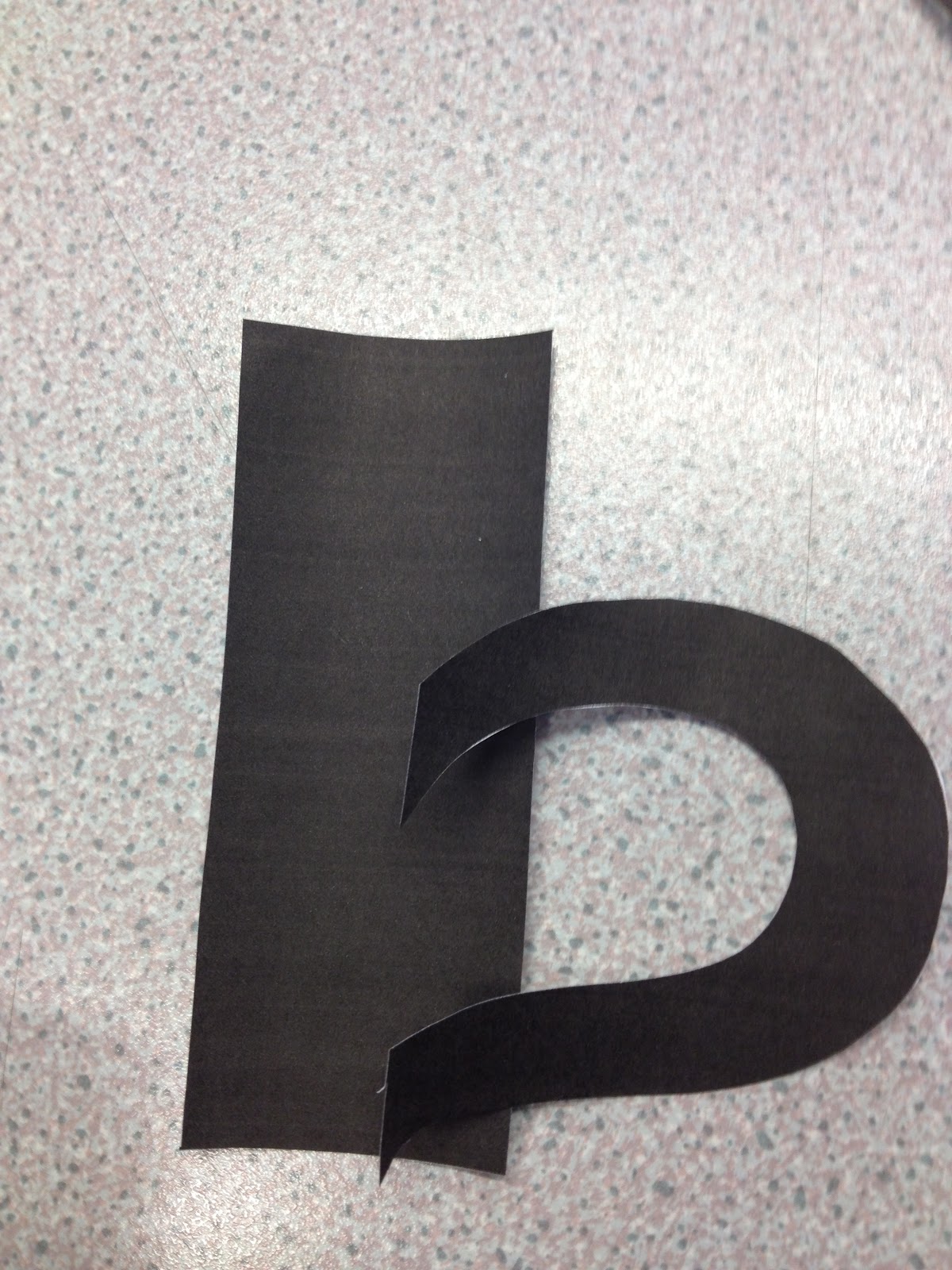
We also thought that the letters down the outside could be cut out of icing using printed out templates, and that the windows could either be; drawn on with writing icing or strips of white roll-out icing. Only experimentation could determine this.
 |
| The Bauhaus. |
Experimentation of the Bauhaus Kuchen
We wanted to try out our ideas, in preparation for the final thing.
Using a victoria sponge mix and several food colouring dyes, we separated the mix into several different bowls and coloured each of the bowls differently:


And then poured them, at random into a large, ready-greased mixing tray:


After using all of the colour from the bowls, we put it into the oven, ensuring that the colours did not move around the tray.

When baked, the cake looked promising!:


Cutting the cake successfully revealed the rainbow insides!


But we did observe that the lilac/ purple we mixed using red and blue had come out greyish and bland in colour and so unappetising. We concluded that we would not use this in the final piece.


......annnddd due to a little over-excitement we applied the buttercream and jam a little bit too early and so it didn't set in the warm cake:


Things we found out after carrying out the test piece:
- purple/ grey is not a good colour.
- do not apply buttercream too early!
- be more systematic when pouring colours into tray, so definition of colours is clearer.
----------
The final Piece


And put it into the oven...


After baking, upon taking out of the tray, part of the bottom got stuck to the tray and so removed part of the cake! But this was Ok, because the slight curvature of the cake was 'shaved' flat to make the building as flat as possible.
We baked a second cake while waiting for this one to cool.


The ceremonial cutting of the cakes:

We cut one cake down the middle of the length, and stacked it up:

The other was also cut down the length of the middle, but was used to create the third layer, and also laid vertically to create the side of the Bauhaus (on the right). The obtruding front part of the Bauhaus was cut out with a knife, any leftover parts being used to fill any gaps.


Then, we mixed some white icing and completely covered the cake in a thin layer, almost like plaster on a wall, trying to remove all the nooks and crannies which would make the finished piece look lumpy.

After several layers of this icing, we began to roll out some ready-roll white icing and cut it into appropriate sections, securing it onto the cake using mixed icing. Any further lumpy parts were made level by more icing being put under the roll out icing layer. We used black food colouring mixed with lots of water to create grey food 'paint' for the front section and roof of the Bauhaus:


We then painted some ready roll icing with this black food colouring, then cut it into strips and stuck onto the side of the Bauhaus using mixing icing:


The Bauhaus lettering was cut out monotonously using a scalpel and refrigerated for as long as possible to make them somewhat strong. We added a picture of Fred to one of the front windows.

Finally, we dusted some icing powder over the roof for snow (since it was Christmas!) and added a novelty Christmas tree.
The door was painted red with red food colouring.

The finished piece:
 |
| The Bauhaus |
|
| The Bauhaus Kuchen. |