OUGD403 Idea Development and Final Designs - Alphabet Soup

Development for cross section of earth style 'A'. I started with sketching an isometric-style cube resembling the typeface i found in my research and then added a wavy top to resemble the stratum diagrams. I decided to add a 'lake' to the cube missing at the top of the A to make it more like a genuine land cross section image.
I then refined the letterform by making the counter smaller and the sides wider, which i much prefer.
I then corrected the proportions and shaded in with pantone markers on the final product:
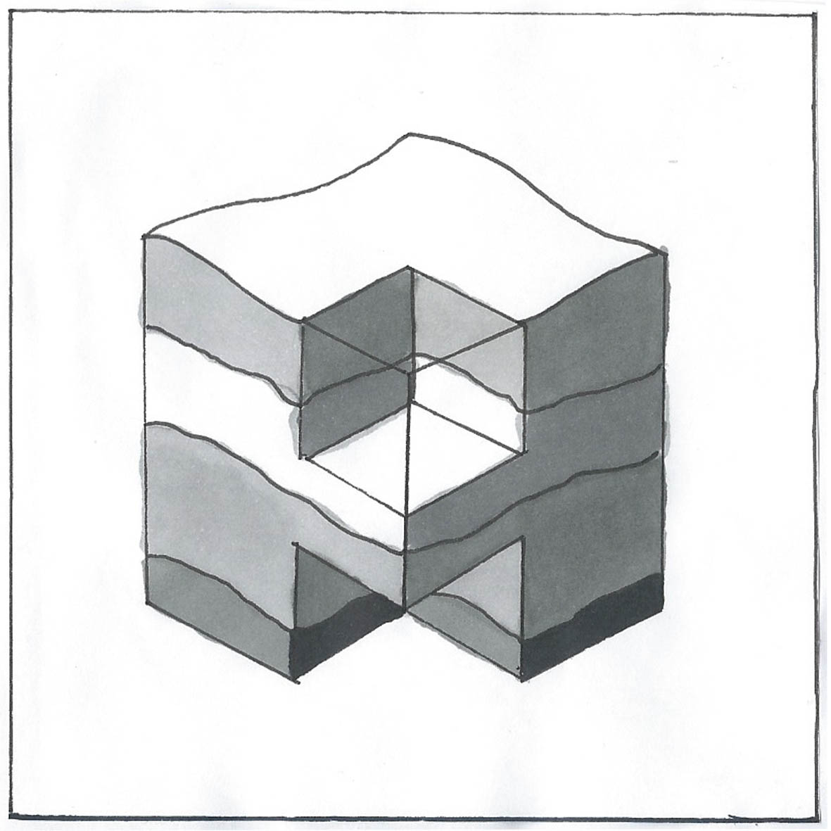 |
| I used pantone markers to give the effect of shadowing and to distinguish different layers. |
------------------------

My initial sketches for the 3D effect were of a simple typeface such as helvetica, as it would be more modern, but i then decided that this could be quite unoriginal/dull and so i chose a little more elaborate typeface. I typed it on the mac, and drew the final image from that. I decided to not include the flick at the side of the letter so the letterform would not be completely copied:
 |
| I like the finished piece and i still think it shows the 3D effect in greyscale. |
------------------------

I used the images of MRI scans from my research to produce simpler sketches, and started to identify letter-like shapes within them. I decided to create a 'C' from the back half of the head in the first image. This is a rather abstract approach to the word layer, but i still think the final piece is quite effective:
 |
| This 'C' could be flipped vertically to also create a 'D' if i were to create a whole typeface from this concept. |
------------------------

To create the anthill-inspired typeface, i took this image and used layout paper to highlight shapes that could be potential letterforms. I tried to keep the unusual twists and turns of the chambers:
 |
In the original tracing i found the capital 'E' on the left hand side to be the most prominent letterform and so developed it further, making the top half angled further forward. I was satisfied with this shape, but i didn't like my original shading and decided that block colour would make it simpler and more effective:

------------------------

My original sketch for my fried egg didn't develop much to the final piece. I wanted it to translate clearly in black and white and so drew it in a cartoon-like style:

------------------------
My eco- efficient typeface also didn't deter much from my original sketch:


------------------------
 |
| For this piece, i printed off an italic 'L' in Helvetica bold and sketched some bricks over the top onto layout paper. I then filled this in with black markers. |
 |
| Using references of onions from my research, my initial sketch for this 'D' i used as my final piece as it was clear enough. |
 |
| I used black and grey pencil to execute this flipchart letterform. I think it clearly resembles those i found in my research. |
 |
| This final letter was heavily inspired by my research into the 'Grease' musical logo, especially the 'quiff' I like this letterform the most because it flows nicely and is a clear representation of hair. |
No comments:
Post a Comment