Tuesday 20 May 2014

OUGD505 - Studio Brief 2 - Final Images

Here are the final images of my luxury Yurt hotel 'Bostandyk' branding:


The stationery designed for inside the yurt itself.


This includes a room service food menu, a drinks menu, note paper, a do not disturb door hanger, cork key hangers, a hotel directory and toiletries, beverages and a first aid box. 


A close up of the ribbed stock. I had to ensure that the lines were vertical on every document.


The cork room keys designed to float when dropped in water should the guest go canoeing!


Cork Wayfinding signage


Office Stationery


Compliment slip


US Letterhead since the hotel is based in Montana!


Closeup of stock.
 

The back of the letterhead and inside of envelope adorned with the Kazakh inspired pattern.


The Business cards
 

Four variations colour coded by the different mini brands of the hotel; room related service, the office, outdoors wayfinding and excursions.

OUGD505 - End of Module Evaluation


BA (Hons.) GRAPHIC DESIGN     
LEVEL 
05
 Module Code  
OUGD505


 Module Title
Design Process


END OF MODULE SELF-EVALUATION

1.  What skills have you developed through this module and how effectively do you think you have applied them?
In this module, the main skill I think I have developed is communication skills and photography/ presentation skills. Constantly keeping up each week with critique sessions and workshops have helped me to gauge where my work should be, as would be in 'real world' constant communication with the client. As for presentation - previously I have settled for shoddy iPhone photos for final presentations and produced design boards as a final thought, and until now haven't seen the importance of setting aside time to present my work properly. Since starting this module, I have learnt how to set up and use professional photography equipment all on my own and produced photographs I am happy to use in my portfolio that do my work a bit more justice! 
I have also greatly improved on my layout design skills in this module. Looking at my research book then looking at all of the design boards that I produced towards the end of the module there's a huge difference! I have come to terms with using grids a lot better and understanding leading, kerning etc in typography. The Jackson Rising session helped a lot!


2. What approaches to/methods of design production have you developed and how have they informed your design development process?
I have, for the first time ever, produced a book with Japanese book binding techniques, which gave my research a more of a folk-inspired look. Other than that, I really don't feel like I've challenged myself enough to try any new methods of design production and only use pretty basic techniques otherwise (IE, Digital print). I think this is because of my loss in confidence in screen printing after the struggles I had with it in OUG504, I try to avoid it at all costs. I need to face my fears and definitely not compromise design decisions for the sake of lack of practice.


3. What strengths can you identify in your work and how have/will you capitalise on these?
This time around, especially for Studio Brief 2 I have chosen to work in a probably more mature style, completely different from my usual preferred style of 1950's and 1960's illustrative style. I think it's a strength that I've gone out of my comfort zone, which for me was a big leap again, as I feel like I've only just got comfy/ good at the one I normally work in!
I have also never really done branding before, so for studio brief 2 it was a nice change! Again, I need to broaden my range of areas of expertise as opposed to packaging, illustration and hand lettering all the time!

4. What weaknesses can you identify in your work and how will you address these in the future?
Because I have come out of my comfort zone in studio brief 2, I think that the execution of my work in this style is quite weak and almost plain, which leaves me really quite unsatisfied as I think that I tried hard to work in a different style, which I don't think is that successful. I really want to improve on this style and learn to teach myself different styles to work in to ensure I am a more versatile designer. 
As always, I have struggled with time management but I see it as a problem that is all-relative to the ever increasing workloads I face. This period seems to be the busiest so far and compared to previous projects I have improved greatly but to meet with the final year's workload I really need to keep timekeeping and staying organised.
I have not been very creative with my design decisions in this module because I don't manage my time properly enough to not put pressure on others that I may require to assist me. For example, I leave it too late to book into the laser cutter, or too late to ask a member of woodwork to help me create something a bit more special. I plan to change this and plan a project in it's entirety completely in advance.


5. Identify five things that you will do differently next time and what do you expect to gain from doing these?
Decide on a research topic quicker and stop being so particular about my design outcomes - a professional designer doesn't always get to work in their favourite style either!
Keep up to date with my blogging - because it only mounts up if I don't!
Be more proactive in trying out different techniques and try to avoid just 'mocking up' design products - if I properly made each of my products I would better understand how they properly worked and what would be required of me in industry to design for that purpose.
Make design decisions more quickly so that I can plan around external professionals who could assist/ print/ help me build the final products.
Bump up the quantity of my work, obviously without compromising quality - this will help avoid pre-deadline anxiety.


6.How would you grade yourself on the following areas: 
(please indicate using an ‘x’)  

5= excellent, 4 = very good, 3 = good, 2 = average, 1 = poor

1
2
3
4
5
Attendance


x

Punctuality


x
Motivation


x

Commitment


x

Quantity of work produced


x

Quality of work produced


x


Contribution to the group


x


OUGD505 - Studio Brief 2 - Final Mockups/ Proposed products

Here are the proposed products intended for the Bostandyk Camping Resort, should this project have an unlimited budget!

Branded Vehicles


Branded in the turquoise colour scheme associated with the events, sessions and excursions mini brand within Bostandyk, 4x4 vehicles were needed for guests to enjoy trips hosted by the resort on this mountainous Montana lanscape.

Front doormat - Wayfinding


In addition to the cork signs around the resort, the black welcome doormat greets guests and introduces them to the brand as soon as they enter the front doors.

In- room comforts


As well as all of the other things branded for the Yurt, towelling and robes adorned with the brands black outline and logo are also given to guests.

Instead of resorting to the usual disposable, plastic mini toiletries bottles used in the hospitality industry, I have designed mini biodegradable, reusable pouches that fit snugly into the boxes provided, if the screwcap is folded over. If these were created in the intended materials to intended size and all placed in the same box, it would cut back on packaging around 40%. There is a label on both the side and the top so it can be seen both when standing up and laying down when presented in the box itself.


Monday 12 May 2014

OUGD505 - Studio Brief 2 - Bostandyk Logo development

I know that I want to have the Shanyrak found in my research as part of my logo:


But as you can see by this first image, it's looking a bit plain! It also doesn't convey the hotel's high class 'michelin' standard I'm after. I think it needs to be more delicate!

I look back at the Kazakh alphabet for a bit of inspiration:


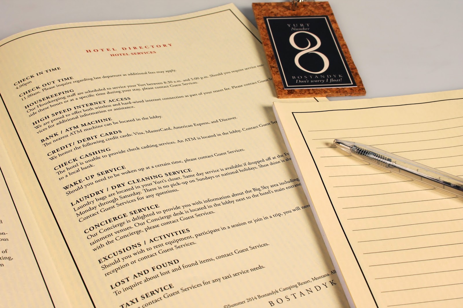
I have now decided to change my hotel name from Koreym to Bostandyk, meaning 'freedom' in an anglicised pronunciation of Kazakh. I chose to change it because I wasn't entirely certain on the meaning on 'Koreym' and I was having problems working around the 'K'! I chose 'Bostandyk' because it means freedom, so is a lot more relevant to the outdoor theme of my hotel. After looking at the Cyrillic Kazakh alphabet I have chosen the symbol that best resembles the latin 'b'. I don't mean to ever use this in context but just as a starting point for visuals:


Trying out with different letters how they may look a bit more kazakh- stylised. 


The logo so far - I used as many different symbols from the cyrillic alphabet as possible. At this point, I feel like the logo looks rather dated, and possibly needs simplifying.


To incorporate the Shanyrak symbol back into the design and to simplify the long logo into a more apply-able version, I have cut to just the 'b' shape with the brackets of the Shanyrak over the bowl of the 'b'. 

In this image, I have deleted one of the brackets as I'm now using the swoop of the bowl as the third vertical bracket.


Here is the finished logo! I refined the shape of the 'b' to a lot more sleek and elegant by practising lots of different line thicknesses until this was the final result.
for the title etc, I tried lots of different fancy typefaces but found that the simplest ones, like 'Adobe Garamond Pro' with stylised kerning settings give a lot more classier look.
I'm really happy with the logo so far, but I am thinking that I want to incorporate different colours into the overall branding so I will see how the logo gets affected in these different sectors.