Brief
Produce a graphic response/ graphic product/ piece of work that makes a statement, comment, observation or gives advice about your experience on your first year of this course.
Work with any appropriate media or format and develop and identify the content will be entertaining, advisory or informative.
Background/ Considerations
Think about the new experiences that you have had, the difficulties that you have overcome and the new people you have met and the life skills you have acquired this year.
Remember what it was like starting your first week how did you feel and what emotions did you experience? Excitement, trepidation, fear and/or overwhelmed? You might have benefited from some advice, opinions and insight from other that have experiences the same transition.
What you might say, do or give to the next years graphic design students to make the transition into the student experience, particularly this course more welcoming?
Mandatory Requirements
- Enjoy the process of reviewing your year!
- Ongoing documentation on your blog.
Deliverables
- Design development sheets, supporting work and notebooks.
- Resolved design solutions in a format and media appropriate to your ideas.
- Rational and evaluation.
Module Deadline : 3rd of May 2013
----------
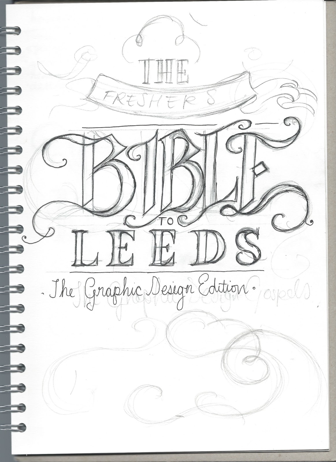
I chose to work in a group with Danielle Harrison, with the intention of producing a 'rip out poster book' to give to the future first years. The handbook will feature hints and tips that couldn't be found anywhere else, and have only discovered through being a student here in Leeds.
We felt that a 'Bible' like this would have been very useful when we had joined uni, and want to include every aspect of advise about life here as we can. We narrowed our ideas down into the following categories:
- Food : shopping for food, restaurants, takeaways & cheap n easy recipes.
- Recreational : the best clubs nights that would appeal to us, cinema, bowling and other things to do.
- Travel : booking trains way in advance to save money, which taxi companies are the best, where not to walk alone at night.
- Housekeeping : did you know there is a washing machine that will run on only £1 as opposed to £2.50? Or that you should always wash up immediately after because your food becomes almost engraved on your dishes? - who knew?!
- Graphic Design : Who is your muse? What are the best websites to go on? How can you manage your time correctly? ALL WILL BE REVEALED
Things the book could feature;
- A calendar of club nights, one for every day of the week - maybe categorised by different music tastes? Different cocktail recipes?
- Include that you can go bowling for £1.50
- The student meat pack in the market
- Vintage clothing sales
- Hints and tips
- registering with a doctor
- when your loans come in
- what not to bring to uni
- cheap toileteries that are just as good as expensive ones - Vo5 shampoo
- different vouchers and where to get them
- good lunch places
- wearing your lanyard is actually really useful and cool
- where not to go/ places to avoid to stay safe - it's a city after all!
- student railcards
- Don't go to Morrisons straight after uni because it's so busy
- How to load a washing machine for the 1st time without looking like a washing machine virgin
Visual Research for this project can be found here.
Primary Research and Surveys
Danielle created a survey to research into students recommendations about food in Leeds. This varied from ratings of takeaways, good places to shop for food and preferred recipes.
I created a survey to research into recreational activities in Leeds. This included questions about recommended clubs and bars, things to do and what NOT to do, too.
We had a great response from both surveys. This meant that we had lots of percentage info to work off and great truthful content for our book.
Sketching and Planning
As a pair, we went through exactly what needed to be done, and assigned tasks for ourselves. We both agreed to split the workload in half;
Danielle
Me
- Graphic Design
- Recreational
- Map
As the project progressed, we realised that I would be better at the more elaborate title pages needed for each section and Danielle more suited to layout and bodycopy in InDesign. I would do the title pages, Front and back cover and map, and Danielle do the rest of the book. Quantity wise I didn't feel like I was contributing equally to the project at first, but then realised a week into doing title pages that it was more equal than previously thought!
Sketching title page designs;
In our pair, we decided that we were going to have a different colour scheme for each of the sections to assist with reading and locating articles through the guide.
- Recreation - red
- Graphic design - teal
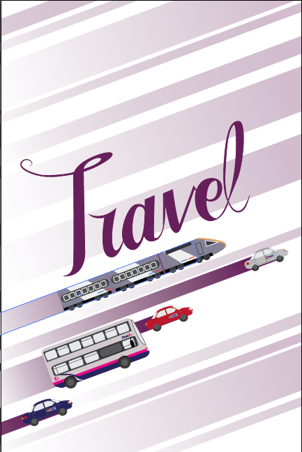
- Travel - purple
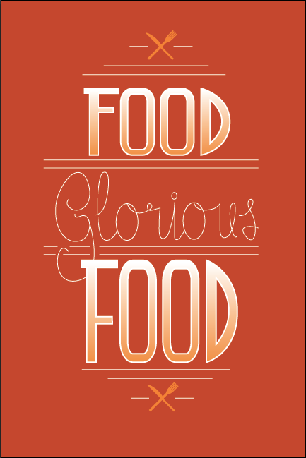
- Food - orange
- Housekeeping - green
Recreation;
Inspired by chalk style type, I wanted to go for a retro feel for the recreation page, as it would include images of bowling and the cinema. This is the initial sketch. I didn't really have any sort of direction with the title pages at first, I just wanted to develop them digitally and then see how they fit together and refine the styles.
First front cover design and Travel title page design;
I wanted the title pages to look hand drawn. I also wanted them all to look different but be in the same style and so coodinating in that sense.
House Keeping and Food initial sketches;
Again, I didn't really have any strong feelings one way or another about these sketches, I just wanted to make them digital so they were easier to refine and make decisions about.
After each day through this project, we would have a pair meeting over Skype to discuss any design problems and try and resolve them as a team. I found it really helpful working in a pair with someone who envisions the same things for the project and can give constructive feedback. We both decided after the initial sketches that we should drop the housekeeping section of the book, as it was one of the weaker sections and didn't really give good enough advice that you couldn't learn on your own. And so the initial housekeeping sketches never made it to digital.
Travel page - initial digital development;
Using the specific tones of purple that me and Danielle refined over Skype, I scanned in the travel sketch and started to trace with the pen tool in Adobe Illustrator.
This is the first tracing of the typographic element. The 'T' looked too much like a 'J' or an 'F' in my opinion. I asked for Danielle's advice and she thought the same. So I tweaked it.
After tweaking the design and confirming it's improved legibility, I could begin digitising the illustration elements to the page.
I tried to make the vehicles, although cartoon-like, as accurate to the real things as I could in terms of detail.
And started adding beams of purple light behind, to keep on tying in the colour scheme and add movement to the page. Because we knew this would definitely be on the left hand side, the upwards direction of the type and illustrations would guide the viewers eye to the other page.
Trying the layout with different lettering. Although you couldn't read it I liked it with the curl on the R because it looked more fancy. Danielle said to go with legibility :(
I added a couple more vehicles to fill the page.
We thought that the type needed more movement to go with the page and so I extended the 'T' and 'l'
Trying with even darker shades of purple to make the type stand out more - we didn't go with this and resorted back to the lighter purple.
Recreation page - initial digital development
I traced around the initial sketch using the pen tool, refining the harsh edges as I went.
I filled in with black, and used several different brush outlines to create a painted or hand made look.
Going along with the hand made look, I added this sepia gradient, which I wasn't keen on....
Then played around with opacity and tried white on black, with not great results. I didn't feel like the design was strong enough - not nearly as strong as the Travel design.
Added a bowling ball for emphasis, which failed because the design appeared imbalanced.
Tried the design with our chosen colour scheme and tried to mirror the same sort of design as the travel one - but again, it didn't seem to be working ?
I tried the original design in green - but still didn't like it! I printed it off ready for the critique on Friday 19th April with the hope of constructive feedback.
Food - initial digital development;
This digital design was only loosely based on my inital sketch, as I didn't include the heart - it looked a bit tacky on second glance! I looked at artist Jessica Hische for ideas, and really liked her green notebook cover design as it really emphasised the lettering, and wanted to do something similar.
I used one of the symbols Danielle drew for the infographics of the food section, and drew everything else with the pen tool. I really liked how it turned out, but printed it off for the crit, as it didn't really look like any of the other title pages I had produced so far.
Graphic Design - digital development
Having come to the mac with NO initial sketches for this (I know, rather unorganised) I began by drawing things lying on the desk that were related to graphic design. Rather handily, my Berol TURQUOISE pencil was exactly the right colour scheme that we agreed on for the graphic design section, and I sort of took it from there.
All of the drawings were just drawn using the pen and shape tools. And the gradient tool. For proportions, I literally held my pen up next to the screen and traced around it using the pen tool. I am sure there was a more logical way to do it...
The writing on the pen was just a mix of fonts that kind of looked like the ones on the pen. I had to squash helvetica for the 'uni' part but that was the only fiddly bit about the design.
The design needed one more crafty tool to balance it out so I drew my Swann Morton scalpel but it was a bit awkward in the design.
I thought the pen because it was the darkest had to go at the bottom. The teal pencil, because it was the same colour as the text would not look right at the top. The scalpel however, I thought looked a little morbid but quick feedback said it looked good so I left it. I still printed it off ready for the crit.

Critique - Friday 19th April 2013
On Friday, the critique was rather disappointing. Danielle had made really good progress on the layout designs and I had done all of the title pages but we received really counter constructive feedback - "I really like your idea", "you're working really well as a group" & "You've made a lot of progress". All very kind, but it didn't help our doubts.
After the crit, we sat together and made a list of the steps we had to take to make our designs better. Our mutual concern was that our 'bible' wasn't looking very 'bibley' and that our designs didn't sit well together - IE you could tell they had been done by separate people. We both agreed that although my titles pages were nice - they didn't really go with each other, never mind the rest of the book.
We decided to go back to the drawing board and look at other ways of integrating the Bible style into the work.
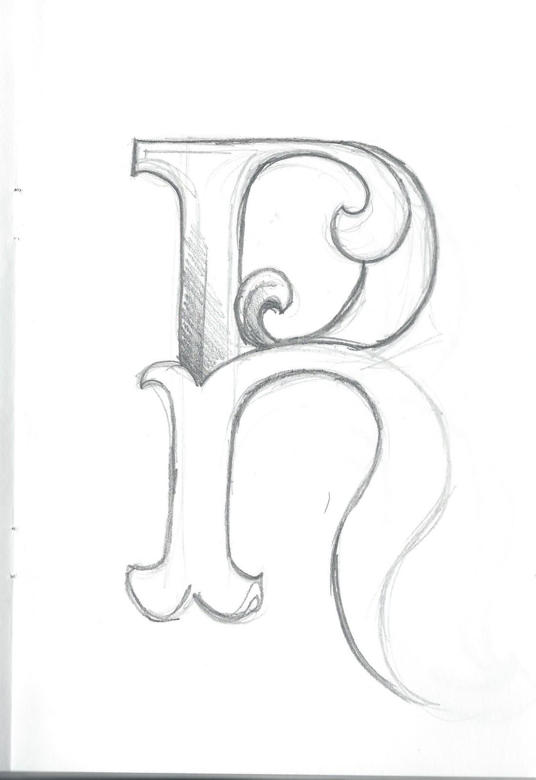
I thought that maybe using just the letter of the title and emphasising it would be enough to co-ordinate the title pages together like Jessica Hische's Penguin Drop Caps. I began to do some sketches like her work and a few other designs I had found on the internet in the past to create a super hybrid of designs for the titles pages. Danielle said that we could include little mini introduction pages to break up the book a bit, and these could feature elaborate designs. We just wanted to make the book a little bit fancier!
Re-sketches for title pages;
Trying to incorporate the already existing illustrative elements into the design wasn't that difficult.
Sketching out ideas for the food and travel pages
Recreation
The final recreation 'R'. I really like how this turned out, really elaborate yet strong.
Some background swirls to use *somewhere* in the book. I wasn't sure where, but it would go behind one of the letters on the title pages.
The final Graphic Design page design. Out of all the designs, this one was my favourite because of it's intricacy.
The final 'f' for food was made to match the graphic design page
Digitally developing the new title page designs;
Graphic Design:
After scanning in my sketch, I used the pen tool to trace around my drawing.
In the background of the drawing I had some swirls and I also drew around them, but only half and then duplicated and flipped so the background design was symmetrical.
Digitising one of the swirls
I used the pathfinder tool to cut out the centre of the lettering without interfering the two different shapes.
I copied and pasted the spur of the G and brought it above the D. This meant that the two letterforms appeared to be intertwined.
To mix the modern style with the old (which Danielle didn't think was possible) I used the original illustrations from the previous design and placed them above and below to add to the 3d effect. I also created a gentle drop shadow for this.
I really liked the way that this design turned out and wanted to make the others as much like this as possible. (in the final design, the font along the bottom would change to the same headline font as used throughout the book: Tomasso) So I placed the image of this design when digitising my other designs to match up proportions etc.
Travel:
I traced the middle of the letter that I drew, but the shadowing was individual shapes with individual gradients.
Deciding the colours for the lettering was quite difficult, because with the background of illustrations it looked a little bit over complicated...
This looked a lot less overcrowded
Especially with the added illustrations.
I thinned out the outline, because it was looking a bit chunky, and we wanted the designs to be delicate. I wanted the designs to be the same in that they were each bold typography and each the same size, with the same layout. Not necessarily looking like the same font.
After showing my design to Danielle, she really liked the Graphic Design page and thought that this one needed to be even fancier. Desperate to not part with my precious 3d shadow, I thought about how I could decorate the actual letter itself;
Out of the two, we both preferred the one on the right.
The final final final one was a slightly simplified version of this.
Recreation:
Like the travel 'T', I traced around the sketch onscreen using the pen tool. And like the Travel 'T', the shadows were individual shapes around the letterform.
I added a cheeky bowling ball and pins like in the original design. But I didn't want the page to be just about bowling, so I had a little think about how I could incorporate other elements of recreation that wouldn't interfere with the letterform itself.
And so, I thought that some of the swirls etc around the letterform could be film reels to represent the cinema.
I really liked how the design was progressing, the swirls made it look really elaborate and high class - a lot like the Graphic Design page.
But I thought that the combination of red, green and white looked a little bit Christmas-sy and so I did a few variations by changing the colour of the bowling ball;
The final design is the one on the right and was chosen as a group ( and several others from the class)
Food:
Originally, for the food page, I just used one of the letterforms I drew for the original designs and the same knife and fork symbols. I found a new home for the swirls I knew would come in handy, they are kind of art deco style and go well with the long-spined F.
However, Danielle and I thought that it wasn't as delicate as some of the other designs, and so thought that the knife and fork be changed to more realistic illustrations and the F be made more elegant. I used the last drawing (above) modelled off of the G & D sketches.
The final 'F' design:
The new F wasn't as centred as the previous design and so the new fork took pride of place. I did the knife and fork illustrations using the same techniques and tools as the pen, pencil and scalpel designs. They were fairly straightforward and only took 3 different gradients each. I really like the way the final design turned out and I think it was a good idea to change it, even if it was rather last minute.
Designing the front and back covers:
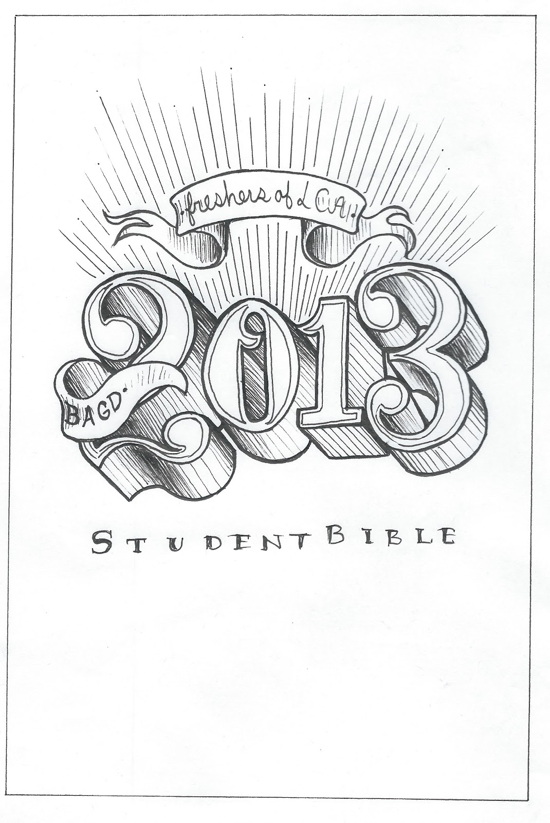
After looking at a collection of different Bible covers, medieval scripts, black-letter typography and celtic calligraphy, I came up with this rather grand design. (this was at the very start of the project, before we even refined the paper size - this was rather a quick sketch for an idea that got out of hand)
I began to digitise it a couple of days later
From the start we envisioned having gold on black, and so with gradients etc I was trying to help to visualise that.
Then the front cover was put on hold - we couldn't design the cover if we didn't know what the rest of the book was going to look like!
Fast forward to nearer the end of the project, after the title pages and helping Danielle with her design decisions, picking paper stock etc. and I drew another cover after I saw a couple more Bible designs online. I thought that the previous design maybe looked TOO biblical - what if it offends? what if people mistake it for an actual bible? - it was also a little bit outdated looking.
So I drew a new design - I was intending for it to go on the back cover - but Danielle thought that it looked grand enough for a front cover in its own right:
Original scruffy pencil sketch
Neater hand drawn pen version.
We showed it to a couple of our classmates, who thought that this would be better suited as a cover design. I started to digitise it, and develop it further.
Tracing over the letters with the pen tool
I used the line tool to draw just one of the 3d perspective shadow lines. I then copied this so they were all at the same angle and added it to all the edges and corners where appropriate.
I added them individually as a steady gradient - We weren't sure how we were going to get it in gold at this point but knew that in gold it would look good in line form.
I copied the lines from the numbers themselves and duplicated it to create the edge of the shadowing. I filled the numbers themselves in in white so it covered the shadowing where appropriate.
I drew a rough line with the pencil tool where I wanted the lines to extend to. I had seen a similar design on the back cover of a bible, the lines representing beams of light. I locked this squiggly line and used it as a guide for all the beams to extend to.
I drew the upper banner off a sketch I did for the map (below - I was doing these designs at the same time pretty much) and used our two agreed fonts that we both used throughout the book.
I had completely traced the design that I had originally drawn but to me it looked kind of empty and needed more - a border maybe? I looked back at my saved bible designs.
I added a border but it still needed something - I saw on a bible design a really nice shape in the centre. I sketched a similar shape and scanned it in. It worked really well with the lettering but made it almost impossible to read 'student bible'
So I added a border to that as well. I also added a banner to break the middle of the piece up a bit, which Danielle 'hated' and so did lots of people of the class and so was removed.
Once the middle band was removed it looked a little bit top heavy so I added beams of light to the bottom of the design which successfully evened it out. I also added a prettier border inspired by one of the bible designs found in my research.
Back cover
For the back cover design, I wanted something that would mirror the front cover design but not as overfacing as the large '2013'.
As I was looking at these Bible designs there were always doves featured - the symbol of peace. My next thought was, what bird/ symbol could we use for our book.
My next thought was the Leeds Owl.
After a little bit of research, I found that the owls on the Leeds crest and all around the town are modelled off the European Eagle Owl.
I found a photograph and began drawing around it immediately.
Voila.
The fiddly part was not drawing around the owl with the pen tool, but positioning it on the back cover! We wanted another banner reading 'in design we trust' - like 'in God we trust' - glorious. But making sure that the banner was centred and also working with the bird was a nightmare!
Trying out different banner:owl positioning.
Our next concern was how are we going to create this gold on black effect? We already knew about this gold foiling technique that you could do in the classroom using the toner printer and the laminator to transfer the foil. A couple of people in our class were trying it out for theirs and they had found that the more textured the surface, the less the foil would transfer - it wasn't the news we wanted to hear as we had already investigated into our book binding and chosen our leathery textured cover material. We needed to find another way.
We phoned around many places around Leeds - no one could do it for us very cheaply - it all seemed to require a plate being made for us - around £30 for just the cover. Would probably be worthwhile with 30+ copies but we had just one or two. We also looked into guilding (metallic edges to the pages) but found nowhere that could do it for good money.
Crit on 22nd April 2013:
A visual mock up of what our designs might look like when they're finished - we brought these to the crit. Our classmates strongly advised against the owl on the back cover and the band on the front cover - my two favourite elements to the design but I did agree with them.
For this critique, we came with a bunch of questions to ask as we were nearing our printing stage:
- Where can we get gold foiling done cheaply?
- Can you put leathery material through a toner printer?
- Should we have large titles on both pages of a double page spread?
- How would you approach our gold on black dilemma?
During the critique we found that the best way that our classmates would go about our gold foiling idea were to be to screenprint the gold onto the book cover itself- as every other way seemed almost impossible.
We were also advised that we should 'get rid of the owl' on the back cover - my pride and joy! They thought that it overcrowded the design - they were right! :(
It was also mentioned that the title pages could match a little bit more to the outside (this is when I added more swirls etc)
-------
We came away from the critique with a few things to sort out. We immediately went to the screenprinting room to enquire about what we would need for our front cover. This was at Blenheim Walk but we finally resorted to doing the screenprinting at Vernon Street campus as we could do the book binding on the same day - would be a lot more systematic and convenient!
We also needed to sort out signatures. We realised that for such a big book (around 40+ pages) we would need to have signatures otherwise we'd get an overhang of pages. We consulted the IT technician Mike to help us with this.
We also needed to do something about the owl. We agreed it was overfacing for a back cover but both really liked it. Then I remembered a feature in Kat Von D's book : the Tattoo Chronicles (which I really love) where on the first page there is an illustration of an open eye saying 'welcome', and a closed eye on the last page saying 'goodbye'.
I suggested that we utilise the owl image in this same way. I could modify the image of the owl to look like it is flying away at the end of the book without too much effort. Danielle agreed and we incorporated that into our design.
Printing
When it came to printing, we finalised our designs, and took them down to reprographics. We were greeted with a warning that the postscript files our signatures were in were basically a form of PDF and may not callibrate well on both sides.
We had never heard of this before but had no time to change or alter - there was no other available time for reprographics to fit us in - and so we had to just go with it and hope for the best.
It was irritating and disappointing to see that this actually happened but we learnt that for next time we print straight from indesign and find a way to create signatures without exporting them from indesign.
Fortunately the damage wasn't too bad!
Creating the Map
After looking at loads of wedding map designs and my old map design I had done for a previous project, I knew roughly what elements I wanted to include in the map design. I went straight onto screen.
By taking a screenshot of the key areas of Leeds on Google maps I was able to trace the streets accurately and proportionally using the pen tool.
I set it up on a document around 6 times the size of the page sizes. It would fold out of the book in a back pocket.
I began to add all the key points of interest with red dots and different colour coded areas such as the shopping district and dark neighbourhoods.
I wanted to feature a banner on a logo that would make the design look archaic.
This would result in a more centred design that I would then use for the front and back covers and the inside sheets.
I played around with different positions for the logo design.
A closeup of some of the streets of Brudenell!
I decided to shrink the map down to just 4 times the size of the book - it would also be scaled down ever so slightly so it would fit neatly inside the envelope.
I found it awkward positioning the layout and felt it had no direction/ I wasn't getting anywhere with it!
Once I got a bit more information on it (all provided by my own know-how and the surveys we conducted) I was able to play around with the layout a bit better. I also drew a compass, and refined the logo.
I added a border similar to the front cover design. This border would also feature around the little introduction pages throughout the book and so was a strong theme.
Swirls were added behind the new logo to help tie it in with the title pages a bit more. I really liked how the design was coming together, and felt that the whole thing was easily readable and easy to understand, which I think is key for a map, don't you think?
The final version of the map was a lot brighter and colourful. It featured lots of symbols found in the book and most of the content is found in the book - the book is basically the key to the map. The whole thing would fit onto A3 paper and slot neatly in the back of the book - was the theory!
Printing and binding the book
Binding the book wasn't too difficult considering we hadn't done it before. Sarah at Vernon Street was very helpful - but it did take the whole day which we weren't expecting!
We also got to do screenprinting independently for the first time which was very exciting. Although in the actual final piece the member of staff Neil screenprinted our final design onto the actual book because we only had one copy and it had gotten past the time where he could help us with it, so it was quicker and not wasting his time for him to do it.
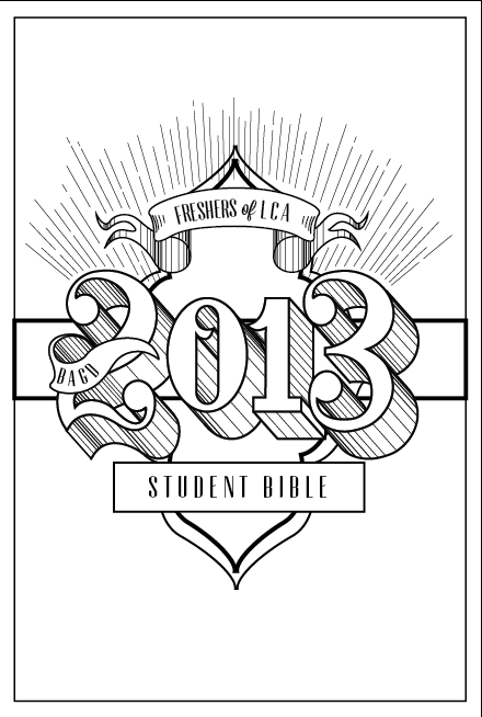
The design looked great!!!!:
And so, the book was finally finished!!!! We cannot wait to give it to our first year in September - we hope they like it!