Friday 28 March 2014

Tuesday 25 March 2014

OUGD505 - Studio Brief 2 - Proposition presentation

OUGD505 - Studio Brief 2 - Proposition presentation

Here is the slideshow I presented to my peers promoting my plans for studio brief two and how they have fed from studio brief 1. 


Thursday 20 March 2014

OUGD505 - Studio Brief 2 - re-writing the brief

OUGD505 - Studio Brief 2 - re-writing the brief

After establishing what I wanted to achieve through this studio brief, it was time to write the brief to secure what the outcomes are now.

BRIEF TITLE

Koryem Yurt Hotel & Spa

THE BRIEF

Create the branding and identity for Koryem Yurt Hotel & Spa.

BACKGROUND

Koryem is a unique style of resort, blending the great outdoors with unusually luxury surroundings. 

CONSIDERATIONS

Considerations must be made about how the incorporation of the great outdoors, sustainability and the campers lifestyle can be combined respectfully with luxury hotel branding in a way that pleases/ suits the audience. How will you bring the outside in?

CONCEPT / PROPOSITION

Proposal of a number of things such as full- scale signage, vehicle branding and toweling etc may be necessary to show the full range of items suitable to this unique resort.

TARGET AUDIENCE

A more mature audience with background experience in camping and are perhaps need an easier but equally as enjoyable camping experience. They are interested in outdoor activities, all the great outdoors has to offer, have a medium to high holiday budget and like to treat themselves every once in a while. 

MANDATORY REQUIREMENTS

Establish a look of the overall brand with a logo, chosen typefaces and colour schemes. Think about materials how they will reflect nature whilst still remaining sustainable.

TONE OF VOICE

Tone of voice is mature and friendly suited to the audience's needs. They're on holiday to relax, fulfil their hobbies and enjoy the peacefulness.

DELIVERABLES

Mandatory deliverables:
  • Signage - front sign, navigation around the site, labelling of individual yurts (symbolism)
  • do not disturb sign
  • room key
  • welcome pack - mini brochure
  • toiletries - shampoo, conditioner, showergel & body lotion

Wednesday 19 March 2014

OUGD505 - Studio Brief 2 - Workshop & further development

OUGD505 - Studio Brief 2 - Workshop

Today, we had a workshop session exploring our chosen subject from our research book to see how it can be developed for studio brief 2.

We began by listing words associated with our chosen research subject. We were asked to star the ones that stood out or we felt were most important: 

YURTS

  • Dwellings
  • Nomads
  • Traditional*
  • Ritual
  • Spiritual
  • Cultural*
  • Felt
  • Portable
  • Tribal
  • Hospitality*
  • Design*
  • Trellis
  • Food 
  • Shelter
  • Family*
  • Generations
  • Travel
  • Landscape
  • Heritage
  • Honour
  • Wealth*
  • Poverty
  • Peasants
  • Mongolia
  • Asian
  • Folk Art
  • Decor
  • History
  • Weather
  • Embroidery


We then were asked to list processes we were most interested in trying still:

PROCESSES

  • Packaging*
  • Branding & Identity*
  • Photography
  • Layout/ Editorial*
  • Foiling
  • Web Design
  • 4d products*
  • 3d programs - 3d printing*
  • Embossing


Combining the two lists, we then made a few mind maps to explore how we could translate our ideas.

My firm idea was that I could combine the idea of Mongolian and Kazakh Yurts and brand a 'yurt hotel'. I never really do branding so it would be a nice change. The hotel would be marketed as a luxury camping hotel and spa. It would be a good challenge to get across the great outdoors theme with luxury and comfortable mood.

Identity
'Do not Disturb' sign
Room Key
Brochure > Augmented Reality?

Promotional
Advert
Website

Packaging
Bottles > toiletries >Soap > Shampoo/ conditioner 
              > Boxes

Branding
Ethos
Signage >Room Numbers > Front sign 
Logo >colours > symbols

This would cover:

  • Branding & Identity
  • Packaging & product
  • Information & Wayfinding
  • Retail & Promotion


We then had to establish the audience:

AUDIENCE - What DON'T I know?

  • How old they are?
  • Where do they live?
  • What kind of income do they have?
  • Do they enjoy pamper leisure or adventure leisure? 
  • Where do they holiday? Who do they holiday with?
  • Why are they interested in my subject matter?
  • What is their sense of humour like?
After the session I decided to refine my ideas further to help me write the brief for myself!

Definite final features:
Logo & Identity
Signage - front sign, navigation around the site, labelling of individual yurts (symbolism)
Business card/ letterhead
do not disturb sign
room key
welcome pack - mini brochure
toiletries - shampoo, conditioner, showergel & body lotion

Possible final features: 
Outdoor activities
Branded transport
sports activity guide

spa guide
towels, decor
key card passes

Friday 14 March 2014

OUGD505 - Studio Brief 1 - Research Book Development

Based on the patterns I found in my research, I decided to make feature pages in my research book that have this kind of decor and colour palette: 


 Here I am creating the staggered pages intended for my publication:


My first layouts of my research book didn't go to plan all too well, and I think that these layouts look really unprofessional, to say the least. They need a lot of work, but not sure yet!


Saturday 8 March 2014

OUGD503 - Responsive - Yoke Dialogue Exhibition

OUGD503 - Responsive - Yoke Dialogue Exhibition

Yesterday was the opening night to the Dialogue exhibition of the creative duo Yoke. I was flattered when I saw that my work was featured several times in different posters and on postcards, too! 


Wednesday 5 March 2014

OUGD505 - Studio brief 1 - Yurt research book sketches

OUGD505 - Studio brief 1 - Yurt research book sketches

Using my research into my chosen subject, I have been trying to come up with a few ideas of how to present it in my research book.

Because I know my strengths are definitely NOT in layout and editorial design, I have been trying my very hardest to come up with ideas that detract from my not-so-sharp layouts. Different features include different laser-cut elements, materials and stock.


Here I am trying out lots of different layout designs just for the first page. I am struggling to find decent imagery of yurts, as I have never visited one and there are only candid photos available online, it seems so I may have to resort to illustration.


I want to create a pattern that would continue throughout the book and keep the theme consistent.


Here I am exploring different types of binding for my book. 


I wanted to create the front cover from the first three pages which would be staggered to show the layering of materials and textures needed to create the suitable insulation of a yurt building. 


This spread features a fold out page with a laser-cut shanyrak design. I also want to include an illustration and freehand lettering.


Based off one of the patterns found in my research, I created this pattern with the hope of incorporating the shanyrak design.

Tuesday 4 March 2014

OUGD505 - task 4 - One day branding brief - '184 Harley Street' Presentation

Today, we had the day to come up with our own brand and branding guidelines based on a given profession. 

In my group of three there was me, Abigail Nelson and Sophie Abell, and our given profession was dentistry. We decided we would be a 'Harley Street' cosmetic dental practice, as this gave us the chance to do something a bit less clinical. We went for a high-end branding style with a royal colour scheme.

It was the first time I think any of us in the group had done branding guidelines, and in my opinion, I think we found it quite difficult. Because of my lack of access to a computer ( I don't have a macbook, but a mac that's at home ) without being disjointed from the group, it was difficult to split the time on the computer equally and as a result I think our visual quality of our brand suffered. But this didn't stop us from properly exploring what is required in branding guidelines and creating a sufficient presentation. I have learnt a lot about the depth of requirement for coherent guidelines, and it's been a notable experience.


Saturday 1 March 2014

OUGD503 - Responsive - Collaborative Practice - R is for Rivers development

OUGD503 - Responsive - Collaborative Practice - R is for Rivers development

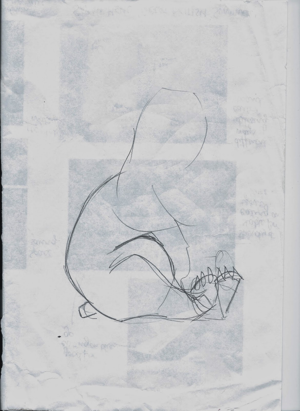
Like the other two boxes, we started off with a sketch:


For a long while we referred to the box as the 'L is for Lakes' with the intention that the whole lake could be cut out and used in the play-set. This was quickly changed as it interfered too much with the other components of the design, such as the nutrition information etc to 'R is for Rivers'.
This box will include a more cartoon version of the man himself, BEAR. We also wanted to include a canoe, and some salmon. BEAR would be fishing in the River.


Here is the basic shape of how we started, all other elements were constructed using the same techniques as on the other two boxes! 


Rocks were borrowed from the other two boxes, and elipses were created using the circle and gradient tools.

Creating the R is for Rivers sign


Creating BEAR


 The most anxious part for me was creating BEAR himself - he represented the company and needed to be done correctly! 


Lots of different 'BEAR's were sketched up but I decided to do a blend of a few different designs.


Here I am going over the basics with the pen tool.


Using the same techniques as on the other animals, such as the gradients and brush strokes I created BEAR! He is going to be holding a fishing pole.

For the bumblebee- firefly element on this box, at first I wanted to go with butterflies as they are quite colourful and pretty for the box. 


However, using this many bright colours and drawings made the overall look a bit tacky! So we instead went with Dragonflies!


The final box design:


I added Danielle's element of the salmon and the canoe, using other elements from the other two boxes such as the trees on the bank of the river. I added a few drawings of reeds for foliage and created the texture of the water using lots of different brush strokes.

I also created the R is for Rivers sign using the techniques I used to create the rocks on the C is for Camping box- by layering up the different shapes to add tone.

In comparison to the other boxes, the R is for Rivers box was completed a lot faster and maybe more details would have been added if there was more time.