Brief
You have developed a message/opinion in response to the previous brief.
Produce a mail shot that distributes, disseminate and reinforces your message to an appropriate list of recipients.
Your resolution should fit within the envelope provided* and be accompanied by a visually appropriate mailing list. You should consider the relationship between the outside/inside of the envelope and it's contents.
*You can remake, modify or reproduce the envelope in any other media but the dimensions must remain the same.
Background/ Considerations
What do you want to say and how do you want to say it? What language would be appropriate?
What visual languages exist that relate to your message and how can you use them?
Is the content communicated primarily through type or image? If it is both what is the relationship between the two?
What does the mail shot aim to achieve? Does it direct you to a website, encourage you to attend an event, is it interactive or self-contained?
A limited colour pallet (no more than 2 colours) will allow for the reproduction of your designs across a range of media.
The tone of voice should be appropriate to your message, the context in which it's intended to be read and the audience to whom your work will be delivered.
Mandatory Requirements
Your designs should be for 2 colour (+stock) print delivery.
Your resolution must be able to be delivered by post. One of your resolutions must be posted to the address given:
BA(hons) Graphic Design
Leeds College Of Art
Blenheim Walk
Leeds
LS2 9AQ
Deliverables
- 5 editions of your resolution. (1 to be sent via post as directed)
- 1x graphically/visually appropriate mailing list.
- Use notebooks to document your ideas. Use design sheets to develop your visual investigation.
Studio Deadline:
- Crit: Friday 16th November 2012
- Presentation: Monday 19th November 2012
Module Deadline : 23rd November 2012
Ideas:
 |
| Following on from the child-like/ storybook theme I immediately thought that a pop-up would be an appropriate idea. These designs here show V-fold mechanisms with several different themes. The first being a snapshot from Snow White, connecting with my poster design. 'Once upon a time' would be written along the bottom with some sort of reference to political correctness. I didn't really like this idea, only because I'm not entirely sure what the message would be from this. If unaccompanied by the poster then this mailer wouldn't make to much sense... Again, I do not think that my Jack & the beanstalk pop up mailer has a strong enough message without an effect-ruining lengthy paragraph! The Baa baa black sheep idea would be the sheep jumping over the fence, as if it were a childrens bedtime storybook. Along the bottom it would say baa baa black sheep, with 'black' scribbled out. I like this idea as it portrays the same themes and idea but still different to the poster designs. And finally, a Mickey Mouse in Steamboat Willie pop up book. Through my research I found that it is quite politically incorrect, with one scene showing Minnie being craned up by her underwear onto the boat. This wouldn't need any censor bars and would still communicate the message well. |
 |
| My first idea on this page would be the 'postcards from the past' mailer. It features vintage postcards/ images turned into postcards from around the 1940s/50s showing typical housewives/ 'sexist' roles from that time. On the back of the postcard it would question these roles in a politically correct manner. I quite like this idea as it reflects on times that weren't so politically correct but at the same time weren't actually offensive and making the reader think about how times have changed. 40s and 50s art is very in trend at the moment and would appeal to a large audience. My envelope front cover design consists of a close-up of the 'most offensive' part of my image poster - Minnie's censored underwear, with big block letters reading 'THIS CONCERNS YOU". Perhaps a little odd, but this would confuse the reader and make them curious as to what is inside. Another idea would be the interactivity surrounding a sliding mechanism. There would be an image of Minnie with the censor bar and when you pull the tab it reveals the same image but without the censor bar. This would disappoint the reader, as not much changes, but that is the point. It would prove that hypersensitivity is unnecessary because the offending article isn't actually offensive. Another, simpler concept of this, would be a card with a tracing paper front. The image of Minnie would be printed on the inside with the censor bar covering the outside and when you open the card the bar is taken away. My final idea on this page is the army-style recruitment leaflet for the 'battle against PC'. I do not think that this is a very strong idea because of it's loose themes and typical style of contemporary advertising. |
 |
| A few more ideas for my direct mail piece were actually taken from my poster design ideas. Here, we have a fake (or possibly real?) order form for a golly-wog toy. It would either be readily filled out with the name of the recipient and would shock them with the association of their name with a supposedly 'racist' toy. This would make them realise that it is just a doll and perhaps part of history as being just a doll and there was no need for offence, even when it was made. My original idea about stereotypes for my poster design could be used like a postcard, with questions on the back like 'Do you find this offensive?' and 'What is the first word that comes to mind?', hoping to challenge the readers beliefs on what is offensive. There could be other postcards of this style, such as 'baa baa black sheep', 'jack and the beanstalk' and 'merry christmas folks!' because there is room for explanation of their meanings in this format. |
Although my most favourite idea was the pop-up, I considered the time scale and decided to take forward the 3x postcard idea (last idea):


Like Minnie Mouse and Donald Duck in my poster designs, I used the pen tool to trace around images I had found online, and stuck to the same colour scheme as before: red, black and white stock. I really liked the way they turned out, but at the same time, did not think that they would make as much impact as a pop-up design.
And so, last-minute I completely changed my design and started on the pop-up design based on Mickey Mouse in steamboat willie:
 |
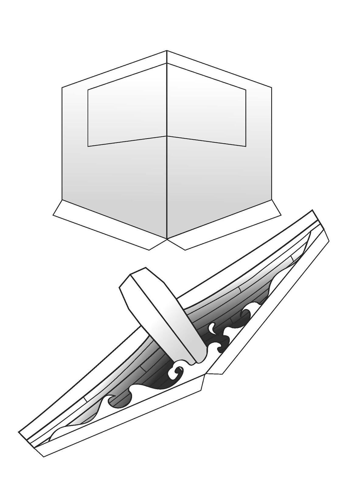
| Although in my design ideas I drew a V-fold mechanism, I began my investigation with a normal pop-up mechanism, as I thought that the inclusion of the skyline with smoke was necessary. I began experimenting with different sizes. |
 |
| ... and started thinking about how they could be applied. The problem with this sort of mechanism was that the further forward (towards the viewer) the pop-up is, the smaller it has to be, which wasn't very good when you're trying to create the illusion of perspective. I decided that my original idea of the V-fold was the best resolution to this problem. |
 |
| The first trial of this practice was in fact very successful. I drew the cabin of the boat in a dramatised 3d style with a cut-out window, and the front of the ship a lot shorter with the front beam being the tallest thing. |
 |
| I stuck these onto a piece of paper double the width of the correct dimensions of the required envelope. IE, this would BE the envelope. I had to trim down any parts that stuck out of the envelope when closed. I then pulled apart the design and scanned it into the mac. |
 |
| This tiny v-fold was to accomodate a flying arm mechanism. Meaning that Minnie could be attached to this on an arm and appear to extend out on an angle from the page. But after testing this, I found that it was unsuccessful in that Minnie always came out a different angle or that she stuck out of the envelope when closed. So I discontinued this idea. |
 |
| I used the pen tool to trace half of each design. I then highlighted it with the black arrow and copied and pasted it so that each of the two were symmetrical. I played around with gradients to give the effect of shadows. I also used a thick brush stroke to enhance the cartoon style. I also kept it black and white because they are my chosen colours. (and it's a black and white cartoon) |
 |
| Again, using the pen tool I traced around images of stills from the cartoon itself and used gradients and block colours to bring the characters to life. I then used the 'live trace' tool to turn an image of a boat steering wheel into a black and white vector image. I didn't include arms or any more particular details of mickey because these would be hidden behind the steering wheel. |
 |
| I didn't want the outside of the envelope to be over-complicated, but have an initially curious yet short title to invite the viewer in. I chose to write 'Do you feel OFFENDED?', which stands out from other front covers of direct mail envelopes. I kept it really simple with colours and used type to entice the reader. The writing on the back of the envelope is in fact upside down when you come to open it, and the tab is over the text when closed. This was done on purpose, as the reader would want to know what the text says, and in doing so opens the letter. |
 |
| The inside of the envelope is also very simple, so as not to distract the viewer from the pop up mechanism. I chose the same font as the Mickey Mouse trademark and a suitable script font to mock-up a scene from the cartoon. I used the same scribbly style font to highlight the political incorrectness of this scene, thus uniting the mailer with the posters. |
 |
| Once completed and assembled, I think that the pop-up is a strong and interesting way of communicating to people of all ages, even if the style is mock-cartoon. The message is clear yet simple and portrayed in clear yet simple aesthetics. |
 |
| Minnie mouse sits within the gap between the front of the boat and the cabin on a small V-fold of her own and stays vertical with a small piece of paper keeping her distance from the cabin. |
 |
| Mickey drives the boat. |
No comments:
Post a Comment