Development of my Product
After researching into Buddhism on a broad scale, I was given this brief, which required me to make some decisions as to which direction I was going to go in.
Brief
Through a process of collection and categorisation of content specific to your own research theme, you are required to focus on information graphics. How can you translate facts, figures and statistics into clear and understandable visuals?
Using your research theme explore information graphics through one of the following outcomes:
PRODUCT AND PUBLICATION
PRODUCT AND PACKAGING
PRODUCT AND DISTRIBUTION
Your resolution should reflect your own practical and conceptual interests (derived from your given research theme) within the field of contemporary graphic design.
Background/ Considerations
The product/ resolution can take on many different forms dependant on its function, content, audience and context. How will these affect the decisions you make about format, scale etc...?
You should consider the relationship between content, categories, organisation, media and form. How does one affect the other? Who is your audience and how can you engage with them? How will they interact with your product? What are you trying to achieve? What is the function of your product - is it supposed to inform, educate, document, entertain or instruct?
Having decided on the content you should focus on the practical, formal and conceptual development of possible design solutions. In doing so you should address those aspects of the design process that reflect your interests, ambitions and skills.
Mandatory Requirements
Research demonstrating an application of a range of appropriate and inventive approaches to collecting, organising and responding to primary and secondary source material.
Worksheets / Notebooks / Test pieces demonstrating an ongoing visual, practical and conceptual investigation. Design development and process driven research, material and media including their appropriate application.
Blog Entries demonstrating the critical evaluation of contextual references and contemporary design practice appropriate to the project
Deliverables
A body of supporting research
PRODUCT AND PUBLICATION
PRODUCT AND PACKAGING
PRODUCT AND DISTRIBUTION
Studio Deadline : Friday 25th January 2013
Module Deadline : 31st January 2013
------------
I made some spider diagrams of all the vague ideas in my head. At first I really liked the idea of product and packaging, and so creating a 'starter' Buddhism kit. I was confident that this would be suitable, as I had seen lots of different products, but not all together in one go.
I also really liked the idea of creating Zen Tea packaging with an innovative design and thought that it might be quite diverse. At first I really didn't warm to the idea of the publication, because all informative publications about Buddhism are generally encyclopaedias!


To help me decide on a direction to take, I did a few quick ideas to take to the critique on 14th January.
 |
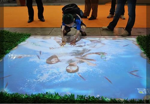
| I thought about designing a campaign for a begginners Buddhism program, presenting itself in a cool and calming way, and target the campaign in busy, stressful places. For example, on the back of buses so drivers can read it in traffic queues, on the London underground, on the inside of buses. I even thought that some floor transfer designs such as this. with a zen garden image or an interactive floor design such as this with a koy fish pond design. These installations would also be put in busy, stressful places like a shopping centre or a train centre. I really liked all of these ideas but when I was told that we would have to actually execute it as opposed to come up with a concept, I realised that I probably wouldn't have time or enough money to execute it in the context I intended. |
 |
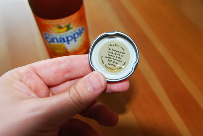
| My second and third ideas were bottled Zen tea with a Buddhism phrase under the lid like a Snapple bottle. The other being packaging for a Buddhism starter kit including a prayer pillow and prayer beads, a book, and a Buddha statue. I both really liked the commercialisation of a somewhat ancient society. I was confident that this commercialisation would not be offensive, because I asked Jonathon (see research on context blog). He said that the Buddhist society is always open to innovation and new members, no matter how they are recruited. |
 |
| My fourth idea was a Zen teabag dispenser. I took inspiration for this idea from this dog food dispenser. I thought that I could modify the shape to look more like a Zen tea pot with an oriental design on the side. However I thought that this design was quite limiting, and if the changing of the shape of the net didn't go to plan, there wasn't much time to make amends. |
 |
| My final and most favourite quick idea was a Buddhism pop up book for children. I had already thought about this, because there was lots of visual elements in Buddhist symbolism such as the 'om' symbol, the wheel of dharma and the 4 noble truths. |
 |
| I researched into it a little bit further and thought that a desktop 360 book would be good because it would go on a table and be at children's eye-level. I took these ideas and a moodboard of different pop ups to the crit, and got this response: |
 |
| Mood board I brought to the crit gave a basic image as to what I wanted to achieve. |
Responses from the critique 14th Jan 2013:
- Look into embossing and different textures to add even more diversity and interesting elements for target audiences.
- Make sure you manage your time!
- Try both hand-rendered and digital illustration to see which one is the best.
- Refine the style of the illustrations and decide what age range will appeal to the style you take.
- Try test pieces to really refine your final piece.
- Make sure you include plenty of information in your final design.
--------------
RATIONALE - decisions on what I will make
*PUBLICATION AND PROMOTION* Why have you made this decision?
I decided that this was the best way to display the information I found as a whole was through a book, rather than applying it to packaging or advertising etc. I also thought that creating something graphically strong would be best through pictorial information. From this I developed the idea of a pop-up book about Buddhism for children.
Who is the audience and how do you intend to engage them?
The audience are children ages 5-11 (or possibly younger). I intend to engage them through colourful images with pop-up paper engineering.
What is the function of the product - is it supposed to inform/ educate/ document/ entertain/ instruct...? What has informed this decision?
The book will be to inform, educate and entertain children/ young audiences - chosen because of the lack of informative books about this subject on the market.
How will the audience interact with the product?
Different pop-up elements and tabs/lift-the-flap features will make the book interactive and engaging.
------------
Firstly, I had to decide what elements/ information/ facts about Buddhism I wanted to include in the book. I had to consider how much time I had to design, test and build it.
I decided to do it in reverse, and research further into pop up designs, then decided what elements of Buddhism could be fitted into that, because my ability to execute the pop up would limit what the artwork on it was going to be.
I went to the library and took out 'ABC3D' and '600 black spots'
 |
| My favourite page in ABC3D was the 'G' page because it has an impressive feature where it twists out of the page and provides a perfect oval shape in the centre of the page. I initially thought that this would be quite good for the face of an elephant (from the Siddhartha birth story). |
 |
| I also liked the dramatic impact of the last page of '600 black spots' but couldn't think how to apply it! |
 |
| I really liked the height that this pop up gives. It also is a very simple mechanism, and could be applied in lots of different ways. |
After looking at a few pop up videos, too (see my research post on context) I had decided what I wanted to portray in my book : The Siddhartha Gautama story (the original Buddha). Because I was going to be aiming this at children, I wanted it to be very illustrative, bright in colours and simple in words.
I consolidated the story down into what I considered to be the most important (and most visual) parts of the story and 'translated' it into a simpler language that children could interpret more easily. I split the story up into essentially 5 different double pages:


This story was slightly modified afterwards, with the second to last page being taken out, and another page added right at the very start: the white elephant page.
Experimenting with Pop up Designs:
I began to produce basic sketches of how I wanted each page to roughly look like, and started to do test pieces to figure out how I could incorporate the pop ups into my ideas:
The Elephant Page:
In the story, a white elephant comes to the queen in a dream holding a lotus flower. The elephant tells the queen that she is going to have a baby, the baby grows up to be the Buddha.
 |
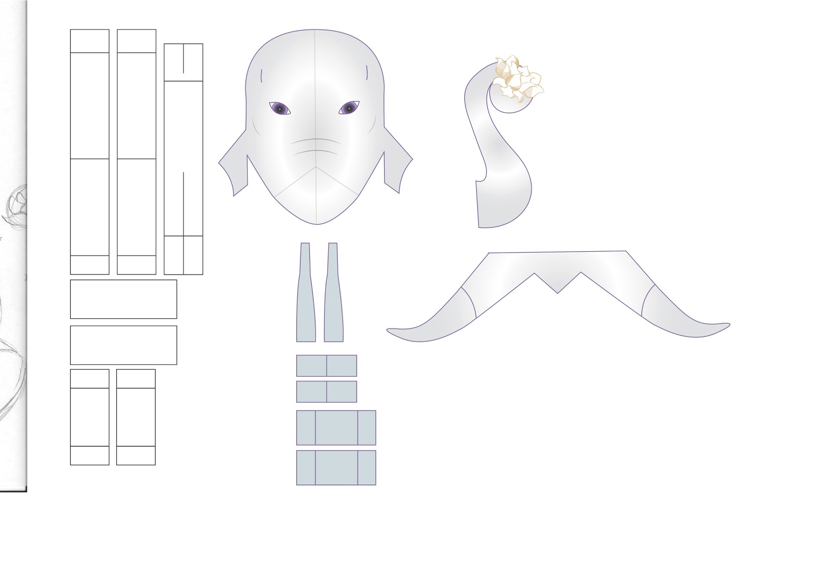
| My original sketch for what I envisioned the first page to look like. I later realised that the ears were that of an African elephant, when it should be an indian elephant. You will also notice that I drew the queen asleep in the corner with the intention that you would be able to pull a tab to open and close her eye. This was later removed from the design because it took up too much of the page and also made the page over crowded. |
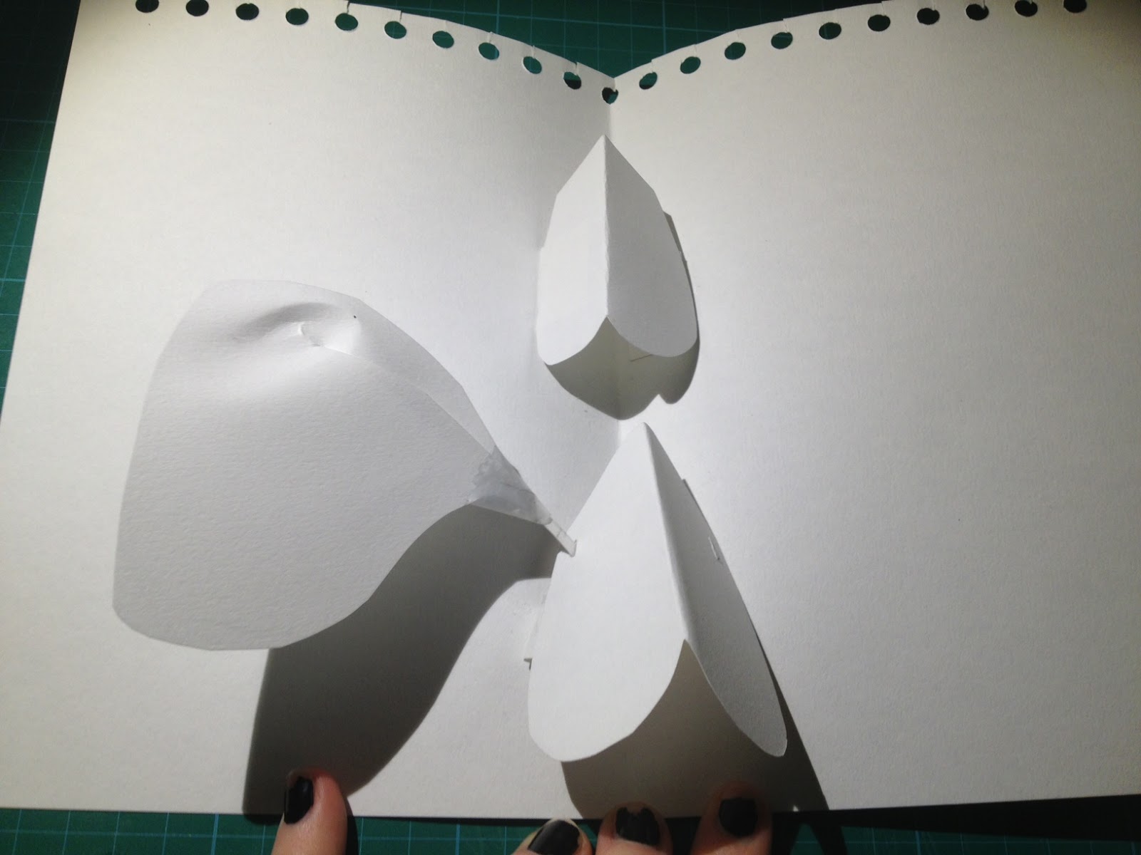

At first, I started to just experiment with little to hardly any knowledge about the engineering behind pop ups, other than observing current pop ups and knowing how to do simple v-folds. I liked my ideas so far, but needed to start with a design I knew that worked. (In the images above, I am experimenting with retractable elephant ears using the same idea as the final page in '600 black spots'. Slots were made in the side of the elephant face, with the ears attached with a thin strip that fit through the slot, and they were taped next to the fold beneath the face, meaning they retract when closed.)
 |
| Experimenting with different trunk sizes and shapes. The one drawn on the paper I had designed to be 3-d and come out the end of the elephants face as opposed to 2d and only attached to one side, like the others. I found out later that this wasnt as successful as a 2d trunk. |
So, I went online to look for simple pop-up tutorials that I could modify/ take inspiration from for my own designs. I found the perfect mammoth pop up design here.
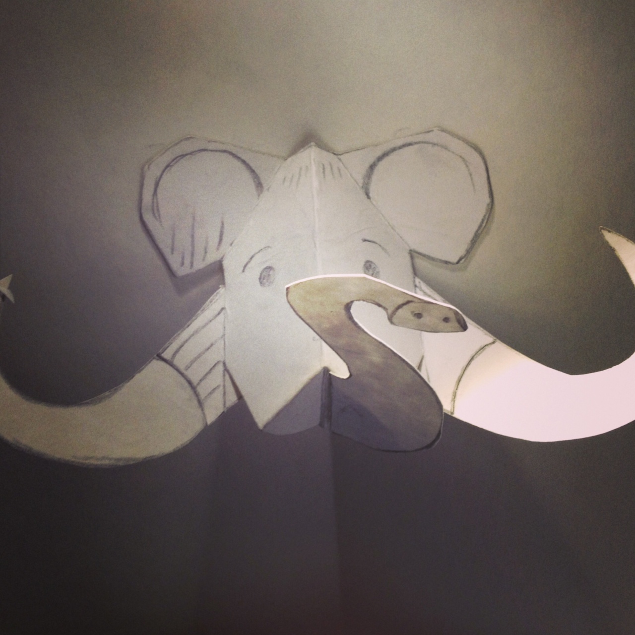 |
| After printing out the tutorial and executing it, I began to understand how to create a more realistic, proportioned, sturdy pop up design. However it needed quite a few changes. Elephants faces are wider in proportion to their trunks than mammoths, don't have as big tusks and have different shaped ears (well indian ones do, the one in the Buddhism story). |
 |
| I removed the pop up from the page and disassembled it. I drew a modified template and scanned it in to the mac. I went over it in adobe illustrator and printed it out to test it again. The ears were completely removed from the pop up, to be designed as separate pieces that would retract like in my original mock up. I used this image as a reference for proportions. |
The edited elephant template assembled:


By experimenting with bits of masking tape which would later be turned into card tabs, I managed to get the elephant to stand almost upright when the page was opened. I really liked how it turned out, but think that the trunk needed to be a lot smaller, and the head itself needed to be even wider. I didn't do another test piece for the elephant because I was confident that these little changes would not affect the final design.
I disassembled the mockup and drew on it where the graphics would go, such as the tongue. The artwork would have to be double sided, especially the ears.
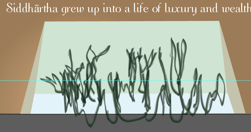
Growing up and Leaving the Palace Page:
In the Buddhism story, the prince grows up and decides to leave his palace one day. He has never been to the outside world and has always been sheltered from the sufferings of life such as illness, oldness and death. He is shocked to see all 3 at once and so strives to make a change to be eternally happy, emotionally invincible to the circle of life.
For this page, I didn't create a pop up at all. To be honest, I had almost ran out of time when I came to this page and so didn't really have the time. I played it safe and went for a simple V-fold mechanism and lift-the-flaps which I already knew how to do. I had to settle for the fact that I would have to make the artwork as good as possible on this page to compensate.
Here is my sketch for this page:
 |
| This double page would consist of a large flap folding out to reveal a lavish day bed inside a grand palace. The opposite page would feature lift the flap windows looking outside to see the old man, sick man and dying man. I also wanted to subtly incorporate the lotus flower into this scene by having a few growing in a pool. I wanted to be as accurate as possible to Buddhist artwork so used this perfect picture as a reference when it came to the artwork. |
'Choosing the middle way' Page:
In the story, the Buddha leaves his life of luxury in search of enlightenment and decides to starve himself to teach him the harsh realities of life. He decides that neither of these ways will have a positive outcome or lead him to enlightenment. He chooses the 'middle way' neither poor nor rich so he can focus on his religious epiphany goal.
I decided to show this using the large scale pop up from '600 black spots'. It was surprisingly easy to do! I observed the page and sketched rough shapes of the tabs.


It only took one mock-up to figure out the pop up successfully. I came to the conclusion that I would have to make the tabs shorter for the final thing, but again did not feel that I would have to make another mock up to confirm this.
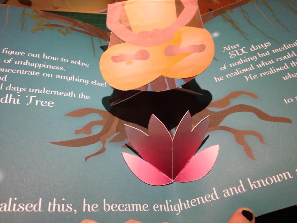
Finding enlightenment Page:
 |
| A quick sketch of what I roughly wanted the final page to look like. |
The Buddha meditates for days in the forest before finally figuring out the method for being eternally happy. I wanted this to be the grand finale page of the book, and wanted a grand pop up to go with it.
I really liked the panda pop up image I brought to the crit (scroll up) and so tried it out:

But then I discovered that it actually didn't pop up at all! I needed a totally different pop up. So I went back to my idea of the 'G' from ABC3D. I looked carefully at the pop up in the actual book and drew a quick mock up and drew a picture of the Buddha where the 'G' went:


Straight away this proved to be successful and I felt that there was no need to construct another pop up. I disassembled the pop up and scanned it into the computer. I traced over the net in Adobe illustrator and made it about a third bigger than this, to make a bigger impact.
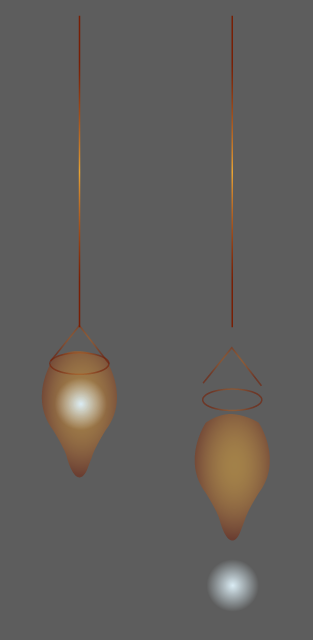
The Lotus flower Pop up
The Lotus flower is the symbol of the Buddha. In lots of artwork he is always seen sitting in one. Even the position he is sitting in is named the lotus position. It is an important element that must be included.Using another template from the Robert Sabuda website, I took an element from a mothers day card design, with the intentions of colouring it like the traditional lotus flower. I didn't want this particular pop up to be as over whelming as the rest of the design because it was going to be on the same page as the Buddha enlightenment.

Creating the artwork
Elephant dream Page:
For the first page, I wanted a night-sky scene with cartoon stars and hazy purple hues. To keep to the eastern theme, I took some inspiration from these artworks for the cloud designs:


I set the document up to be 45.1 cm, double the width of the book cover with a mm to spare for the fold (the card was going to be very thick). I drew a circular gradient over the double page, making the colours get gradually lighter towards the middle, where the elephant pop up was to go.
Using the pen tool, I went over some of the cloud designs from the images above, and also improvised in the same style for some. I used a wispy style brush on the paths to create this hazy look. I wanted the clouds to stand out against the background but not be as stark white as the text was going to be, so I used this subtle hazy creamy colour.
I copied and pasted a couple of the cloud designs, but only filled them, without lines so they were solid colour. I turned the opacity right down and changed the style to multiply. I resized them so they were huge against the background, because I think that lots of different subtle layers looks a lot better and more detailed. I drew a long thin cloud that would essentially connect the two designs together.
I drew 3 different star designs with the pen tool and filled in with white. I copied and pasted them a few times, resizing and adjusting as I went.
I chose a font that I had used before in a design in college and really liked it because it was modern and strong yet whimsical and easy to read so good for children. Unfortunately it didn't host certain characters, so some letters are from Times new roman! I observed that there is little to no difference in these letters (lower case a's) so it wasn't too bad!
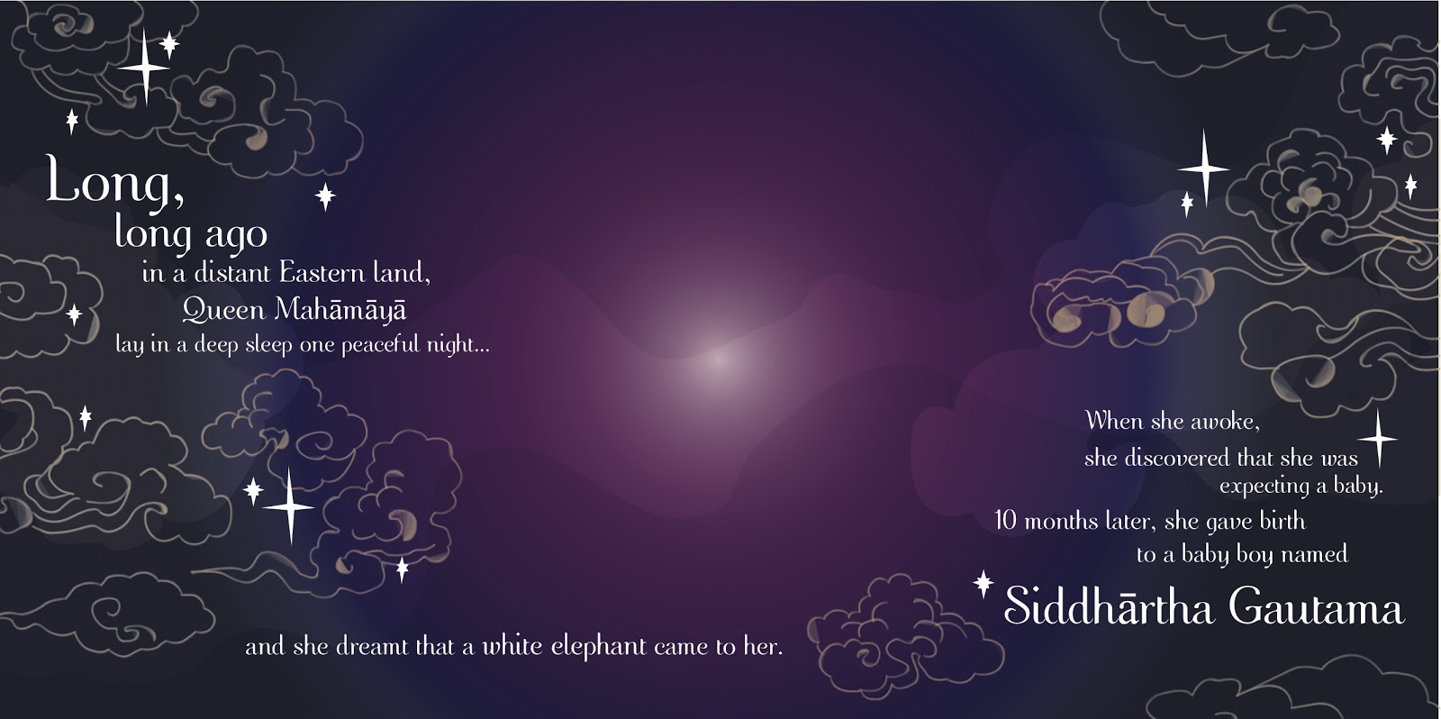
The artwork for the elephant was very simple, since all the calculating was done beforehand. I added a subtle off-white to white circular gradient to give it a 3d feel. the reverse of this had a tongue beneath the middle of the tusks that would be visible when assembled.
Growing up and leaving the palace Page Artwork:
For this page, I had to create the double page spread and the double sided tab that was to fold out of the left hand side. The main double page, however looked liked this:
 |
| The page on the left's text had to be offset to the right so that there was room for the large foldout tab. The right hand page was made to look like a large interfering wall of the palace, interfering with the Princes perfect life. This page has about a million gradients on it. The file became incredibly slow for the amount of drop shadows on it, too! |
Detail of the pillar and wall:
 |
| The shadow of the pillar is a separate object in itself, with very low opacity. The lines on the wall each have their own gradient to make it look as 3D as possible. I tried to make the lighting as accurate as possible, with the position of the highlights on the pillars facing in towards the centre of the page and the shadows facing outwards. The gradient on the back of the wall helps with this. Again, i referred back to this for inspiration for the architecture. |
 |
| The opposite side has boxes for where the separate lift the flaps will be attached. |
This is the fold out flap. This is the first part the reader will see before lifting:
Step by step of the creation of the pool:
This is now the inside of the flap, the half that would be against the left hand side of the double page:


Finding Enlightenment Page:
The cover of the book:
For the front cover I originally wanted to create an emblem/ logo So I looked at this by Jessica Hische:


Then, I found this Alice in Wonderland book cover design online:

I had a lot of issues with printing my documents. The reprographics I had chosen to print in only had the A1 printer available, which I didn't know couldn't print double sided, meaning that the book couldn't slot together like previously thought. It would have to have the double pages printed out separately and then stuck together.
Another problem I encountered was that the files couldn't open on the computer in uni. I thought I had saved all the files correctly and embedded the font, but Illustrator was refusing to open it. After a few technical difficulties later, I realised I had my Illustrator settings incorrectly set. Although it was now working, I was far behind schedule.
I decided that my pop ups weren't going to be finished by the time I was going to go to the reprographics, and so decided to print them out later after the book on the studio's toner printer.
This proved messy, as all of the ink on the folds of the pop ups began to flake off (toner is not kind to folds) and that there were strange red squares around a lot of the illustrator artwork from the toner artwork.
Assembling the book itself was relatively easy. I cut out all the individual pages with a scalpel and scored them with a sharp edge of a metal ruler. The book was only held together with Pritt glue, but it was successful! I didn't stick the spine itself to the pages, only the outside cover, so that the book could successfully fold.
The final book:


 |
| I referred back to this image for the inspiration for this page. I tried to set the scene of a luxury palace as much as possible with the draped curtains and the lanterns. |
 |
| The lanterns were made out of lots of different shapes and gradients. |
 |
| Each of these pieces are separate, because I wanted them to be different colours, all minty-green, like the bottom of a pool. They were selected using the eye dropper tool on the floor colour and then increasing different levels of white, green and blue. |
 |
| I then began to randomly scribble on top with the brush tool in a deep dark green. This will become the roots of the lotus' and waterlilies. |
 |
| I then made a box the shape of the pool with a blue to white circular gradient with really low opacity. I did this over the top of the roots so it looked like they were underwater. |
 |
| I created an oval with the same gradient as the pool square, but I added more and more white and blue elements and turned the opacity down on this too. These were going to be the ripples/ reflections under the lotus flowers. |
 |
| Using my illustrations of lotus flowers (traced from some of the original buddhist artwork I had found in research) I placed 3 over the top of the ripple reflections. |
 |
| I drew a heart shape in the same deep shade of green as the roots. I copied, pasted and resized it accordingly until I had enough to fill the pool. I then resized them all together to a flatter, oval shape to simulate perspective. |
 |
| Again, I copied and pasted the same design from the palace interior page and went to transform > reflect so that it was symmetrical, ensuring that the centre artwork lined up with the palace page (the pillar on the right is the same as the pillar on the very left of the double page spread). I created the pillow using a simple oval shape and a complicated circular gradient. |
The fold out royal day bed:
 |
| Using all the same principles as the rest of the book so far, and copying and pasting a lot of elements already in the book, I created this royal day bed. |
The old man, sick man and dying man lift-the-flaps:
I wanted to simulate the inside of an eastern castle (it is not entirely agreed upon where the Buddha is actually from, so I wanted to keep the style vague) but didn't really know what an eastern castle windows would look like. I found this image online:

I really liked it and wanted it exactly like this. I brought the image into illustrator. I live traced it into a 3- colour design. I deleted the edge of it so I only had the middle window design and not the walls or window ledge in front. I changed the black shapes in the middle to a light brown like the inside of the palace.
I found another image, this time of an eastern (Nepal) landscape.

I copied and pasted the negative of the window design (the bit where you can see out) 3 times, positioning them on the image in the same way that the windows are in the book: diagonally downwards. I copied and pasted the landscape image three times too. I live traced the landscape images to 16 colours (took a while). I selected one of the window designs and its correlating landscape image. I made sure the window design was on the top of the image, then I went to object > clipping mask > make. This trimmed the landscape image to the inside of the windows. I did this for all three windows/ landscapes.
The Middle Way Page:
This page is set in the forest.
 |
| Using a lot of the same principles as the rest of the book, this double page spread was mostly based on gradients and pen - tool illustrations. The tree designs were based on the Bodhi tree, but not as grand. |
 |
| The Bodhi Tree. |
 |
| The sky background was literally copied and pasted from the first page - but changed the colours! I also showed the sun AND the moon to symbolise that he spent over a week here, alone. |
 |
| I used the same brush tool technique as the waterlily roots to create the fuzzy vines that hang down from the trees and the grass. I made sure that the tabs for the three Buddhas were the same colour as the sky/ grass so they blended in. |
Finding Enlightenment Page:
 |
| I chose to have the background turquoise/ blue for this page, because in Buddhism this is the symbol for knowledge. It is also a very refreshing colour. I made sure it didn't get too bright towards the middle so that the white text was still readable. In the middle is the grand Bodhi tree. The Buddha pop up and lotus flower will be on this page. I did copy and paste a lot of the elements from the previous page to create the tree. |
The cover of the book:
For the front cover I originally wanted to create an emblem/ logo So I looked at this by Jessica Hische:

I also liked this design that I had done in college for a Pizza Express campaign ( where I last used this font) because I thought this layout went well with the font.

However, with my chosen colour scheme it looked kind of dull, and a little bit too chinese/ oriental, and not really going with the rest of the style of the book:


I really liked the way that the cover design reached around to the back cover. Then I thought that maybe I could use the same design that I had used for the enlightenment page, and that that would reach around the front and back cover!
Here is the result:
 |
| I added some more lotus illustrations and 'fireflies' I considered the spine when designing, adding an extra 1cm to the width to accommodate the 4 pop up pages and adding the title of the book and the penguin books logo. I tried to make it look as realistic and professional as possible by ensuring there was a barcode and publishers note. I wrote a simple blurb and aligned all of the words on the front cover. I was really happy with this overall design! |
I had a lot of issues with printing my documents. The reprographics I had chosen to print in only had the A1 printer available, which I didn't know couldn't print double sided, meaning that the book couldn't slot together like previously thought. It would have to have the double pages printed out separately and then stuck together.
Another problem I encountered was that the files couldn't open on the computer in uni. I thought I had saved all the files correctly and embedded the font, but Illustrator was refusing to open it. After a few technical difficulties later, I realised I had my Illustrator settings incorrectly set. Although it was now working, I was far behind schedule.
I decided that my pop ups weren't going to be finished by the time I was going to go to the reprographics, and so decided to print them out later after the book on the studio's toner printer.
This proved messy, as all of the ink on the folds of the pop ups began to flake off (toner is not kind to folds) and that there were strange red squares around a lot of the illustrator artwork from the toner artwork.
Assembling the book itself was relatively easy. I cut out all the individual pages with a scalpel and scored them with a sharp edge of a metal ruler. The book was only held together with Pritt glue, but it was successful! I didn't stick the spine itself to the pages, only the outside cover, so that the book could successfully fold.
The final book:
 |
| Front cover |
 |
| Elephant dream |


 |
| Inside the palace and leaving |


 |
| The middle way |
 |
| Finding enlightenment |


No comments:
Post a Comment