In preparation for the studio session we brought an example of 'ABC abc' in a roman, gothic, script and block font. We ( literally ) dissected the letterforms with a pair of scissors and experimented in creating new letterforms by rearranging the cross bars, stems etc. Here are the results:


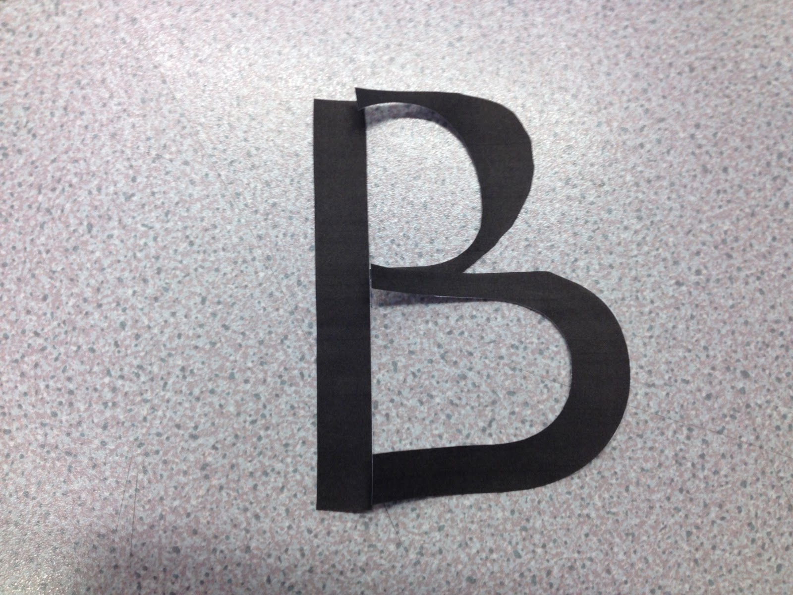


Out of these 100's of examples, I have narrowed it down to my favourite 5:


I picked these 5 mainly because they vary in line thickness, which in my opinion creates interest. I will now design other letters based on these to create a preview of the alphabet.
1.
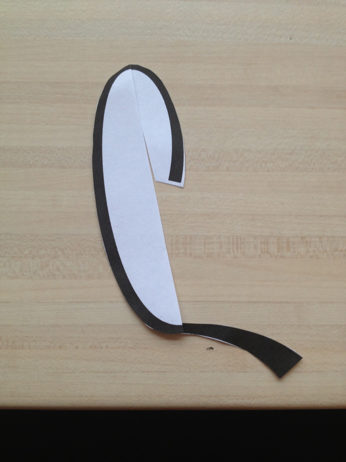
Using this letter as a starting point, I looked for sections of this that could be translated into other letterforms such as 'a':


I found the 'x', 'y' and 'z' the most difficult because they were not similar in shape to the first 3 letters apart from the 'y', but this was also difficult to achieve while avoiding trying to make it look like a 'g'.


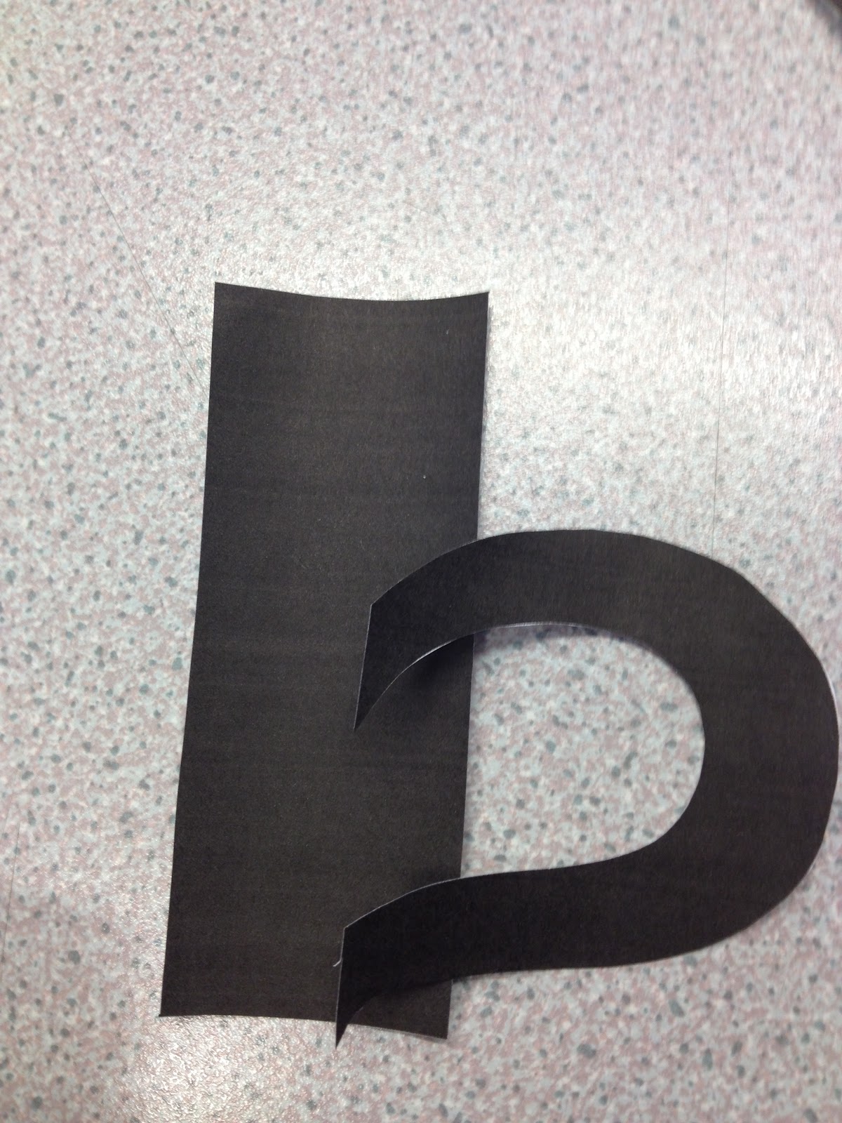
To create the capital letters, I used the 'b' as a starting point, for the correct height. I found that flipping the 'b' upside down and back to front created an upper case 'P'. If I were then to add a curl to the bottom of this it could be a 'C'. Similarly if I were to join up the curl it would create a 'B' and so on.
I continued with this kind of development with all of the upper case letters until I reached the 'X', 'Y' and 'Z' because again, they are not similar in shape to the first 3 letters. I found it difficult to make an 'X' design that was as slim as the other letterforms and so felt I had to leave it as 2 'C's in symmetry...
The 'Y' I developed as a larger version of the lower case letter and a similar resolution was created for the 'Z':

The final letterforms of 'Nouvague' A loose take on an Art Nouveau font.
------------------
2.
Again, from the 'b' I can create the 'c' and 'a' because they are of similar, curvy shape.
I used the bowl of the 'b' to create the a by flipping it vertically. From that again, I could then use the bowl of the 'a' to create the bowl of the 'c'. I added the loops to unify the design:

From the 'b' design, I could develop the 'y' by turning it upside down and opening the bowl:

By using the bowl
from the 'a' and 'c' I could develop half of the 'x'. For the other half I decided to create a loop like the other designs.
However, the 'z' was slightly harder to develop because it's such an angular letterform.


I scanned in the 'b' and worked in the same way I did when hand rendering, by copying segments of one design onto another:

The finished lower case letters:

To create the upper case letters, I started with the cap-height of the 'b'. For the upper case 'B' I simply added the top bowl to the original 'b' to ensure unification. From that, I created the upper case 'A' by using the outside curves of the 'B' and a simple loop design for the cross bar. The upper case 'Y' was developed from the bowl of the lower case 'y', used twice with the loop design from the 'c'. Again, the hardest thing I found to unify in style were the 'Z' & 'X' designs, which had to be drawn from scratch:


The finished designs:

The final letterforms for 'loops' font. Named this because of it's looped features.
----------------------------
3.
I started by tracing this letterform and developing the other letters from what I could fit into the original sketch. For example, 'a' was developed from the 'b' turned upside down and the stem shortened.
The other letters were developed in this way, all originating from the 'b':


The final letterforms to 'Chester' font. Named this because of it's similar appearance to an old sign in Chester.
-------------------
4.
Using the bowl of the b to create all curves of the letters, I found that by this time, I was producing the letters a lot more quickly and all in one go with little to no problems to face. Even the hardest of letters such as 'z' and 'x' had become nothing more than routine!:

Then within twenty minutes was digitised using Adobe Illustrator:

The final letterforms of 'Cursive Doodle' font. Named this because of its formal-yet-informal appearance.
-------------
5.
Unlike the other fonts I had created, I didn't trace any of the original letterform onto others, but decided to do it all freehand instead. This meant that the font overall looked less formal and less unified but was a much quicker process and I knew that it could be refined digitally.
The initial sketches:

I traced around with the pen tool, and this time I copied and pasted certain elements to make it look more uniformed. I decided to leave them unfilled, as I liked the effect it created and how it looked different from the other fonts I had created.

The final letterforms to 'francais' font.
-------------
this is amazing haha, yours look great!
ReplyDeleteOnly just seen this! haha thankyou, shame it was wrong lol!
Delete