OUGD504 - Design for Print and Web - Posters Development
The first thing I got down to designing were these Adshel posters as they were the first things I started to sketch:

It featured illustrations representing key parts of the story of Around the World in 80 days. The first poster featuring the steam train featured throughout the novel, the second being a hot air balloon, and the third being a steamboat. I tried to make them consistent yet different, featuring different kinds of typeface furniture in a vintage travel-advertisement style.
Digitisation of Hot Air Balloon Adshel Poster

I started off with the dimensions of a typical Adshel poster, and then added a border like the sketch I had drawn.

Next, I found an image of a Victorian hot air balloon (model). I didn't want to copy off an illustration of one because that could be considered as plagiarism! I wanted the style of these posters to be in Victorian etching illustration style (as seen in my research).

I went over the straps with the pen tool.

In this image I am adding a stroke to the lines to make them as though they are somewhat hand drawn.

Because I wanted the hot air balloon at an angle as if it were caught in the wind, I made the straps shorter so they were true to this new angle as opposed to straight on.

Here I am adding details to the basket.

And now shadows to the basket. I have also adjusted the straps so that they look a bit more true to the angle and attached to the straps on the basket.

I then place it in the middle of the poster. I have also added circles where the world book day logo and event logos are to be placed. I also have drawn a text line around the balloon for the slogan to go.

I then took some details off of a Calligraphy poster ..

... and re-arranged them as decor onto the poster. I also added some of the other planned text, changed the details to white and dropped in an image behind the poster.

I decided that the text at the top would look better on it's own.

..like so!
However, when this format of photograph behind artwork came to the map and book token designs, it became apparent that it wasn't working. The details were not easy to see, as the photographs were interfering. And since there was no proper colour scheme established as the colours were solely depending on the photos, I ditched the photo idea and hatched a new theme and colour scheme.

Not only did this new poster adopt the new colour scheme, but the new typefaces as well. It looks like a completely different poster! I think that this format is a lot more suited to the broad target audience, which is likely to include a lot of children, as advised in my final crit.
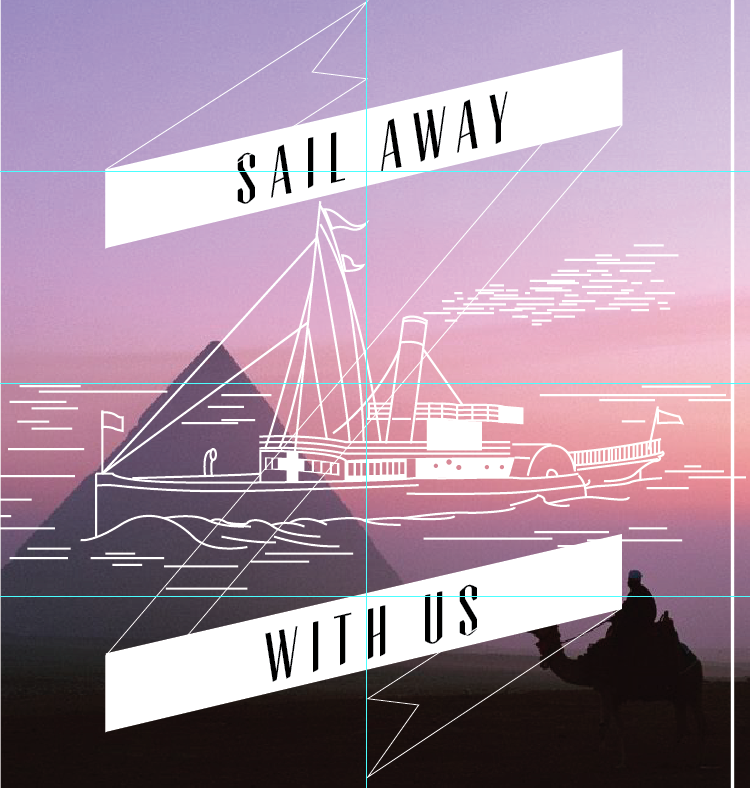
Steam boat Adshel poster

To create the second poster, I started with a copy of the original design on a locked layer, to get an idea of the proportions of the composition like the border and placement of the illustration.

I added a banner with this addition of a similar slogan according to the theme of the boat.

Using the same techniques as the hot air balloon image, I went over the key details of this Victorian steam boat with the pen tool, as if it were an etching illustration, IE, having certain strokes as opposed to recreating the image as it is.
Here is the boat in the poster - before I have adjusted the strokes of the pen tool.

I put it onto a black background temporarily so I could see the strokes easier.
I was having big problems with the background banner as it kept interfering with the illustration so I thought that a gradient might be necessary? I was still playing with the idea as I was unsure.

Here is a closeup of me adjusting the stokes on the details of the boat. Notice the interference of the gradient with the illustration image.

I was to create outlines of the typeface so that they could be a negative of the banner - IE seethrough so the photo could be seen through from behind.

I then picked a more appropriate image according to the nautical theme.

I changed the border according to my initial sketch - it was nice to have minor variation between the poster designs. I also changed it to 'hoist your sails'
Like the first poster, this one went under a drastic change when accommodating the new colour scheme and collection of typefaces. I needed to redo the banners to change this, as the typefaces were now a part of them...

Here is the finished poster after all of these changes. It works a lot better with all of the other printed ephemera.
Digitisation of Steam train Adshel Poster

For the steam train poster, I started with the rounded corners of the border. I did this by using the 'minus front' tool on the pathfinder box.

I put in the other design on a locked layer to get an idea of proportions of the composition.

I started with the banner.

I then changed it to the correct typeface and used the exclude tool to get the transparency.

To make the banner/ logo composition consistent to the other poster, I added an appendix to the border to accommodate the new logo position.


Unfortunately - this is as far as I got with this design! I made the decision to only have 2 posters in the end - as I felt that another illustration in addition to the other two would have been too much, and I was also thinking about time and all the other things that I would have needed to do, and so I had to cut back.
Impressive post. In Melbourne Adshel posters are mainly used in bus stop and railway station. Adshel posters create a very impressive environment in the places.
ReplyDelete