Today, we each brought in a collection of 5 logos and their associated branding stationary. We intended to disassemble the logos and decide on the messages they convey.
We started off with the NASA logo as an example:
Background info:
- Logo from the 1980's
- Displayed on all the space shuttles
Why red?
- Red can symbolise danger
- One of the main colours in the US flag - patriotism
- 'Red blooded' Americans
Why the rounded edges?
- Futurism
- Helps legibility from a distance
- Represents the tubing used on the space shuttles and tubing between astronauts and space shuttle itself.
- can represent areodynamics
The letters are joined and in my opinion represent unity. They also remind me of bent metal and ironwork so it has an industrial, futuristic feel.
The logo was changed after the crashing of space shuttle Challenger in the mid 1980s. There are lots of reasons why companies choose to rebrand - in this case it was the end of an era.
Then we start to discuss and analyse the logos and brands that the rest of the group had brought in.
Then we start to discuss and analyse the logos and brands that the rest of the group had brought in.
Ellen Setterfield
Apple brand


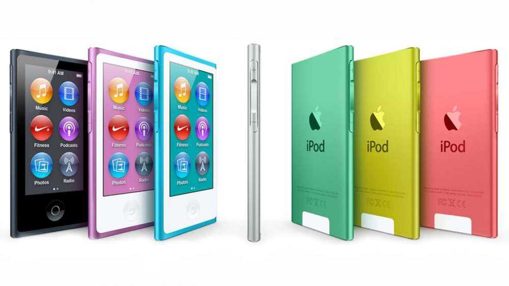
There are usually little to no colours in Apple branding to make it simpler and unify the audience. The sans serif type usually used makes it modern and timeless - this reflects in the products, that don't seem to age!
The tone of voice usually used in Apple adverts and branding is conversational yet formal. This could be because they are trying to be less corporate/ less intimidating and making the idea of state of the art technology as accessible and easy to understand by all.
Liz Earle Brand


The logo is a flower with an atom symbol. This represents the company well in that it unites both science and natural remedies. The mint green seems to symbolise freshness and natural beauty and the grey text represents the science behind the company.
The serif font used makes it look very elegant and quite feminine despite the unisex colour scheme.
Ogio Wine brand

The combination of sans serif text and the fact that the label has a whole in it gives the impression that it is good quality wine, because they let the product speak for itself. It's quite trendy packaging, which appeals more to a younger audience, because an older more experienced audience wouldn't be swayed by fancier packaging.
The gold top on the red wine symbolises maturity, whereas the serif font on the rose wine shows a more elegant, feminine audience.
Next brand


The black, white and grey colour scheme unifies the audience as it is neither masculine or feminine. It's modern and a little bit quirky, which represents the company well.
Bagel Nash brand
The rounded typeface reflects the roundness of a bagel and in doing so looks young and fun. The lower case used gives it a humble feel, which matches the size of the company and their matchbox shops.
In my opinion, the doodle style image of the bagel suits a younger audience because it is playful, but reminds me of the infinity symbol. Bagels are infinite!
Laura Wallbridge Bruce
All Saints brand
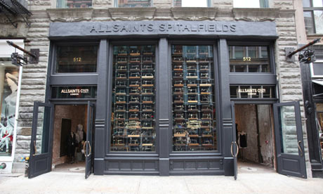
Has this authentic vintage feel. The grunge effect on their bags and tags portrays an industrial, warehouse setting. It looks young and trendy, with the added 'skull' stamps it looks edgy with an element of danger.
There are a number of different logos which shows the eclectic style to the brand.
Jo Malone brand
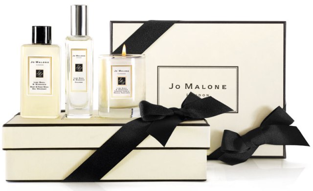

The black and cream colour scheme is clinical yet sophisticated. It represents luxury and gives the setting of a boudoir. The logo is left uncomplicated, left to speak for itself.
The Botanist brand


The lettering in the logo reminds me of Victorian wrought iron work - like a greenhouse. It has an established feel but is sketchy as if it humble and informal at the same time. The rest of the branding has a handwritten feel and combined with the brown grainy paper feels a lot like a friendly gardening scene.
Elemis brand

The grey and white colour scheme feels very scientific. The wave motion on the 'E' represents being cleansed with water. There are no bright colours used giving the overall impression of a clinical feel. They have an alternate logo which looks a lot like the Ying Yang symbol, which adds another angle of the logo - a more natural, trustworthy feel.
Chloe brand

The rose gold and champagne colour scheme not only give this an expensive but also an elegant and feminine vibe. Because it's French and there is an accent on the the e in Chloe it projects French style and chic elegance. The logo is plain and simple, as if they don't need to dress it up to impress viewers.
Harrison Park
Food Writer's Guild
The fountain pen nib uses the negative space to show a spoon - quirkily incorporating both the writing and the food in a modern twist. Really easily applicable to any source of print or web.
Pan Am
Blue colour can symbolise either the sky or tie in with the fact it looks like a globe. According to Pan Am themselves it 'defines driving ambition' but in my opinion its the curves lines in the logo that remind me of the red arrows in the sky or even an altitude reading meter inside an aircraft. Either way, it all gives the feel that this is an aviation company.
Elephant and Castle shopping centre
Good incorporation of negative space but to me this looks dated and awkward - the edges aren't rounded but quite angular and doesn't look professional.
'Customs'
Has the worn off feel of a stamp or a lino print, not unlike the stamps they actually use on their boards. The logo itself is the shape of either a surfboard or an early skateboard.
Priesh Desai
Puma
The jumping/ pouncing action of the animal itself is determined, focused and powerful which reflects well with the brand. In my opinion the logo looks quite dated because of the typeface used but still reflects a sports brand so is still true to it's purpose.
Twining's Tea

Because of the serif used it looks like Twinings is aimed at an older audience. The Victorian style of the logo puts trust in the viewer as if this product has been around a long time and has a lot of heritage. It's tried and tested and established as a trustworthy product, and it shows. It's a very stereotypically British product, because of the crown and patriotism.
Vaio
The logo (and possibly even the name) was comprised of the analog and digital symbols incorporated into letterforms. In my opinion this makes the logo not very legible but still fluid and modern looking.
Braun
The whole logo has a proportional scale of 1:1 and so is perfectly mathematically designed and yet has smooth, rounded edges and a friendly approachable feel. This reflects in their products that they're state of the art technology used everyday.
Kandoo

This logo is fun and playful because of the unisex colour scheme and squishy 'leapfrog' typeface.
Joe Leadbeater
Hutchins Center
The cross bar over the 'H' creates an 'A' shape. The serif typeface makes it sophisticated and established, reflecting the university but the splash of lime green makes this very contemporary and up to speed.
The Butcher Shop
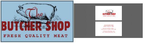
Has a local, traditional feel to the logo because of the stamp style. The red has been described as 'meat red' which might be a little too close to home for some people, along with the image of the pig, which in my opinion gives a traditional farm like feel. The logo overall is quite vintage looking, giving the impression they have really fresh meat and use traditional methods of tending to meat.
NBC
The peacock in this symbolises the network with the increasing amount of colour channels - more than any other channel in the United States at that time. Each colour of the peacock also represents and corresponds with a different department of NBC's website. The peacock is a proud creature and to be shows an established company you can trust.
Belle Minon

This logo and set reflects French Elegance - to me the colour scheme reminds me of fine china and marbled hallways - perhaps inspired by the architecture of the shop?
National Geographic
The yellow border around the the magazine is distinctive and is now used as the main logo for the TV channel. The Kodak yellow is also very relevant because it says cameras, and the shape is not actually around the type but next to it, almost like a snapshot or a freeze-frame.
Sarah Butler
BarCode
Good use of negative space that gives the logo a contemporary feel. The incorporation of both a barcode and a pint of beer is both playful and quirky.
Wave

Wavey, fluid typeface gives a good indication to the feel of the company.
Knife
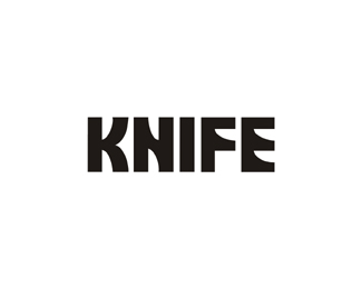
A subtle use of negative space in the lettering makes this look like a contemporary, classy horror film.
Horror Films

I don't like this logo that much - I don't think that the use of the negative space is subtle enough to be clever - the screaming face within the film reel is a bit too obvious for me.
Lizzy Gosney
Propaganda

Indie, colourful illustrations reflect a younger, fun audience. The word 'propaganda' seems a bit contradictory to the look of the flyer though - although in a sense, there is a peaceful rebellion against mainstream culture in this Indie night and the look of the flyer.
The Smoothie Company

Simple products accompany a sans serif, straight to the point logo.
No comments:
Post a Comment