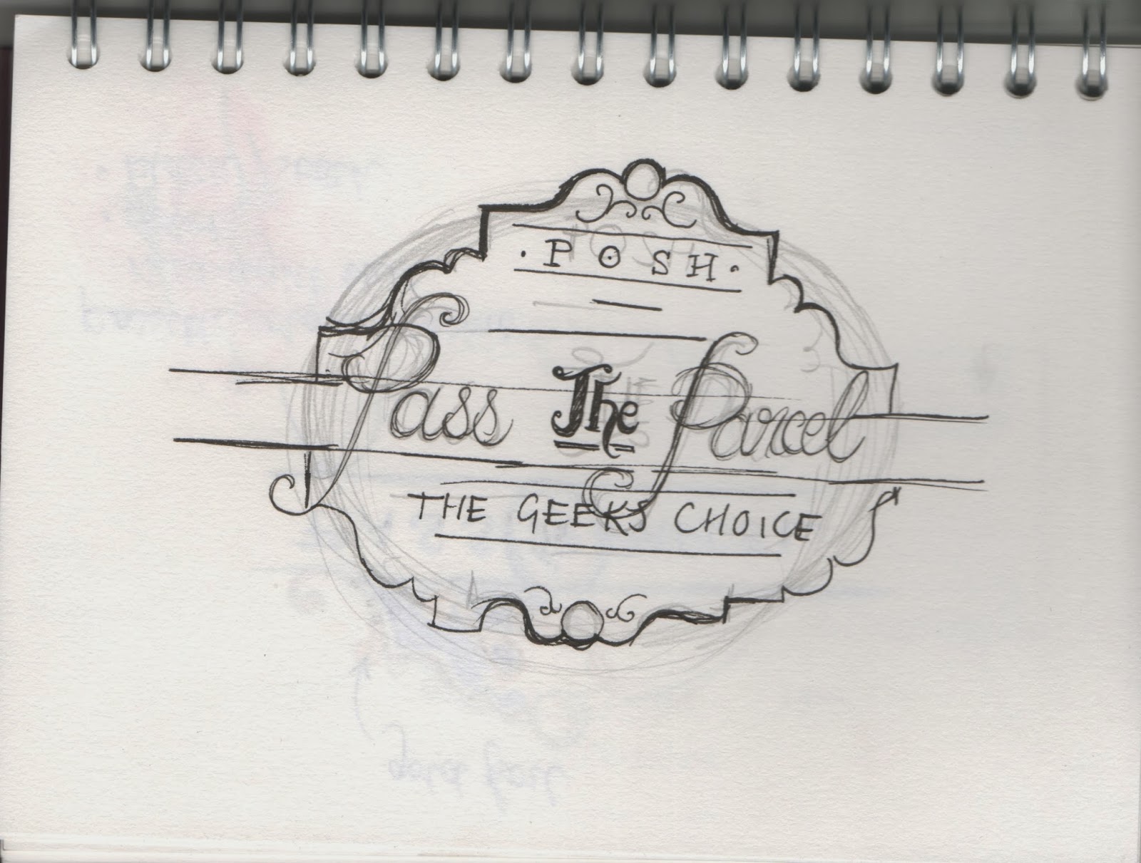
As inspired by the Victorian design work I researched I started to sketch up some logo ideas.

I knew I wanted the outline to be poignant and strong, but still art deco and ornate. It was just fitting

Trying to refine the logo and break it down into different sections
I am also trying to incorporate a belly band for the product- how would this work?

Deciding on colours and trying out different word placements
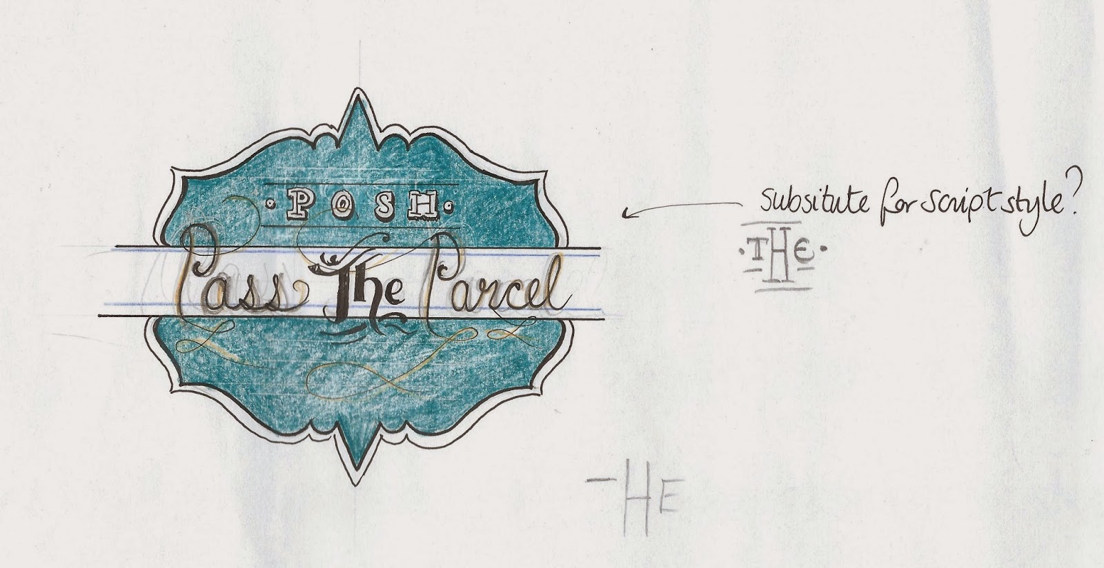
A calligraphic typeface accompanied with a plain serif typeface is a good juxtaposition adding balance to the logo:

going over the design using the pen tool

The whole logo is nearly finished!

I added a gold effect as I intend to add foil to this logo! All finished!
No comments:
Post a Comment