OUGD504 - Design for Print and Web - Map design development
For my map design I want to include:
- The 80 Stories Logo
- The World Book Day logo
- Illustrations from the posters
- A compass
- A decorative quote from Jules Verne
- A key ( if required) and instructions

Of course, I have sketched this without knowing the shape of the actual route around London, but with this as a quick guide, I am confident enough to immediately take it to screen.

I start by calculating the size of the map. It is roughly A4, but is slightly smaller due to being 6 times larger than the dimensions of the overall lanyard design (since it will feature within the lanyard pack)

After placing basic shapes to represent all the other components in the composition, I start to create the banner for the title around the logo design. I think it looks a little too dark, and the bottom part is too intruding around the instructions box.

I change it to a more Victorian style composition with furniture instead of banners.

I enlarge and increase the leading of the 'London' title as I thought it looked too squashed.

I started by planning the route off of Google maps. I want it to start in Picadilly for possible utilisation of the big Advertisement screens to mark the start of the route, to Waterloo station, where Phileas Fogg departs for Egypt in the story.

I decide the route doesn't cover nice sights like Big Ben and the London Eye, and that this is more visually striking for visitors and that including that will make it a better experience.
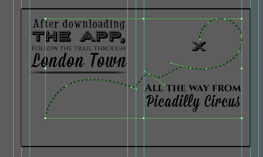
I go over the route with the pen tool. I then take 2 circles and go to object > blend to connect the two circles like a string of beads.
I then highlight both the beads and the route and go to object > blend > replace spine. This means that the beads will go along the route.
I then went over the main landmarks such as the River Thames and the main roads with the pen tool also. I then highlighted other landmarks with text.

To create the arrow, I started with the polygon tool to make a perfect triangle. I then drew half a triangle within this, to give the impression of a shadow. I then, with the add anchor point tool, added another anchor point on the larger triangle in the middle. I used the white arrow tool to pull both the middle anchor point and the edge of the little triangle down, to form an arrow. I used the pathfinder tool to create a negative space out of the larger triangle:

I thought that my fonts were making the overall design appeal to an older, smaller audience so I introduced a new font to make it more 'fun'. I now have a problem because all the other fonts don't go with it, and now seem inappropriate in comparison....

Here I am adding the 80 Stories logo to the design.

After adding the logo, I found that the banner design wasn't really working with the composition and so I made it horizontal and incorporated the new font.

The introduction of the balloon illustration made the design look better

However the addition of the boat as well was too much and so was removed.

Here I am making the compass:

I started off with a square.

I then moved the two side points down to form this diamond shape.

I pulled the top point up to enhance this, and used the same technique as the arrow.

I duplicated the arrow design and rotated appropriately - however I don't like the gaps between each of the points.

...So I closed them up using the white arrow tool.

I wanted to add a circle design to the background of the compass, and so I used one of the border designs. However this didn't go well when I wanted to expand it to change the colour to white.

So I just made 2 different circles and used the pathfinder tool to create a similar effect.
I also added the N S E W in a strong, nautical font.

When I rotated the map design to best suit the overall composition, I deliberately rotated this line in the background, so I knew the correct angle the compass should be at.
I made a gradient in the background of the design to avoid pixelation and blurring with a photograph, with the same sunset effect:

I then added the World Book Day Logo and moved the compass to a more helpful spot.
The design is finished to a degree, but I still think that the World Book Day Logo needs to be in plain white, and that the 80 stories logo needs adjusting, as I feel it doesn't work well when actually applied in practise. I also feel like the background is interfering with the design, plus the new typeface I introduced (top right) doesn't match any of my other designs! I may have to come back to this design before printing.
***
After the final crit on 8th January, drastic changes needed to be made (not suggested by anyone else in the critique, I didn't find the actual session very helpful! I just decided when I was presenting that it didn't look quite right and that I needed a new solution) , as I felt that the photographs weren't working- especially on the smaller pieces. This meant that the map design adopted a new colour scheme and a bunch of new typefaces!

I decided that the map/ lanyard would be printed on cream coloured stock. In this design I also incorporated the floor sticker designs, the wall markers and the Waterstone's logo.

As this is the other side of the map design, I start with the same dimensions as the map document.
I place in my sketch of the plan of action and the sketch of the front cover idea:
Because of the way the map folds, the other side when flat is two ways up.

I start to trace over my sketch.

I'm having particular problems with the banner, it's too tall - its a but overwhelming. Also, on my sketch, it says the date, I drew it before I fully designed my logo.

So I add 'official guide' to the banner instead.

I quickly put together the back of the design using the components from the reverse of the book token designs.

Following my (very rough) plan, I improvised with my existing graphics to create the rest of the designs. Here on this page I am advertising the website.
Here I am creating rough instructions. Comprehensive instructions are on the other side of the map, these are just for fun.

Here I am refining the 'route' line.

And adding some nice text!

This is the opening page of the design.

In this first draft of the map, I had not decided on the latest colour scheme (it was in this design that I finally solved this) and so here I am designing a basic app icon design using components from other designs.

With a photograph in the background.

Here is the first two pages of the design. I added the swirls featured in the window design and the posters.
It was then that I decided that I needed a colour scheme that was friendly and quirky and didn't make it look too childish/ generic.

I tried this colour scheme - but the first three colours looked too much like the union jack and the black was too harsh.
I found inspiration in these two designs:


I pinned them on Pinterest because of their Victorian / Colonial designs and (the first one's) association with Jules Verne related style.
I used the colours out of these as inspiration for my design:

Here is the completed design:

I am really happy with my final design. The new colour scheme, accompanied with the cream stock it is going to be printed fits in really well with my intended audience and overall 'fun' theme.
Sticker Designs


Using different graphics from the whole project and the colour scheme, I quickly put together these 4 different sticker designs as an addition to the Lanyard pack, as I thought that this would appeal to younger audiences.
No comments:
Post a Comment