Visuals
Starting with mind maps and my research, I began to build a catalogue of sketches and ideas for the visuals and artwork for my food pack.

I wanted my food pack to be able to hold as many different kinds of foods as possible, and so making this mind map really helped me to consider all shapes and sizes of food, hot or cold and see how I could incorporate it into my design to please all audiences.
 |
| I researched further into visuals for the Great British Summer after I created this mind map, but again, this really helped me brainstorm my illustrations and ideas. |
Preparing the logo

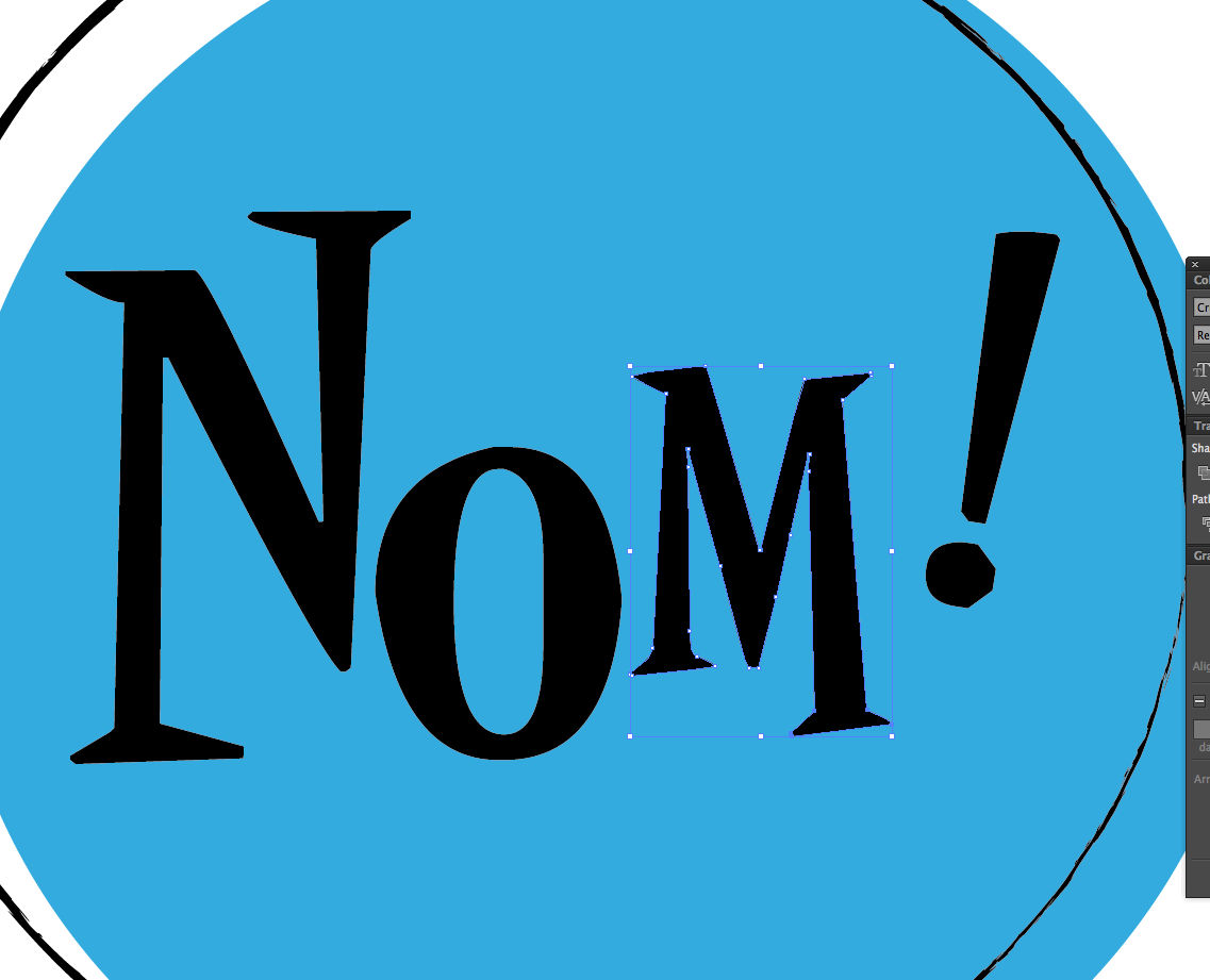
I type out all of the letters to 'fayre share' as separate letters and place them on a 100mm by 100mm art board.

I then change them to my desired font; Anderson Stingray.

I then go to type > create outlines. This enables me to resize and reposition the letters. I want them all different sizes, but to also intertwine and work around one another.

Here I am tweaking the capital 'F' and the tail of the 'y'

The logo taking shape.

Because lots of the same letters are used, I typed out both lower and upper case letters to mix up the appearance. Here I am making the bottom 'R' as different to the top one as possible.

Adding the circle to the background, I am starting to really like where this design is going!

I decided to make the lettering white and place it inside of the circle. I decided to do this because I thought that a logo contained inside of a circle would be easier to apply to further designs.

However, I still felt that the 'H' needed tweaking further, as the negative space below it left the design unbalanced.

Done!
Preparing the illustrations
The speech bubbles
A large part of my artwork design depends on the speech bubbles.

On my sketches, I am starting to form some sort of pattern that depends on the use of quirky speech bubbles.

I wanted to feature the 'mis print' effect that I saw featured in my research.

I started by first scanning in my sketches and then drawing from them in Adobe Illustrator. Using my current catalogue of 1950's fonts, I started to play around the placement of the lettering.

I decided to change the font.
Like the logo, I start to resize each letter and move them around a bit.

I then added a brush effect around the edge of the lettering and the circle itself, so it would appear hand rendered like I found in my visual research.

To balance the design, I added a line under it.
At this point, I wasn't totally sure on colours, and so I just filled in the background with any colour to get an idea.
I followed the same process for the other five speech bubble designs:


Illustrations for the pattern


Based on my visual research, I started to create stylised sketches of food and the great british summer. I scanned in these sketches and began digital development.

Here is my (very rough) sketch alongside it's original digital development illustration.

I then added a brush stroke effect to give the appearance of hand rendering.


I applied this same process of using the pen tool, playing around with the line weights and thickness along with the brush strokes, to all of my illustrations.
(from left to right; ice cream, apple, carton of juice, ham sandwich, ketchup/ drink bottle, slice of cake, glass of water, burger, chocolate bar, muffin, stick of rock)

I awkwardly jumbled all of my illustrations and speech bubbles together, with the accompaniment of words associated with the Great British summer, in the hope that it would start to work as a pattern!

I did a few more sketches on paper, but found it difficult to visualise the pattern so I continued to play around on screen by resizing and repositioning all of the different components. I then repeated the pattern and tried to see how it would fit together repeatedly.

I decided to apply one of my original colour schemes I scribbled together on one of my sketch pages, as inspired by my visual research.

To be honest, I really didn't like where it was going! To me it looked tacky as opposed to vintage and so I felt like I had to completely start over! I also felt that the illustrations were lost in the background and the idea that it was food packaging had to be emphasised.

After going back to my visual research, I saw that some designs were split up into different frames, in some sort of informal grid. I felt like this was a good way to emphasise my food illustrations.

I also adopted a new colour scheme, as I didn't feel like the Great British theme was being communicated strongly enough. I begrudgingly used a muted Union Jack colour scheme. I say begrudgingly because at first I dubbed this as being too obvious and cheesy.

After carrying on with this plan of using frames, the pattern was finally coming together!

Further progress on the design made me broaden my colour scheme further, til I was working with about 6 different colours.

However, although the muted colours made it quite stylish, I thought that it was a little dull looking and maybe even too dark for printing, so I made some of the colours brighter and lighter.

After research into my fonts after my troubles with my Disney hoodie design (other responsive brief), I realised that the fonts I previously used were only free for personal use so I set about finding new fonts that were appropriate for public distribution.

All of the replaced fonts with new colour scheme.

After repeating the design and filling in the gaps with a secondary design, the pattern was finished! My main fear was that it was too child like, but I was reassured that the style although childish, was old fashioned and therefore nostalgic in style.
No comments:
Post a Comment